
..........................................................................................................................................................................................................
interviews & features | dvds | equipment | clothing | books | videos
..........................................................................................................................................................................................................a losing battle?
just shy of the junction between school street and main street in bowmore, sits a white, long-wheelbase van which has occupied the same roadside space since the beginning of summer. the logo and lettering on the side panel advises passers by that it is home to noah's bark, a purveyor of pet products, and is owned by a family recently moved to the island. almost within viewing distance, on shore street, sits the local veterinary surgery which, not surprisingly, offers its own range of pet products. that particular retail and veterinary service has been in place since well before mrs washingmachinepost and i moved to the hebrides, and i find myself a tad surprised that they have not lodged a complaint with the council over the semi-permanent siting of noah's bark, given that the latter can easily undercut the former due to a lack of similar overheads.
a recent issue of the comic highlighted a couple of prominent uk cycle shops which had unfortunately called in the receivers and closed down. one cited the well-recognised economic headwinds faced by many retailers, compounded by the lower pricing to be found on the interwebs. that competitive edge is akin to that of noah's bark described above. we all know that it's unfair, but as has become a common mantra, 'life's unfair', so one more instance probably makes little difference. and anyway, we're all suffering at the behest of those economic headwinds, and fair or not, we'd all prefer to pay as little as possible for our velocipedinal bits and pieces.
almost diametrically opposite the parked white van, lies the celtic house, a longstanding (in every sense of that description) emporium and bookshop with a particularly fine upstairs café. many of the books i read cost me nothing, since the majority are sent for review, either in these black and yellow pixels, or for the black and white pages of our local newspaper. but every now and again, i find myself with a desire to read a particular book, and though i can easily order it at a discount from amazon, i mostly opt to purchase or order from the celtic house and pay the designated cover price. because if everyone opted to swell the coffers of jeff bezos, shops like the celtic house would cease to exist. and i'd prefer that this didn't happen.
i like to think that, were the island to feature a bricks and mortar bike shop, i would support it in similar fashion. one advantage would surely be almost immediate gratification; i currently have a pair of pedals on order from an online retailer which, so far, have taken two weeks not to arrive.
but are bike shops fulfilling the purpose for that which they originated? in my previous home in scotland, there were three bicycle shops within easy travelling distance, all of which provided servicing, a wide range of componentry and bicycles to suit every type of cyclist you can think of, from kids to members of the local competitive cycle club. however, larger conurbations might, at one time, have found themselves with a demographic that would support several cycle shops, some of which would be more specialist in the bikes to be found on the shop floor. those who catered more for the offroader or aspiring pelotonese for example.
my own theory is that the latter was bolstered by the bradley bubble of last decade, when a multitude of gears, a carbon frameset and drop handlebars was the velocipedinal persona demanded by many (mostly because marketing encouraged them to see themselves in that particular light).
there's little doubt that covid altered the paradigm very much in the favour of bricks and mortar, where many sold everything they had because it was all that they had. the mistake, as we have all learned, was in expecting that state of affairs to persist indefinitely. quite why that was the case is still something of a mystery; as many, self-included, were wont to point out, the first draughts and rain of autumn would undoubtedly have seen the majority leave the bikes in the shed and scurry back to their cars, particularly when lockdown ended. and so it came to pass, apparently to the surprise of manufacturers and retailers alike. but even had the archetypal new adherent opted to defy the weather and continue to ride, why was it supposed that, having bought during covid, they would decide to replace or upgrade only a matter of a few years later?
that might be an unremarkable option for you or me, but as i'm sure you've been told on many occasions, we're not like normal people.
as i believe i pointed out many, many years ago, for cycling to grow, and by implication, maintain at least one tangible outlet in each community, there has to be more folks buying proper bikes; upright riding position, flat bars, hub gears, comfy saddles, mudguards. probably not gravel bikes. those acquiring top-end bikes of all flavours, despite frequently dominating the conversation, are a tiny percentage of the actual and potential market. it's a sector that hasn't really grown to any appreciable degree over recent decades, yet it's the one to which the majority of manufactuers aim their marketing, bikes, components and apparel. can you honestly see the purchaser of a shimano hub-geared commuter bike opting to accessorise with a pair of rapha £250 pro-team bibshorts?
despite recent closures, the bicycle association assures its members that things are looking up; that the industry is in good health. little comfort to those who have pulled down the shutters for the last time, but i fervently hope that the association is right, and not just trying to convince itself.
saturday 19 september 2026
 ..........................................................................................................................................................................................................
always intriguing

though it was a period in time that will hardly be remembered by thousands, if not millions, as one of the finest they've experienced in their lifetimes, the lockdown years of 2020 and 2021 were times of relative peace and quiet on the islands. in order to keep the spread of covid to a pragmatic minimum, calmac imposed strict regulations on their ferry services to create essential lifeline conditions. it became necessary to prove residence on the islands before travel was allowed alongside a ban on motorhome travel to the islands. several owners of second homes on islay managed to slide under the barrier to escape mainland conditions, but by and large, the ferry restrictions kept us safe.
confined to one return sailing per day and none at all on sundays, the interpretation of advice to exercise locally, as being constrained to the island, meant that there was almost no change to the velo club's weekend activities, other than a tacit agreement to ride individually, and miraculously contrive to meet up at debbie's 'accidentally'. those regular bike rides were the saving of some of us (ie, me).
the occupation of journalists and those involved in the production of newspapers were excepted from the regulations enforcing furlough. ironically those times were probably the hardest in many publications; advertising had all but evaporated, and news, particularly in a small community such as ours, was hard to come by, if only because no-one was doing anything. in my specific case, there were only two of us in the building for weeks on end, though thankfully, we both got on particularly well. however, notably fine weather, and a sizeable reduction in traffic, made those weekend bike rides an absolute joy. they are what i believe kept me relatively sane by offering an escape valve. sadly, that's possibly still true to this day, though the surrounding conditions are considerably less life-threatening.
i do understand that velocipedinal life on the mainland was far less enticing, but nonetheless, many said at the time that even the minimal kilometres they were allowed to ride made all the difference. and though i'm aware that many a carbon fibre machine is replete with electronics, hydraulics and the ability to precisely pinpoint one's position via satellite, bicycles are still considered a relatively innocuous means of achieving regular exercise; transportation that has the ability to remove us from our immediate environment and allow a troubled mind to divest itself of any accumulated encumbrance(s). for that we must be truly thankful.
but will it remain that way for much longer?
from interactions with friends on the island, i have become aware that what began life as a means to an end, has indeed, become an end in and of itself. i am, of course, discussing zwift and its peers, originally designed to allow the time-poor and/or the unfortunately located, to use their bicycles as stationary training devices, augmented by virtual reality displayed upon anything from an ipad to a large format wide-screen television. unfortunately there are those who now eschew the great outdoors in favour of the above, even on days when the hebrides achieved the nearest we'll ever get to a heatwave round these here parts.
if it's going to inveigle its way into the velocipedinal realm, zwift et al strikes me as the most likely target for artificial intelligence, a blight on humanity that could undoubtedly result in tangible benefits, but currently seems only to make the lazy portion of humanity even lazier. you do have to wonder at the wisdom of creating what some analysts have contended could wipe out humanity within the next decade, while warning that very humanity that it needs to bolster its network defences against the very technology reputedly born to act on its behalf. like sitting on a runaway train, wondering if it should perhaps have been outfitted with brakes at the manufacturing stage.
but aside from indoor cycling, it's currently hard to see how artificial intelligence could transform cycling from the highly pleasurable activity we all know and love. i have no doubt that a.i. will be used in the factories churning out bicycles for us all, and quite probably in the design process that precedes the carbon layup. perhaps it might be possible to have a.i. choose in which gear you ought to be pedalling, and effect the necessary changes while you admire the view or chat within the peloton. but i don't see (or hope for) that happening. it's almost impossible to open a newspaper or news website at present without being faced with at least one article on artificial intelligence, though it will soon become ubiquitous and scarcely worthy of comment (like donald trump).
as cyclists who can head out into the wide grey yonder, away from claude and chatgpt, we ought to count our blessings.
friday 18 september 2026
..........................................................................................................................................................................................................but is it really?

i'm pretty sure i have broached this subject on at least one previous occasion, but since i've no real idea when that might have been, and nothing seems to have changed in the interim, i don't suppose there's too much to be lost in mentioning it once again.
commencing this coming weekend, in montreal, canada, will be the world road racing championships, comprising every category the uci could think of. and, you would like to hope, the world's finest cyclists capable of providing an excellent show and even if not thought likely to achieve a medal of one colour or another, at least in a strategic position to help one of their countrymen or countrywomen to garner the spoils of victory.
i would be fibbing if i said i knew of or understood how the blazers at aigle decide the number of riders allowed to compete for each country, but there is a long table available showing the end result. this ranges from eight riders for the world's top countries (britain, usa, belgium, italy, et al), all the way down to a solo effort from ukraine, sweden, mongolia etc. though i dare say there's always an outside chance that the fellow from uzbekistan might find himself in the right place at the right time, i wouldn't bet the bike shed on it.
the women, for one reason or another, are limited to teams of seven; that may be due to there being arguably fewer competitors from which to choose, but i'm not entirely sure. strangely, in the list for the fairer sex, sweden are allowed only five in their team, while tadej's home country, slovenia, is also restricted to five riders, yet their male counterparts are allowed the full company of eight. so no matter which category you choose to follow, the world championships are not what might be referred to as a 'level playing field'. there are no doubt perfectly explicable reasons for all of this, but when i become king, every country will be allowed to enter teams of exactly the same number. considering that the union cycliste internationale have long stated their wish for mondialisation of the sport of cycling, they have a very strange (and regressive) means of doing so.
can you imagine if a similar process had been applied to this year's world cup? imagine if scotland, for example, had been granted leave only to field a team of eight players, while the sport's top countries had been apportioned the full eleven.
however, these are observations that will no doubt have been made by others, and perhaps a tad more forcibly. i would be very surprised to learn if anyone in aigle has even heard of thewashingmachinepost, let alone paid attention to its daily monologues. but, of course, the inequity does not end there. following his unfortunate accident in la vuelta, tadej pogacar is ruled out of this year's event, as is his nemesis, jonas vingegaard; both as a result of injury. but there will be others who have deliberately opted not to participate, either because "it's been a long season", or "the course doesn't suit me."
i have long railed at britain's teaching profession for the fourteen weeks holiday they receive each year, compared to the more usual eight weeks that most folks own, often for working every bit as hard, and possibly for less money. but statistically, a top professional road cyclist will race between 50 and 70 days per year, while even the lowliest of domestiques will be required to top that up by an additional 20 days. it's possibly worth my pointing out that, not only are there 365 days in a year, but, it seems, the greater your earnings, the less demands there are upon your race time.
and at the risk of cutting myself off from velocipedinal society entirely, i would tentatively suggest that those in the top echelons who find themselves free from injury, ought to be required to participate in the road world championships, if only to have it fulfil the promise of the title. otherwise it's just a series of races in a single location. how can any winning rider wear the rainbow stripes as the recognised best rider in the world, if several of the top riders opt not to take part? given the potential vacuity of the honour, do we even need a world champion in the first place, if decided in this manner?
though formula one motor racing is hardly a valid comparison, at least their world champion has earned the title by participating in every round of the series, emerging victorious on the basis of accumulated placings. would not a variation on that theme, perhaps involving a minimum selection of races currently in the world tour calendar, be a reasonable possibility?
does anyone have david lappartient's phone number?
wednesday 16 september 2026
..........................................................................................................................................................................................................the write to reply
i have what i believe may be regarded as an annoying habit involving apostrophes. well do i know that this is not one that is solely the preserve of yours truly, but given the nature of the day job, it's probably not entirely unheralded. granted, the iniquities of the english language don't necessarily make comprehending the rules the simplest thing on anyone's daily list of potential accomplishments. in contemporary, computer-laden society, it's very unlikely this situation would have been allowed through the front door, subjected as grammatical and punctuation rules would surely have been to widespread dissemination by focus groups and lingusitic experts before beeing foisted on an unsuspecting public.
however, you will be relieved to learn that i have no intention of pursuing the intricacies of diacritical marks, but i fear that my apostrophe obsession may be the basis of explanation. that i feel such has become a necessitous undertaking is in response to a question aimed in my direction only a matter of days past. this was the result of a discussion involving various strains of social media, artificial intelligence and blogging
while attending a concert at the annual caol ila distillery sponsored, islay jazz festival, during interval conversation, i was asked why i had persisted with the written word, instead of opting for a more contemporary approach, such as instagram, tik-tok, podcasting, or youtube? i cannot deny that i have flirted with at least two of those modes in past decades, prior to rejecting them out of hand and continuing with my dyed-in-the-wool daily task of typing the very words that you are currently consuming. podcasting, in my case, could only be achieved by way of a script, meaning twice the time to accomplish the same result; filming reviews was even more extensive, once requiring two weekends to complete a single bicycle review.
however, before you accuse me of being flaky, bordering on negligent, i have long-term faith in the written word, not only to achieve a singular aim, but perhaps to provide a modest level of (subliminal) education in the process. the english language is bursting at the seams with wordage that receives very little regular use, despite adding a welcome level of colour to both conversation and dissertation. not long into the era of thewashingmachinepost, i adopted a self-imposed mission to make use of as many of those words as it was practical to employ. whether i have actually achieved any meaningful results in this pursuit, is a debatable point, but immoveable objects frequently have a mind all of their own.
and then there's the act of reading itself.
i was reminded that 2026 is the national year of reading by way of a press release from calmac, who apparently demonstrated their support for the initiative by inviting a group of school children aboard one of their ferries to spend time with their teachers, reading suitable books in the comfort of the child-play area aboard the mv isle-of-islay. (that the school involved was not one from the - actual - isle of islay could be viewed as somewhat of a marketing faux-pas). a national incentive to encourage children to indulge in the joys of reading can, of course, be tacitly undermined by those who point out that, if reading is as enjoyable as it is claimed to be, why does it find itself in need of government persuasion masquerading as support? after all, soccer is unbelievably popular, an achievement reached entirely at its own behest.
according to a recent guardian article by john harris, the natural literacy trust reported that the number of young people who say their enjoyment of reading in spare time has fallen by 36%, while the reading agency charity provided further evidence demonstrating that 35% of adults claimed to be 'lapsed' readers. much closer to home, the mobile library that once plied the highways and byways of islay and jura, has been off the road for 15 months due to the council having been unable to recruit a driver/librarian. and during that time, there has been not one letter or adverse comment published in the local newspaper (though our local councillor advised that he had received one or two complaints). such evidence would tend to confirm the contents of the guardian's contentions.
i am, of course, more than well aware of the irony of placing this in the public domain in such a manner. were i more astute, surely the very locales in which it should be highlighted would be a podcast, youtube video, instagram or tik-tok? i have been told, however, that the latter has, unintuitively and unexpectedly, fostered an entire widespread book club. writing about reading is, at the risk of stating the glaringly obvious, preaching to the converted.
cycling's almost mythical rich heritage, while depicted by an extensive litany of photographs, is also recorded for posterity in vast tracts of the written and printed word. it would disturb me greatly to think that the velocipedinal world is at risk from a world-wide decrease in literacy. of course, that has unfortunately been assisted by the current dearth of print media dedicated to the bicycle. but just as vinyl has experienced a welcome resurgence in the world of music, i live in hope that print is on the cusp of doing likewise.
come the revolution...
tuesday 15 september 2026
..........................................................................................................................................................................................................great scottish bike rides. 25 classic road cycling routes across scotland. dave barter. vertebrate publishing 159pp illus. £25
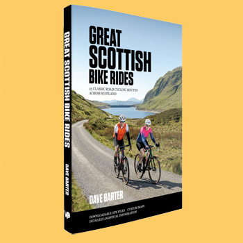
i confess, it's been a while since i received a cycling adventure book that did not concern the ubiquitous gravel bike. but dave barter has bucked the trend by publishing, in concert with vertebrate publishing, a concise and well-illustrated volume describing just over two dozen road cycling routes north of the border, though i must admit, i don't completely comprehend the pre-fixing of those with the word classic.
as evinced in a recent guardian article featuring couples who moved from the usa to scotland, though scotland is conjoined both physically and politically with the southern part of the uk, in many ways, it couldn't be more different. and possibly the first difference likely to be pointed out by scots and non-scots alike, is the substantial amount of precipitation suffered, predominantly on its west coast.
in other words; rain.
the map preceding the book's contents shows the 25 rides fairly evenly split between west, east and central. however, my parochial island sensibilities found themselves slightly disappointed that the author's only departures from the mainland, were a visit to arran and to mull (skye is no longer eligible to call itself an island following the opening of a bridge in october 1995 and bute is so close to scotland (35 minutes), as to be almost inseparable). the southern hebrides (islay, jura and colonsay), along with the western isles (the outer hebrides), were seemingly thought unworthy of inclusion. that makes it all the more ironic that he begins his introduction with "Scotland is old. It began approximately three billion years ago in the Outer Hebrides..."
he does, however end with the admission, "i'd love to have included many more...", without actually explaining why he didn't.
as with many cycle guide books, the author provides salient advice as to the best means of approaching the contents from the saddle, alluding to fitness, nutrition and hydration, suitable apparel ("Cyclists who venture out must be prepared for a whole range of weather conditions.") before moving onto mechanical considerations by way of tools and spares and coping with unforeseen emergencies, maps and navigation, and a helpful separation of the rides into three categories: moderate, challenging and epic.
each of the 25 rides is copiously illustrated and augmented with an introduction, its location on the map, distance, elevation gain, route profile and the relevant map references. some of this data is summarised in a single table inside the back cover. when it comes to maps, though each ride is downloadable as a series of gpx files for uploading to your gps device of choice, mr barter advises "...I always carry a paper map." alongside each ride description is a single-page, colour map of the route; less sophisticated than an ordnance survey version, but sufficiently detailed to provide at least a taster of what the determined velocipedinist might expect.
the elevation profile for the skye route will give you sleepless nights.
the ride descriptions are commendably 'chatty' in style, as opposed to the more usual step-by-step instructions. "The next section is a bit of a slog [...] I'm afraid there's not much to see along the way, apart from a military firing range." and "The late afternoon light will enhance the views and ensure that you have the lake road to yourself."
for those of us who still consider ourselves to be roadies rather than gravellites, this is a welcome addition to the cycling bookshelf. and the very fact that the author resides in devon would tend to confirm that the joys of scotland are not confined to those of us who live here.
friday 11 september 2026
..........................................................................................................................................................................................................return on investment
it's always nice to know that people care, even if their reasons for doing so occasionally seem a tad obscure. as a spoiler alert, meaning there will probably be days this coming weekend without any of this velocipedinal nonsense to wade through, the caol ila islay jazz place will celebrate 27 years of existence, part of which will include yours truly being percussive in the local gaelic centre. there will be addditional travel requirements as i attempt to fit as many concerts into the weekend as i dare. however, to return to the caring disposition for a moment, one of the local organisers visited yesterday afternoon to say that he felt i had been somewhat poorly treated with regard to communications about my joint public performance with a few other musicians.
as a non-professional, both in fact and disposition, the situation has caused me no particular grief, but i did find it quite gratifying to learn that my welfare was at least being genuinely considered.
and one can only hope that the apparent concern shown by strands of the bicycle industry are not only as well-meaning, but largely untrammeled by non-altruistic concerns. let me explain: the industry as a whole is keen to engender the reputation as one which cares deeply for its actual and potential customers. any touted improvements to componentry, apparel and the bicycles themselves are, we are often assured, born from genuine concern that we have, at our fingertips, the best that technology and actual concern for our wellbeing can provide. i realise that the last sentence may give rise to accusations of guarded cynicism, a state of affairs that i strenuously deny.
probably.
i assume that we're all familiar with the ancestry of the humble three-in-one oil can, a lubricant that is embedded in childhood memories, and kept a raleigh-twenty shopping bike ready and willing to participate in daily newspaper deliveries throughout the early 1970s. i don't doubt that, in certain corners of civilisation, three-in-one oil cans are studiously continuing this tradition to the best of their ability. of course, i am not personally involved in the high stakes, high performance world of professional cycling. but i can assure you that, were i to fail to forestall a sprint victory against wout van aert, it would not be at the behest of my chain lubricant.
however, those of us who consider ourselves fully-paid up members of the cognoscenti are effectively barred from even considering a can of three-in-one. not for us the simplicity and low viscosity of refined petroleum; our needs are far better served by scientifically engineered lubricant, the latest of which comes from the laboratories of french-based motul.
apparently the snappily-named, 'racing chain lube', "has been engineered to deliver very low friction, high wear resistance and protection against contamination in a range of riding conditions." in other words, it's reputedly better than a spray lubricant featuring the number 40. it's not the sort of claim that the average hebridean blogger is in any position to dispute, and it is more than likely that motul's claims are as true as any others. but the company goes on to contend that "cyclists (are) increasingly looking for products that minimise power loss while protecting the drivetrain." you may already have alluded to my cynicism, but i can legitimately state that i personally know of no cyclists for whom the above question has cracked the top ten.
so is motul, and by implication, every other lubricant provider (with the possible exception of three-in-one) truly invested in our velocipedinal well-being, or is this simply a case of not wishing to miss out on a market that appears to promise future economic growth?
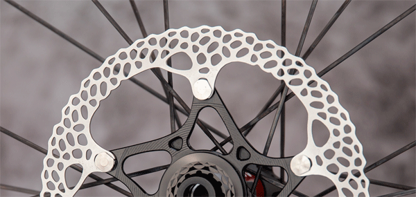
and while we're here, is it at all possible that other strands of the world of bicycle technology are similarly concerned with aiding and abetting our road or gravel-going superiority? i ask, simply because the notorious absolute black has recently introduced a new range of floating disc rotors on which the braking surface hole pattern is reputedly devoid of aesthetic concerns in favour of "greater thermal capacity under sustained braking." absolute black says it analysed the friction track as hundreds of circular paths, "aiming to create a flatter, more consistent material distribution across the main working area of the rotor."
i don't doubt for one moment that this is true, but was it truly necessary? as a luddite, i'm still of the opinion that rim brakes (on road bikes at least), were perfectly adequate for all of us; professional or otherwise. but though admitting that hydraulic disc brakes have succeeded in world domination, are there any, including world tour riders, who have publicly or privately expressed concerns over the material distribution within their brake rotors? and if they have, why? i do understand that allowing the outer portion of the rotor to float minimises any propensity to squeal under braking, but even if these new, thermally efficient rotors can bring a rider to a halt several centimetres sooner than their competitors, to employ the vernacular, "so what?"
if we are willing to acquiesce to the contention that hydraulic disc brakes are more efficient than their rim-brake predecesssors, and that the latter brought hundreds, if not thousands of race victories throughout the 19th century and early part of the 20th, why do we need even more efficiency that probably no-one actually asked for?
remember when we just used to go for a bike ride?
wednesday 9 september 2026
..........................................................................................................................................................................................................where it's at
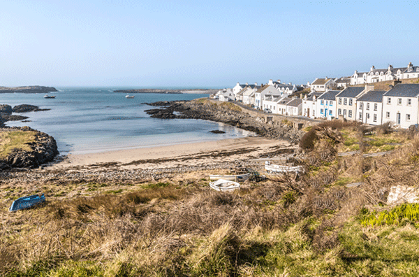
this past saturday, my services were engaged by a cycling holiday business, to guide a group of visiting cyclists around a pre-determined route within the principality. i have, in fact, carried out a similar function for the business on previous occasions, presumably based on the notion that i am well acquainted with the topography, history and narrative of the land. to a certain degree, that is a not altogether unfounded assumption, and i am happy to relate that there is a great deal of satisfaction to be gained from showing visitors around your home (so to speak).
in this particular instance, the route topped out at around 62km, leading from bowmore village to bridgend, before turning left and heading, via bruichladdich, to port charlotte. with the most southern point of the trip being ultimately that of portnahaven and port wemyss, the most scenic means of achieving that is to turn right towards kilchiaran, and take the coast road south in an anti-clockwise direction. undertaken direct from port charlotte entails staring out to sea for over 12km, while the kilchiaran road not only provides an intriguing north atlantic coastline, but, speedily remembered by the guide, a visit to windswept farm shop which sits atop a cliff affording (on saturday at least) a clear view of the ocean.
though i doubt anyone was convinced, i did suggest that standing on tiptoe on a picnic bench would allow clear views of canada's eastern seaboard.
those who followed dutifully in my tyre tracks were aboard a mish-mash of e-bikes and acoustic bikes, though adhering to a deliberately slow pace gave no particular advantage to the former, interspersed with frequent stops for photographs and the occasional opportunity to purchase islay-made crafts.
islay residents often display an undeniable propensity to take their surroundings for granted; but not everyone has the good fortune to live on the coast of one of the world's major oceans, and travels along singletrack roads with grass growing down the centre. if i add that we met only one car from turning off at port charlotte until we were on the approach to portnahaven some twelve kilometres later, you will perhaps appreciate just how far removed from the rat race we truly are. on arrival at portnahaven where the bike stop afforded glorious views over the picture-postcard bay (see above), while looking across to orsay lighthouse, celebrant of its 200th anniversary only last year, you'd have been forgiven for assuming the groups christmasses had all arrived at once.
on the return ride north, overlooking loch indaal, there were glorious views to be had across to laggan bay, the hills bordering the sound of islay and the paps of jura. another reason why the route was formed this way. debbie's reputation for serving the world's finest bacon-butties brought demands that we stop in bruichladdich for a mid-afternoon repast, demands to which i cheerfully acquiesced. cheered on by a welcome tailwind back to bowmore, my guests-for-the-day confirmed their delight at the day's activities, and that they would leave islay on sunday morning, harbouring excellent memories of the islands (they had visited jura earlier in the week).
i write of this not to boast of my ability not to lose anyone en-route and keep a group of cyclists happy on a parcours that included a 14% ascent of a gravel and sheep infested road. i write this because the day perfectly illustrated that exploring anywhere, but an island in particular, by bicycle, is incontestably the finest way, bar none. had our 62km trip been by car, we'd have seen very little of our surroundings while having to watch out for oncoming traffic on singletrack roads. and when we came across a view of great interest - kilchiaran bay, for instance - it was a simple matter to stop and look. i feel i need not underline that parking a car, without blocking the road entirely, is simply not a practical consideration.
by car, the journey described above, including stops, could have easily been assimilated in under two hours; by bike, it took us six glorious hours. the land of civilisation proved that everything is better during and after a bike ride.
tuesday 8 september 2026
..........................................................................................................................................................................................................keeping fit

over fifty years ago, just as i began my third year at art college, a friend in my design class, invited me to sit in as drummer with his band, as a result of his regular drummer having opted to take a holiday. the band held a residency in one of the local hotels, the drumset being a part of the hotel furniture, though it did belong to the vacationing drummer. under the circumstances, as i recall, there was scant opportunity for rehearsal, so i simply spent an afternoon at my friend's (the bass player) flat, running through a selection of the set-list, much of which consisted of elvis presley songs. (it is a session drummer's duty not to query that which he has been asked to perform).
on the night of the gig, arriving in timely fashion as is my cultivated habit, i was somewhat concerned to apprehend the drumset on which i was required to perform. a grey, oyster pearl premier kit, with two rack toms, a floor tom, metal snare and zildjian cymbals, it transpired that the setup was exactly as it had been when removed from the delivery boxes well over a year previously. (how come i can remember all that from over 50 years ago, but not what i had for tea last wednesday?)
when i relate, exactly as it had been, i mean that literally.
though it may be common practice nowadays to tune a drumset prior to packing it for despatch, in the 1970s, it was apparently deemed good enough to sit the drumheads on the shells and loosely place rims and tuning bolts. thus, as i sat behind the kit for the first time, only 30 minutes prior to performance time, i realised that none of the heads were tuned, and that several of the tuning bolts rattled in their slots. you would, perhaps, be forgiven for asking why i didn't simply employ my drum key and tune the darned thing, but the unwritten rules of sitting-in, demand that other than perhaps adjusting the height of the stool, everything else should be left as is; someone else's kit, someone else's rules.
in the intervening years, i have played many other drumsets; some of them mine, some of them not. the only ones that i ever tune, are those i personally own, and i rarely do i play the drum straight from the box without altering the tuning to suit.
a similar set of unwritten rules applies to reviewing bicycles, in that, while there may be favoured components i have come to prefer, during the period of review, the bicycle should be left (other than pedals), exactly as it was on release from the box. that's entirely on the basis that anyone purchasing a similar bicycle, either direct from the manufacturer, distributor or bike shop, would receive it exactly as had i. how would the subsequent review relate to that in the bike shop, were i to have replaced the chainset, wheels and saddle? even where it proved possible to retain a bicycle for at least a couple of months for a longer-term review, the same set of circumstances prevailed. there's really no means of predicting how any of the changes effected by a new owner might impact my conclusion, hence the decision to review a bicycle on its own, original merits.
but could it be that my desire to retain the bicycle's original integrity is a great deal closer to reality than i might have presumed? do the majority of purchasers of new bicycles, actually make any changes at all? and how many undertake even minimal research prior to the act of purchase? for instance, there may be certain makes and models of bicycle that catch my eye and even progress towards the aim of potential purchase. but should that situation occur, i will want to learn if it features tubeless or clincher tyres, at what width, what length of stem, brand of groupset and length of crank? at one time, a decent bike shop may have been willing to make a few subtle alterations before it left the shop floor, but many recent complexities have rendered that process null-and-void.
for instance, it was once a commonality to ask the shop to fit a shorter/longer stem. but with many bicycles now sporting one-piece bar/stem with integral cabling, that you can fully comprehend why asking the question results in a stern frown from the shop owner. and crank length? probably not.
but then how many carry out any of the above, possibly necessitous, alterations following delivery of the bike? based purely on anecdotal evidence and observation, i believe the majority are likely to follow the example of the vacationing drummer mentioned at the top of this monologue. leave everything as is. this could either be the result of a relatively uninformed choice, or, having spent slightly over budget on acquisition, a lack of available funds to make any desired upgrades. those new to the cycling experience are quite likely to set the saddle too low, but those with greater experience and for whom this is not their first bicycle, will have likely been informed about the latter by a well-meaning colleague. but quite frequently, that is the sum total of imposed changes.
and based entirely on my own experience of a complete cyclefit bike fit by the inestimable phil cavell, when the numbers were found to differ substantially from that which i had been riding for years, why did my suspicions fall upon mr cavell, rather than yours truly? especially when his numbers proved to be darned near perfect?
richard sachs has said that very few riders are in need of a custom-made frameset, unless very short or very tall; that today's off-the-shelf bicycles are perfectly adequate. so are the wide range of inexpensive drumsets, but we all have our preferences. ride cymbal low and to the right; a longer stem to suit longer arms; snare drum a smidgeon lower than the tom-tom; narrower saddle than the one supplied by the manufacturer.
i am not advising that you make changes for the sake of making changes, nor attempting to create a setup identical to wout's or tadej's. unless evolution has been remarkably kind, you're probably neither of the above. but i think it's better to rely on your own investigations, rather than those of a manufacturer you've never met.
monday 7 september 2026
..........................................................................................................................................................................................................feeling lucky?

beloved of many youtube videos and certain types of magazine, is the round table discussion, where an indeterminate number of individuals, often from the same industry or activity, literally sit round a table and discuss a specific topic, reputedly of relevance not only to said individuals, but to those of us out in the wild with aspirations to have been one of those sitting round the aforementioned table. hypothetically, i am thus including my reader as one such individual, then asking whether he/she and yours truly are feeling lucky? and the velocipedinal aspect about which i am theoretically enquiring is the number of sprockets accumulating on our back wheels.
this is in reaction to the apparent discovery that shimano has upgraded its dura-ace groupset to thirteen speeds, bringing it in line with sram and campagnolo. they both had to alter their freehubs to accommodate one extra gear, and there appears to be surmising that shimano has had to do likewise. however, bizarrely, in an industry that relies on selling stuff, shimano has declined to discuss an, as yet, unreleased product. shades of apple computer, methinks. therefore, the many potential customers who have eagerly awaited new trinketry for their bicycles, are excluded from planning ahead in conjunction with the mortgage department of their designated banks.
the luck part, in case you were wondering, is that we find ourselves alive in an era where the number of sprockets on the rear wheel has moved from the five-speed freewheel that originally brought us the ten-speed racer to the thirteen that has now become de rigeur in the peloton. i need not tell you (but i'm going to anyway) that a double chainset up front thus provides a theoretical twenty-six gears. in this particular case, i think the french approach it with the greatest degree of perspective, having provided the alternative word vitesses to describe the function of cassette sprockets. somehow mentioning to the great unwashed, that the bicycle astride which you stand, features x-number of speeds. conveniently associates us with the impression of velocity, and an avowed prowess to achieve it.
but is luck really that which has been bestowed?
if, like me, you have been watching either live broadcast or edited highlights of la vuelta, you will possibly have observed the speeds being achieved by the participants, speeds that few, if any, of us could reach without ending up in hospital. as mentioned but a day or so past, the current average speed in this year's tour of spain is presently at 40.5kph (around 24mph in old money). answer honestly; when was the last time the sunday ride ended at the coffee stop with just such an average speed showing on everyone's garmin? it's possible i may have momentarily reached near 40kph during my galeforce tailwind-assisted return from debbie's yesterday afternoon, but there's not a chance in christendom i could have maintained that past bridgend.
but, of course, whether we refer to them as vitesses or otherwise, does not in fact make life in the saddle any faster. i know the component purveyors would prefer that it not be said in public, but twelve speeds are not faster than eleven, and thirteen proffers no speed advantage over twelve.
so is this perpetual desire for more gears really all about providing smaller jumps between gears, or simply a means of maximising income at the behest of belief in the marketing?
when campagnolo introduced their thirteen speed ekar gravel groupset, it brought with it an inherent need for a new wheelset, whether a fan of vicenza or otherwise. harbouring thoughts of upgrading the groupset on my specialized crux, i approached google to investigate the cost of so doing. a groupset cost of around £800 didn't seem too outlandish, but the likelihood of having to purchase a new wheelset, and thus discarding the two pairs i currently possess, placed it beyond the pale.
but our luck may also be soon running out as highlighted by a sunday morning friend of mine, who has had more wheel problems than anyone else i know, and now encounters the difficulties inherent in finding a campagnolo compatible carbon wheelset suitable for rim brakes. as progress marches on, it has scant regard for that which it leaves behind. none of the big three are continuing to upgrade the mechanical versions of their top-of-the-range gearsets, and in so doing, they have cast aside the humble rim-brake. if rim-brake compatible, mechanical versions of sram red, campagnolo super-record or dura-ace are your holy grail, i hate to say it, but...
adobe's portable document format (pdf), apple's e-books and kindle's versions of the same, could arguably were once viewed as the future of reading material, yet i can still buy a 'real' book if i want to. and according to industry figures, books outsell e-books four-to-one. and isn't the number thirteen meant to be unlucky?
saturday 5 september 2026
..........................................................................................................................................................................................................currency
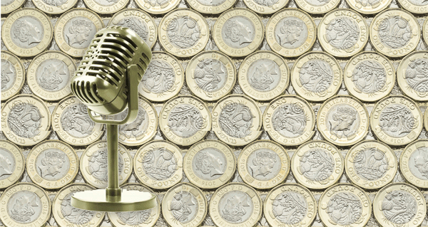
in yesterday's guardian newspaper, there was an excellent article by sports/football writer, barney ronay, entitled 'money loses meaning in chaotic carnival of excess'. as i have said to the point of boredom, i have no interest in football whatsoever, but was enticed by a front page click-bait which stated 'it's the fans who end up paying for the £3bn transfer window.' you can perhaps see why, instead of simply discarding the sports pages as usual, i turned to page 40 to read in earnest.
a bit like the business pages in the same newspaper, despite having very little comprehension or insight into the machinations of industry, i find myself strangely attracted to stories of chief executives' often obscene annual remuneration, augmented by very unseemly bonus schemes. and despite having no plans whatsoever to visit across the pond, i check the exchange rate between sterling and the dollar on a daily basis. similarly, though ignoring the sports pages, when perusing the bbc news website in a forlorn attempt to keep myself informed, there is inevitably more than a single instance of some ludicrous amount of money being exchanged for a teenage footballer, who will now receive an annual salary in excess of the money paid to to surgeons.
and all that just for kicking a football about for ninety-minutes.
mr ronay's contention, as if you hadn't already guessed, is that no matter how large the amount spent on transferring a footballer from one team to another, it's the fans that ultimately pay. to quote from the article, "Who pays in the end for this circulation of funds? You for starters. There is no such thing as football money. It's all TV rights, state propaganda funds and hard private investment from the kind of people who really don't give without taking back in the end." what the article doesn't mention is that it's not just football fans who are paying.
i know we've been over this ground so many times that it's almost part of the wallpaper, but tnt sports spent £6.7bn for the sole rights to broadcast premier-league football matches until 2030. not unnaturally, the owners and/or investors in tnt sports did not pay such a ridiculous amount in order to prove their altruism; they will not only want that £6.7bn back by the end of 2030, but a few pounds on top to keep the office coffee machine well-fed. yet the football fans mentioned above are not the only ones being charged £30.99 a month to watch the streaming channel. even if, like me, you only want to watch cycling, or, in my case, cyclocross, tnt still charge the full amount, presumably on the basis that i could watch football if i wanted to.
never a day goes past these days, without almost every newspaper featuring an often derogatory story about artificial intelligence. either because rich tech companies appear to be over-riding planning laws by assembling data centres wherever it takes their fancy, or that if a large pay day does not arrive sooner, rather than later, the billions that have been invested in the genre might well lead to yet another financial crisis. but with all the hype surrounding a.i., there is much truth told about the ability of artificial intelligence to reach hitherto untold heights; surely apportioning proportional subscription costs based on customer demand would be something it could do almost without trying?
however, let's not kid ourselves; inordinate costs are not exclusive to football broadcasts. admittedly, tadej pogacar's salary over the selfsame four years of tnt's premier-league coverage, is rumoured to be almost 50 million euros. while that is still a ridiculous amount to pay anyone to do what it is they always wanted to do anyway, none of it comes from tv money, entirely due to the latter being directed to the race organisers/owners, and not to the participating teams. but at least some of the costs incurred by the broadcaster will require to show a healthy return on investment, even if it occasionally appears that with a smidgeon of perspicacity, costs could be minimised.
while watching channel five's la vuelta highlights programme of stage eleven, coverage provided by tnt sports (presumably for a healthy fee) i identified four different voices from the commentary booth: sean kelly, rob hatch, adam blythe and an unidentified other. the average length of a tour of spain stage is 156 kilometres, with the current average speed pegged at 40.5kph. that brings the average time taken to complete the stages ridden so far as 3.8 hours. if we include some hapless fellow who appears on the finish line or mid-point mountain top, that's five, reasonably well-paid individuals, none of whom have to be on air for anything like those 3.8 hours. and occasionally others are drafted in to cover while sean and rob nip off for some lunch.
most of us probably work at least seven hours a day, and quite likely paid a tad less than tnt's commentary team (and don't forget orla and her daily necessity to have a different outfit for each stage). years ago, we used to happily listen to david duffield and sean kelly, with no pre and post-race punditry to tell us what was about to take place, followed by analysis of why it all turned out completely different. none of this alters the day's racing, and i'll warrant that few, if any, of the race participants are aware of who and how many are commentting on their efforts.
but we know who's paying for it.
friday 4 september 2026
..........................................................................................................................................................................................................i'm sorry, i haven't a clue
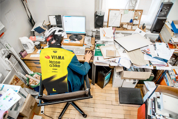
during this year's islay book festival, i met with a friend, whom i've scarcely been in touch recently, but who was promoted to a position of serious responsibility around eight months ago. though promoted within the same company, her previous position was one considerably different than the one in which she now finds herself. it was not, therefore, entirely out of character to ask how she was getting on in a job for which she is undoubtedly qualified. her immediate response was that she was eight months in, and still in the office. but she figured that, by-and-large, she was still flying by the seat of her pants (so to speak). i then enquired about another friend who took on the job my first friend had departed, a girl i've known for many, many years. the implication was that she too was juggling the spinning plates, and only just managing to keep them from falling.
i've been in my current job for just over six years, and i'm convinced that my colleagues and board of directors think i have a far better grasp of the situation than is actually the case. not entirely on purpose, i find myself approaching each day in a remarkably similar manner to my approach to jazz drumming.
i'm improvising all the time.
islay is, to put it bluntly, very far from being the hub of the musical universe. narrow that down to specific genres, and jazz scarcely has a look-in. i have mentioned on probably one too many occasions, that you could probably end a conversation in main street by bringing up either jazz or opera (incidentally, scottish opera will present hansel and gretel in the high school this coming october). though i listen to little other than jazz recordings on a daily basis, apart from a gig each year at the caol ila islay jazz festival, i have no other opportunity to play jazz. thus, when those jazz gigs come along, i am, to paraphrase my friend above, flying by the seat of my pants.
and to place that in perspective, i quite like things to be like that.
at 6pm on sunday 13 september, at the local gaelic centre, i will perform, along with others, a 90 minute concert, the set list for which is still a complete mystery. and simply to top things off, i am aware of only one other musician with whom i will perform, and she's a saxophone player i have never met before. the members of the band in which i play more frequently around the island (very definitely not jazz), would be horrified to find themselves dropped into such a situation without several hours of rehearsal. in the case of the upcoming jazz festival gig, i will be provided with around 45 minutes of practise, ensuring that the subsequent presentation will still be a surprise to both audience and performers alike.
think of it as the equaivalent of rapha's oft-repeated advice to "ride until you no longer recognise your surrounds."
however, it dawned on me that, if i, and my two good friends, think ourselves only tentatively in charge of the immediate future, is it possible that this is a state of affairs which applies to a great many more? to explore that possibility, i queried one or two others whom, i have always presumed, were more than in charge of their destinies. as it transpires, while a couple claimed to be very much in the driving seat, the majority had the same appreciation of immediate matters as do i. and the aforementioned friends. so do we think that might also be the case with professional bike riders? the sort of individuals who regularly find themselves at the head of the peloton?
while watching highlights of la vuelta only the other evening, i observed the commentators behaving as once did my father when watching football on tv, criticising the tactics of either an entire team, or simply one member of same. as mentioned only a few days past, members of the tnt sports commentary team are inclined to take substantial breaks throughout a commentating day, while those upon whom they commentate, are required to persist from the end of the neutralised zone, all the way to the finish line. yet, despite scarcely experiencing the accumulated fatigue of the pelotonese, they find it within their portfolio to point out where each might possibly be making the wrong choice(s).
perhaps it's simply a case of nerves that encourages tadej to accelerate off the front of the peloton some 48km from the end, or maybe wout acts as a super-domestique because he's overwhelmed by the day to day aspects of riding his cervelo? could it be that matthew brennan sprints to victory solely because he has accidentally found himself in front of a bunch of raging sprinters with no easy way out? granted, in the post-race interviews, we are usually advised that the lead-out was the chosen strategy of the day, but how do we know that's true? given this recent appraisal of our own apprehension of the daily grind, other than being a great deal faster, there is surely little difference between ourselves and our pelotonic heroes?
on day one of any grand tour, there can be up to 21 teams of nine riders on the start line; that's almost 190 individuals, all with specific aspirations, but possibly little chance of achieving them as a result of the inherent chaos engendered by a fast-moving, ever-changing peloton. is it not statistically possible that only a handful of that number are able to confidently plan their trajectory towards the finish line? professional bicycle riders might be a class apart, but for the most part, that concerns only their athletic abilities, and not necessarily their personal organisational skills.
i'll never watch the peloton in the same light ever again.
thursday 3 september 2026
..........................................................................................................................................................................................................the future?

you will perhaps be aware that my absence from the interwebs over the past few days was at the behest of islay book festival, events of which upon i was required to report for the local newspaper. in the process of doing so, i cycled approximately 90km; something of a bonus you will doubtless agree, but alongside the need to take notes in longhand over one hour for each event, made for a somewhat tiring weekend. however, not only did book festival attendance interrupt my bicycle scribblings, but on saturday at least, the daily episode of la vuelta.
those who have been following the spanish grand tour will easily equate that particular evening with the unfortunate exit from the event by its red-jerseyed leader, tadej pogacar. i did learn of this later that same evening during my frequent perusal of youtube videos, but was almost simultaneously appraised of the situation by an e-mail from tim dibden in australia, keen to point out that which we probably all knew was going to happen anyway. i am not regularly given to velocipedinal prognostications of a sporting flavour, mostly because i rarely consider myself top be particularly well-informed.
however, as tim rightly pointed out, i had stated, in pixels, following the opening two stages of the race, that the organisers might as well proceed directly to grenada and hand the trophy to the slovenian, as the following weeks were likely to prove remarkably predictable. of course, i hadn't considered the possibility of tadej suffering a race-ending crash, if only because he has seen a career rarely punctuated by debilitating accidents. if nothing else, this clearly outlines why yours truly should keep well away from cycle-related predictions.
however, having missed saturday's highlights altogether, the timing of my final book festival event on sunday afternoon, ensured that i was at home to watch stage nine, with its knee-breaking ascent to alto de aitana costa blanca. won by the race's heir apparent, enric mas, ending almost five years of a complete lack of stage victories in their home race, he was shadowed to the last few metres by scotland's oscar onley. but what we did see was what racing might be like, were jonas and tadej to take up indoor bowls or beach volleyball.
vingegaard succeeded in italy by a margin of more than five minutes over felix gall, a frenchman currently acquitting himself well in spain. come those three weeks in july, with no jonas to trouble him, after suffering his own race-departing crash, tadej stood atop the champs elysées podium ahead of remco evenepoel by over six minutes. gaps such as these after three weeks of racing obviously bolster the reputations of the dane and slovenian, as well as having a presumably similar effect on their respective salaries, but neither race did a great deal to improve the entertainment value of either.
granted, if you happen to be a fan of either gent, no doubt those winning margins following three weeks of derring-do are as succour to the less than downtrodden. but for those of us who prefer to embrace the whole enchilada, enjoying the frequent comparison between professional cycling and three-dimensional chess, it was twenty-one days of predictability, fostering considerations of switching off and doing something more interesting instead. i cannot deny that precisely that option had occurred following pogacar's victory by a tiny margin in the prologue time-trial. all he had to do, i contended, was follow the wheels ahead for the next few weeks, since the three brits behind him in the victory parade were hardly likely to challenge in the mountains.
i'm aware that so doing is hardly tadej's style, but since public entertainment rarely seems to be high on his strategy list, it would surely have proved the most pragmatic means of retaining the red jersey until grenada.
but, as echoed by tnt sports' apparently endless list of commentators (really, how many blokes does it take to commentate on one stage? most of us work at least seven hours a day, but i doubt any tnt commentator is challenged for much more than a couple of hours at a time), the racing we all witnessed on stage nine was a revelation, providing a clear insight as to the enjoyment to be garnered from a peloton far closer in abilities. i appreciate that it's hardly tadej's or jonas' fault that the competition does not rival their extraordinary abilities; it's not for them to regress, but the others to progress. but it's hard to deny that a gap of twelve seconds between first and third on a mountain stage is far more enjoyable to watch than a gap measured in minutes between first and second.
the next couple of weeks will either confirm or deny, but my ten pence is on the former.
tuesday 1 september 2026
..........................................................................................................................................................................................................
..........................................................................................................................................................................................................
 ..........................................................................................................................................................................................................
 ..........................................................................................................................................................................................................
as always, if you have any comments, please feel free to e-mail and thanks for reading.
..........................................................................................................................................................................................................
- bikeportland.org
- chris king precision components
- chris king cielo review
- courage bicycles
- dirty pictures - pdxcross
- epic wheelworks
- jordan hufnagel
- tony pereira
- sweetpea bicycles
- sacha white and vanilla bicycles
portland 2009
- scribbly bikes | taliah lempert
- cycling.tv interview
- interview with portland, oregon frame builder, ira ryan
- interview with scots cyclist shane charlton
- ben ingham interview
- pain and suffering in camden town - a visit to rapha
- a visit to cycling.tv
- paul mason of solo clothing interview
- interview with velo news illustrator brintoni
- cross interview with simon burney
- interview with trystan cobbett of rapha usa
- interview with anthony mccrossan of cycling.tv
- interview with jamie smith - author of roadie
- interview with chris distefano of chris king components
- interview with slate olson of rapha usa
- a visit to mosquito bikes, march 2008
- a visit to rapha, march 2008
- a visit to cycle fit, march 2008
- pasculli bicycles
- interview with eurosport commentator david harmon
- interview with 'roadie' illustrator, jef mallett
- interview with brian smith
- christine mclean interview
- robert millar interview
- ernesto colnago interview
- simon mottram interview
- cyclevox interview 2009
- sven thiele interview
- luke scheybeler (rapha) interview
- tour de ville
- richard sachs interview
- a visit to chris king components
- paul fournel interview
- justin spinelli - svelte cycles interview
- daisuke yano - rapha japan
- illustrator/animator richard mitchelson
- yanto barker interview
- a conversation with photographer jeff scher
- morecambe and mcwise at the end of 2009
- portland photographer dan sharp
- sacha white - vanilla cycles
- house industries' rich roat
- tweed run 2010
- cyclefit - macklin street, london
- kara ginther interview
- michael barry & camille mcmillan interview
- a trip on the jura fast ferry
- tim dawson's saddles
- the metamorphosis of velodramatic
- crouching tiger tours
- the rapha bicycle collection
- horizon fitness rt women's racing team
- dave seaman's bike shed
- rapha condor sharp
- introducing cervo rosso clothing
- interview with harth huffman
- interview with herbie sykes
- endura equipe racing team
- interview with bella bathurst
- what a size they are
- an interview with aszure's ashley brown
- michael robertson - velodramatic
- simon rose - pitch n sync
- interview with author mike carter
- craig hardie on cyclocross
- photographer anthony skorochod
- chris grove - performance race art
- rapha focus cyclocross team
- endura team training camp
- jon tiernan locke
- sugar wheelworks, portland, 2012
- chris king precision components 2012
- synaptic cycles bike rental
- craig middleton of onix bicycles
- derek mclay of wheelsmith
- 2012 scottish road race champion, james mccallum
- sweetpea farmers market
- craig ryan of foresta frames indiana
- louise mullagh of patisserie cyclisme
- illustrator andy arthur
- cycle artist james straffon
- sweetpea bikes carbon tactical boom boom
- some words with helen wyman
- glasgow's siempre bicycle cafe
- made in scotland
- jimmy mac's new jersey
- the thin blue stripe - rapha/team sky
- glasgow revolution track meeting february 2013
- designing chris hoy's bike range
- the artwork of artist david atkinson
- ira ryan and tony pereira's breadwinner cycles
- the artwork of peter english
- who the heck are jardine lloyd thompson?
- a conversation with illustrator rebecca kaye
- chris baird's miniature peloton
- a day in the rapha condor jlt team car at the 2013 nationals in glasgow
- team sky photographer scott mitchell's 2013 tour de france
- a word in your ear - matt barbet
- rapha usa's hillary benjamin
- richard sachs team re-design
- endura's move to the big time
- heather dawe's illustrated ride through yorkshire
- a visit to glasgow's pronto gara
- derek mclay's wheelsmith workshops
- rapha travel 2014 - an overview
- robert millar's 1984 kom peugeot bike
- taurus corinto city roadster
- an interview with rapha's simon mottram
- revolights city wheels
- rapha team sky wet bag
- the cycle art of mark howard jones
- san marco aspide carbon protek saddle
- endura roller case kit bag
- san marco aspide carbon protek saddle
- redant precision road bike maintenance
- a day at shand cycles
- the imperialists - a visit to rapha's new london home
- robert millar interview celebrating the 30th anniversary of his kom win
- chris hoy's new bike - shand cycles
- dan mather - for the love of print
- rapha condor jlt at the usa pro challenge 2014
- portland's gladys bikes
- yanto barker interview
- glory days vintage bike hire
- factory v handbuilt wheels
- sunderland's fausto coffee
- an evening with graeme obree
- andy mackie's testa della corsa italian and skye bike tours
- ste johnson's illustrated cards
- brian smith on mtn qhubeka's successes at the 2015 tour de france
- tom southam ds at drapac cycling
- a few words with kristian house
- an interview with rapha's simon mottram (2016)
- the illustrations of eliza southwood
- born in scotland, ridden worldwide
- james dow's chalet de aravis
- an interview with mick tarrant of prendas
- few words with ned boulting about the tour de france
- was this the greatest product launch ever?
- rapha's head of design, alex valdman
- a few words with tom ritchey
- an interview with maratona's simon carr
- pro rider cycling
- a cycling cafe on arran
- the man behind the book - a few words with peter cossins
- a few words with andrew meo of rocket espresso
- rowley's hand-painted custom cyclists
- london-paris: ten years after
- the drive-in; maserati and cycling
- having a cross to bear - richard sachs cyclocross 2017
- rich roat - an appreciation
- caren hartley: one half of isen bicycles
- helen wyman's happy new year
- books for the curious: bluetrain publishing
- xavier lopez and bike basque
- james mccallum's what's your meta
- if you think the spring classics are hard, try scotland
- london-paris: later that same century
- a few words with andy mackie of la corsa italian tours
- illustratively speaking - a quick conversation
- the artist as cyclist-nick higgins
- totally cyced - angus king
- words with isabel best and taz darling about queens of pain
- rapha's world tour education
- rapha's bespoke typefaces
- campagnolo's uk service operation
- 2019 etape loch ness
- a few words with emily chappell
- a few words with artist, oliver brookes
- an interview with kenny pryde
- busy doing nothing - a commentator's life in lockdown
- the cycling poster according to jackie swann
- dave arthur interview
- a few words with author hannah reynolds
- glasgow's pantani brothers ..........................................................................................................................................................................................................
- clothing review | assos airjack 851
- clothing review | assos airprotec bibtights
- clothing review | rapha performance roadwear
- clothing review: |rapha performance roadwear - merino training top
- peugeot cycle jersey
- giro d'italia zipped sweatshirt
- rapha winter cap
- rapha winter jersey
- rapha emergency gilet
- ardbeg winter jacket
- prendas giro d'italia wear
- rapha fixed jersey
- rapha winter tights & bib shorts
- obree, merckx & kelly t-shirts
- gist cycle jersey and shorts
- solo st neith clement sur lie jersey
- rapha limited edition gloves
- cafe de colombia jersey
- apres velo t-shirts
- solo equipe gilet
- prendas ciclismo neoprene overshoes
- campagnolo thermo textran jacket
- solo equipe long sleeve jersey
- prendas windtex stretch winter gloves
- earth wind and rider merino wool jersey
- post hebridean - lightweight softshell jacket, 3/4 bibs and long sleeve jersey
- prendas windtex stretch overshoes
- prendas meraklon oversocks
- rapha long sleeve merino baselayer
- the hebridean review - endura cycle clothing
- rapha condor recycling long sleeve team jersey
- wabi woolens merino jersey
- rapha condor recycling team stowaway
- campagnolo heritage jersey and windjacket
- rapha grand tour gloves and team cap
- how jerseys are made
- rapha gazzetta gilet
- polaris neo shirt
- bruichladdich distillery cycle jersey
- santini twist gel carbon shorts
- opsal sports screen printed organic cotton t-shirts
- endura fs260 pro pro-lites jersey, bib-shorts and socks
- rapha touring shorts
- lake cx400 custom fit shoes
- gage and desoto c-record t-shirt
- showers pass elite 2.0 jacket - part i
- panache lifestyle t-shirt
- rapha silk scarf
- showers pass elite 2.0 jacket - part ii
- rapha new fixed jersey
- rapha cyclocross jersey & bib threequarters
- adidas super pro classic road shoes
- rapha limited edition tweed softshell jacket
- solo maxwell cycles england jersey
- rapha softshell gilet
- rapha belgian kneewarmers
- welcome to great coffee jersey
- rapha winter jersey and winter cap
- endura stealth softshell jacket
- rapha leather town gloves
- endura deluge winter gloves
- endura xtract zip top
- dhb merston long sleeve jersey & rogate thermal bib tights
- rapha merino: fixed baselayer, winter socks & winter collar
- santini threequarter bibshorts
- a variety of buffs
- the crew room bamboo charcoal shirt/baselayer
- white men can't jump colnago cycle cap
- king of the mountain socks
- mavic zxellium | marresi leather road shoes
- walz tartan woollen winter cap
- rapha stowaway jacket 2009
- colomba tricolor long-sleeve jersey
- shutt long-sleeve drywool jersey
- solo luxury merino socks
- rapha tweed cap & race socks
- quoc pham fixed leather shoes
- endura fs260 bib-threequarters
- mavic altium jersey, bibshorts, helium gilet and race socks
- icebreaker merino baselayers
- endura baabaa merino tech jersey
- etxe ondo hilare bibshorts
- le col cycle jersey
- prendas summer mitts
- rapha pro-team mitts
- sue me bamboo/cotton t-shirt
- schlamm wetzikon training jacket
- rapha merino jersey
- rapha cyclocross jersey & bib threequarters
- rapha red softshell & rapha trousers
- rapha waxed cotton gentleman's cap
- prendas new generation long-fingered gloves
- rapha rainjacket and overshoes
- endura dexter windproof gloves and merino socks
- endura baabaa merino flat cap
- rapha long sleeve jersey and merino winter collar
- prendas thermolite and thermocool socks
- rapha bomber jacket
- dhb southsea waterproof jacket
- rapha winter tights & merino hat
- endura baabaa merino armwarmers
- embrocation cycling journal race socks
- le col winter jacket and winter bib tights
- solo possum fur and merino beanie
- le col long sleeve jersey
- dromarti le grande cognac crochet mitts
- river city bicycles merino jersey
- craft elite windstopper l/s jersey & crew neck wool/polyester baselayer
- le col long-sleeve angora wool baselayer
- apolis/rapha transit elite sweater feature
- swobo merino long-sleeve jersey
- galstudio ventoux tweed cap
- rapha pink stowaway
- apolis/rapha transit elite sweater
- icebreaker merino cycling socks
- rapha merino polo shirt
- rapha merino v-neck baselayer
- hincapie sportswear tour lt jacket
- rapha team kit
- rapha womens jersey
- dromarti storica leather shoes
- rapha long-sleeve shirt and merino boxer shorts
- rapha women's stowaway jacket
- derny merino long-sleeve polo shirt, city shorts, & merino socks
- suplest carbon street racing shoes
- ana nichoola curve jacket
- le col mariana s/s jersey and bibshorts
- rapha tweed run merino socks
- swrve clothing
- muxu spanish clothing
- prendas compression socks
- derny city shirt
- rapha workshop apron
- dromarti black and red leather shoes
- rapha long-sleeve polo shirt
- santini unisex slice shorts
- rapha oversocks
- rapha cyclocross jersey & 3/4 bibs
- missionworks dzr rondel shoes
- rapha breton sweater
- rapha + paul smith rainjacket
- rapha ladies softshell and threequarter bib shorts
- rapha softshell trousers
- wabi woolens sports series merino jersey
- rapha track top
- dhb windslam softshell, super-roubaix winter tights, s'cafe aerofit baselayer
- endura equipe exoshell jacket, gloves and overshoes
- rapha softshell winter gloves
- dromarti sportivo leather spd shoes
- dromarti corio long-finger leather gloves
- dromarti gara rosso leather mitts
- outlier four season og pants
- rapha pro team jersey and shorts
- colnago winter jacket and bib tights
- rapha + paul smith windshirt
- rapha enfer du nord armwarmers
- cielo jersey
- cervo rosso national pride jersey and mk2 bibshorts
- cervo rosso merino jersey
- quoc pham leather tourer shoes
- shaun deller cycle cap
- cinelli t-shirt
- rapha jeans
- dhb aeron shorts and race socks
- rapha ladies jersey and gilet
- road holland den haag jersey
- rapha brevet jersey
- renner sport gilet and armwarmers
- hultra hi visibility s/s jersey
- endura team replica kit
- endura uber bibshorts
- velobici merino cardigan
- endura pak a jak showerproof jacket
- velobici merino armwarmers
- rapha cyclocross pro-team bibshorts
- rapha cyclocross pro-team jersey
- santini metis breezeflow jacket
- armwarmers, oversocks & coolmax socks
- rapha city riding socks
- rapha merino roll neck jumper
- hultra ventoux windproff softshell
- cervo rosso intermedio jacket and winter bibshorts
- endura equipe cashmere socks
- endura equipe bib-knickers
- madison stellar ii waterproof jacket
- cervo rosso armwarmers and legwarmers
- velobici ride 't'
- prendas air tunnel gloves and overshoes
- bbb mistralshield windproof jacket
- capo padrone thermal jacket
- cafe du cycliste yolande long sleeve jersey
- vulpine clothing's nick hussey, softshell jacket and merino jersey
- dromarti la grande 2 mitt
- rapha sleeveless pro team base layer
- craft active rain jacket
- vulpine epic cotton rain jacket
- rapha grand tour shoes
- de feet yellow wool gloves
- mavic hc h2o waterproof jacket
- solo retro tec jersey and armwarmers
- rapha lightweight sportwool jersey
- cervo rosso strada doppio 2.0 jacket
- rapha classic bibshorts
- rapha etape act two jersey 2012
- showers pass double century ex waterproof jacket
- endura urban range polo shirt, stretch trousers and argyle socks
- velobici van dapper road jersey and shorts
- vulpine merino polo shirt
- cervo rosso corsa s3 jersey
- showers pass skyline softshell jacket
- endura bowmore single malt s/s cycle jersey
- rapha hardshell waterproof jacket
- prendas winter hat
- vulpine long sleeve t-shirt
- le col b3 winter jacket and bibtights
- carbonaut breakaway jersey
- vulpine long-sleeve polo shirt
- vulpine lightweight harrington jacket and tailored trousers
- glacier cyclocross gloves
- prendas primaloft winter socks
- solo winter jacket, merino baselayer and merino collar
- prendas cordura oversocks
- cervo rosso ibrido jacket
- route clothing t-shirts
- cafe du cycliste, marie josette s/s jersey
- rapha team sky winter cap
- rapha s/s trade team jersey
- this is...cambridge merino cap
- prendas leisure jacket
- rapha bordeaux-paris jersey
- castelli gabba jersey & nano-flex armwarmers
- castelli gabba jersey & nano-flex armwarmers when wet
- solo kilmory jersey
- vulpine merino alpine jersey
- vulpine button merino jersey
- cafe du cycliste henriette s/s jersey
- rapha/raeburn windjacket
- cafe du cycliste cotton cycling cap
- rapha teamsky kids' wiggo jersey
- condor extreme polka dot socks
- rapha transfer trousers
- dmt marathon 2.0 offroad shoes
- cafe du cycliste loulou armwarmers
- prendas super-roubaix gloves
- aldi l/s winter jersey
- endura adrenaline race cape
- fred perry bradley wiggins range track jacket & merino sweater
- endura jetstream l/s jersey
- endura equipe exo waterproof gloves
- vulpine epic cotton raintrousers
- prendas aquatex overshoes
- showerspass outdry waterproof gloves
- castelli nan-flex bibknickers
- this is cambridge blood, sweat & gears cap
- rapha merino mesh l/s baselayer
- solo 3/4 thermal bibshorts
- rapha winter glove system
- shutt winter performance jacket
- rapha winter socks 2013
- endura luminite waterproof jacket
- rapha city riding merino gilet
- look mum no hands podium boxer shorts
- rapha transfer jacket
- shutt vr ltd edition tweed cap
- look mum no hands headwear
- cafe du cycliste heidi jacket
- showers pass crosspoint windgloves
- claret vulpine softshell gilet
- hackney gt alpine green long sleeve cycle jacket
- kora shola yakswool l/s baselayer
- this is cambridge urban sprinter cap
- showers pass crosspoint waterproof socks
- rapha & raeburn l/s henley and quilted jacket
- meccanica off-bike clothing
- vulpine/oliver spencer blazer
- rapha trade team jerseys
- endura movistar replica team kit
- tribesports gent's cycle jersey
- showers pass elite pro jacket
- endura movistar team replica l/s jersey
- stolen goat ltd ed. fausto coppi t-shirt
- lecol pro s/s jersey and bibshorts
- bits and bobs from prendas ciclismo
- rapha lapelled jacket and s/s polo shirt
- proviz nightrider jacket and waterproof trousers
- rapha commemorative pantani jersey
- tic panache fluoro dots cycling cap
- cafe du cycliste antoinette bibshorts and baselayer
- ardbeg's new retro jersey
- rapha king of pain jersey
- this is cambridge sunflower tdf cap
- santini peugeot retro bibshorts
- rapha climbers jersey
- endura equipe infiniti bibshorts and helios comp jersey
- vulpine ultralight quilted thermal jacket
- proviz reflect360 waterproof jacket
- vulpine dogtooth merino silk socks
- rapha deep winter hat
- rapha long pro team socks and merino stripe socks
- this is cambridge grimpeur cap
- rapha reversible city riding jacket
- rapha crew neck merino t-shirt
- cucu barcelona s/s jersey
- prendas ciclismo leisure polo shirt
- rapha pro team bibtights with pad
- endura stealth-lite 2 waterproof bib-tights
- le col rain jacket
- hackney gt alpine bobble hat
- showers pass skyline winter cap
- rapha city range merino button shirt
- isadore merino gloves
- castelli alpha jacket
- this is cambridge omloop winter cap
- showers pass bodymapped baselayer
- mavic cosmic wind jacket
- velobici merino ribbed collar and white tip merino gloves
- rapha pro team softshell
- cervo rosso strada 2.0 l/s jersey
- portland design works 'cross beanie
- prendas de vlaeminck t-shirt
- hoy vulpine jersey and shorts
- rapha softshell baselayer
- rapha data print pro-team jersey
- ashmei softshell jacket
- ashmei merino/carbon s/s jersey
- rapha 2015 trade team jerseys
- vulpine gill waterproof jacket
- endura classics jersey
- café du cycliste louise s/s jersey
- rapha cima coppi s/s jersey, essentials case and cap
- house industries merino vélo jersey
- this is cambridge tom s/s jersey cap and socks
- milltag top bonk schleppers jersey and cap
- showers pass torch socks
- fat lad at the back lanterne rouge l/s jersey
- this is cambridge panache confortare cap
- wonderful socks
- ashmei bibshorts
- santini team z s/s jersey & bibshorts
- the athletic socks, jersey and cap
- prendas super roubaix fluoro gloves
- prendas aqua light fluoro overshoes
- le col hc s/s jersey
- rapha tom simpson jersey and cap
- prendas santini peugeot mashup t-shirt
- rapha long-sleeve club jersey
- showers pass cascade track pants
- rapha thermal classic bibshorts
- vulpine thermal gilet
- rapha cyclocross l/s jersey, cap and socks
- aldi l/s jersey, tights and socks
- showers pass bamboo/merino henley sport
- rapha lombardia l/s jersey and socks
- this is cambridge 1-in-7 cap
- rapha pro team gloves
- aldi l/s merino baselayer
- hoy vulpine winter bib tights
- proviz pixelite softshell race jacket
- rapha loopback trousers
- rapha cotton twill city riding trousers
- prendas aqualight gloves
- showers pass little crossover kids' rainjacket
- endura freezing point overshoes
- red dots scottish winter cycling cap
- svelte clothing s/s jersey and classic bibshorts
- this is cambridge waxed cotton cycling cap
- cafe du cycliste charlotte softshell jacket, jeanna rain bibshorts and lolou legwarmers
- mavic ksyrium pro thermo kit
- vulpine softshell gloves
- this is cambridge pink omloop winter cap
- rivelo winnats bibtights, langcliffe waterproof jacket and symonds winter gloves
- svelte long-sleeve heritage jersey
- rapha merino winter collar
- rapha pro team softshell 2015
- showers pass spring classics waterproof jacket
- rapha shadow jersey and bibshorts
- endura fs260-pro sl thermal windproof jacket
- rapha core s/s jersey & bibshorts
- rapha brevet thermal gilet
- rapha classic jersey ii
- velobici continental l/s jersey
- rapha brevet bibshorts
- svelte l/s merino baselayer
- osloh crank trousers
- rapha city riding wool jacket
- rapha brevet windblock jersey
- castelli perfetto s/s weatherproof jersey
- la passione bibshorts, legwarmers and l/s winter jersey
- snek winter cap
- lumo herne hill harrington jacket
- john smedley merino jig sweater and merino hugh sweater
- rapha 'rivals' merino cycle jersey
- galibier velo ultimate foul weather gilet
- rivelo s/s peaslake jersey and homister bibshorts
- la passione pdp summer jersey
- prendas ciclismo 20th anniversary s/s jersey
- this is cambridge hors categorie s/s cycle jersey, socks & cap
- rapha pro team windjacket
- hilltrek greenspot double ventile jacket
- magliamo merino wool molteni l/s jersey
- rapha shadow armwarmers + kneewarmers
- n+1 cycling t-shirts
- rapha core l/s team wiggins jersey
- showers pass club shoe covers
- vulpine urban cycling jeans & merino boxers
- rapha cyclocross long-sleeve jersey
- rapha mips helmet
- shutt vuelta winter jacket
- rapha merino stand collar windproof jersey
- this is cambridge s/s baselayer
- hilltrek greenspot double ventile jacket - getting it wet
- endura pro sl bibtights
- rapha commemorative peace race jersey and game
- cafe du cycliste lucette gilet
- specialized deflect reflect hybrid jacket
- rapha classic winter jacket
- cafe du cycliste mid-season gloves
- wabi woolens winter weight jersey
- rapha shadow long-sleeve jersey
- rapha festive 500 jersey and core range waterproof jacket
- dexshell biking socks
- rapha brevet thermal jacket
- dexshell thermfit neo gloves
- maratona classics jersey
- rapha classic bibshorts ii
- endura pro sl bibs ii
- rapha shadow blazer
- showers pass atlas reflective jacket
- rapha pro team bibshorts ii
- rouleur + velominati rule#5 s/s jersey, bibshorts, socks and t-shirt
- rapha packable backpack
- louison bobet softshell gloves
- louison bobet bibshorts, long-sleeve and short-sleeve jerseys
- t-labs stelvio t-shirt
- rapha fausto coppi merino jersey
- velobici premgripp and merino socks
- rapha pro-team lightweight gilet
- louison bobet porticcio 69 merino pullover and letouquet74 merino cardigan
- cafe du cycliste boubou collection zahira diamant s/s jersey
- rapha classic crochet mitts
- rapha lines pro team flyweight jersey
- shutt vr custom jersey and pro bibshorts
- arrivee intermediate l/s jersey
- hilltrek greenspot single ventile lightweight jacket
- snek merino armwarmers and lightwieght merino cycling cap
- rocket espresso s/s jersey and bibshorts
- endura movistar team issue gilet and l/s jersey
- this is cambridge men's bibshorts
- rapha colombia kom s/s sportwool jersey
- new ardbeg celtic cycle jersey
- assos r.s. sturmprinz evo waterproof jacket
- this is cambridge a bloc long-sleeve jersey and socks
- hilltrek greenspot single ventile jacket - getting it wet
- snek merino kneewarmers
- rapha ultramarine pro team softshell
- endura pro sl thermal jacket
- rapha city riding range insulated sweatshirt
- endura pro sl thermal jacket
- assos habutightsmille thermal bibtights
- rapha pro team thermal l/s baselayer
- rapha classic rainjacket ii
- giessegi redoute winter bibtights
- t-labs road riding t-shirt
- rapha pro-team insulated jacket
- rapha quarter zip reflective knit jersey
- showerspass trailhead merino/bamboo hooded sweatshirt
- pedal ed nachi waterproof jacket
- pedal ed essential jersey and team winter bibtights
- assos mille gt spring/autumn l/s jersey
- pedal ed kaido l/s merino jersey
- rapha check windjacket
- q36.5 hybrid que l/s jersey, s/s baselayer, wolf bibshorts and merino socks
- assos t-equipe evo bibshorts
- rouleur cycle clothing collection
- this is cambridge omloop l/s jersey, mesh baselayer, thermal bibshortsm kneewarmers and socks.
- rapha transfer hoodie.
- endura long-sleeve movistar team jersey
- rapha limited edition gavia collection
- haramaki - japanese body warmer
- hommage au velo bahamontes lightweight climbing jersey
- prendas/santini bordeaux-paris jersey & cap
- hilltrek hebridean ventile gilet
- dexshell ultralight waterproof socks
- endura fs260 adrenaline cape and threequarter shorts
- rapha explore range, insulated goose-down jacket
- assos mille gt hashoogi winter jacket
- prendas/santini peugeot bp inverted long-sleeve jersey
- rapha classic bibtights
- rapha milano-roma collection
- rapha tweed softshell
- prendas pro rain overshoes
- showers pass crosspoint waterproof gloves
- campagnolo c-tech winter jacket
- frahm utility field jacket
- velobici rene l/s jersey
- velobici rene thermal bibshorts
- ashmei bibshorts
- this is cambridge omloop rain/windcape
- assos equipe rs bibshorts
- endura apparel cleaner and re-proofer
- rapha core range cargo bibshorts
- endura humvee shacket
- prendas cordura oversocks
- this is cambridge omloop rain/wind gilet
- santini/prendas greg lemond l/s agrigel/adr/bottechia jersey
- prendas lisboa rain cycling cap
- rapha pro-team lightweight shadow jacket
- rapha explore winter cargo bibtights
- café du cycliste petra gilet
- rapha + gore-tex explore hooded pullover
- prendas primaloft cupron socks and winter thermolite socks
- endura pro sl primaloft jacket ii
- albion cycle clothing rain jacket
- rapha pro team insulated gore-tex jacket
- prendas/santini vetements z l/s jersey
- rapha+gore-tex explore hooded pullover
- rapha pro-team road shoes
- rapha pro-team training jersey 7 pro-team training bib shorts
- robert millar/pippa york t-shirt
- endura pro sl bibshortst
- rapha special edition belgian country jersey
- prendas ciclismo - omloop van vlaanderen
- vulpine long and short-sleeve polo shirts
- btr waterproof hi-viz waterproof jacket
- endura hummvee chino shorts with liner
- pearson cycles greg coulton illustrates s/s baselayer
- ashmei breton jersey and cycle bib shorts
- this is cambridge yellow tour socks
- prendas/santini watneys red barrel s/s jersey and cap
- ritchey cycling socks
- dexshell lightweight overshoes
- craft fuseknit s/s baselayer
- rapha core long-sleeve jersey
- prendas omloop van vlaanderen sleeves baselayer
- rapha classic winter gore-tex jacket
- rapha pro team bibshorts ii
- rapha sonic collection
- velobici cobalto thermal jersey and thermal bibshorts
- prendas shell peugeot cap
- endura urban luminite 3 in 1 jacket ii
- prendas/santini peugeot shell michelin s/s jersey
- endura xtract roubaix l/s jersey
- rapha long-sleeve calssic jersey ii
- le col hors categorie bibshorts ii
- vulpine merino alpine l/s jersey
- prendas super roubaix deluxe gloves
- sole active thin insole
- endura custom kit pro sl l/s jersey
- rapha explore lightweight jacket
- rapha gs imperial sportwool s/s club jersey, bibshorts and cap
- tic-cc hc short-sleeve jersey
- vulpine organic cotton tee
- vulpine omnia cycling jeans
- endura fs260 thermo bibknickers
- endura pro-sl three-season jacket
- quoc pham mono ii road shoes
- souke sports l/s jersey, bibtights and thermal jacket
- endura freezing point ii overshoes
- endura mt500 burner clipless offroad shoes
- endura gv500 reiver s/s jersey and bibshorts
- showers pass basecamp merino hoodie
- endura gv500 waterproof jacket
- rapha brevet s/s jersey
- rapha brevet gore-tex paclite plus jacket
- vulpine ultralight quilted gilet
- vulpine men's merino v-lux neck sweatshirt
- quoc weekend sneaker - part one
- quoc weekend sneaker - part two
- rapha powerweave bibshorts
- rapha trailwear technical t-shirt
- rapha trailwear gore-tex infinium jacket
- endura pro sl waterproof shell jacket
- rapha pro team training bibtights
- soukesports graphene l/s fleece jersey, lightweight windproof gilet, winter bibtights and padded winter gloves
- rapha men's trail merino long-sleeve t-shirt
- rapha men's explore gore-tex jacket
- showers pass cloudburst hoodie
- megmeister drynamo l/s baselayer
- souke cargo bibshorts
- uncle pete's handmade casquettes
- rssc sports s/s cycling jersey and bibshorts
- equipment review: | carbonsports lightweight wheels
- equipment review: |fi'zi:k pave saddle
- equipment review: |handlebar camera mount
- thewashingmachinepost colnago c40hp review
- the bicycle as art | taliah lempert
- tour of britain start 2006
- 2006 braveheart ride
- schwalbe ultremo tyres
- ortlieb sling-it
- catlike whisper and kompact pro helmets
- on-one il pompino fixed wheel
- colnago clx
- science in sport nocte
- srm power crank from cylepowermeters.com
- fsa ceramic bearing jockey wheels
- lightweight ventoux carbon wheels
- colnago c50 2007
- fibre-lyte carbon chainrings
- vittoria 30th anniversary shoes + vista pedals
- fulcrum racing one wheels
- eddy merckx chm carbon + wheelsbike 2000s
- fibre-lyte carbon jockey wheels
- rapha fixed backpack
- mavic r-sys carbon spoked wheels
- oval concepts r700 stem and r710 classic bars
- muc-off optix lens cleaner
- brooks swallow leather saddle
- lumie bodyclock light
- ride of the falling rain 2008
- pro-lite piemonte cyclo-cross frame
- ultimate pro-ultralight bicycle repair stand
- rebecca charlton's review: alan a-matrix
- effetto mariposa giustaforza torque wrench
- fsa k-force carbon compact handlebars & os-99 stem
- rapha musette
- chris king classic cross wheelset
- eddy merckx racing alloy
- nokia n82 gps phone & sportstracker software
- independent fabrication featherlight
- garmin edge 705 gps unit
- sportique active body products
- sportique body soap
- sportique century riding cream & deodorants
- fixie inc. betty leeds steel race bike
- bonk breaker energy bars sportique warming up cream and cooling cream
- sportique massage oils
- vittoria revo kxs twin tread tyres
- nokon gear and brake cable sets
- knog gator front light
- chain-l no.5 - huile de chaine
- museeuw mf5 carbon/flax frame
- brompton p-type folding bicycle
- schwalbe ultremo 'r' road tyres
- alchemy goods courier bag
- mule bars
- carbonsports lightweight rd
- trp r960 caliper brakes
- colnago cx-1
- singular peregrine
- independent fabrication club racer fixed gear
- flip ultra video camera and sport mount
- miniature cyclists
- mavic race sl ti pedals
- focus variado expert
- cyclepowermeters powertap rear wheel
- chris king cielo review
- mavic cosmic carbone slr
- shimano di2 review
- fsa sl-k pro carbon compact chainset
- zero g titanium brake calipers
- muvi micro digital video camera
- colnago clx centaur
- squirt dry lube
- crud roadracers mudguards
- bikefood
- hides
- 2010 colnago ace
- muc-off cleaners and dry lube
- ta specialites 42 campag replacement chainring
- reynolds assault carbon clincher wheels
- cyclo tools workshop tyre lever
- bike box alan
- garmin edge 500 gps
- chris king cielo - the story begins
- a graze box of healthy snacks
- sleepathlete pro-sound pillow
- park tools frame fit pump
- full wood fenders
- two'n'fro claqs
- bikefood carbo powder and munchie bars
- dromarti strada lugged steel frame
- a2z components campagnolo single speed convertor
- 9bar energy bars
- iphone/ipod bike doctor app
- crud roadracers mark two
- lazer helium helmet
- 2011 campagnolo centaur ergopower levers
- the legacy of john boultbee brooks part 3 - colt saddle
- van nicholas titanium skewers
- purple harry's bike cleaning products
- mavic k10 wheel/tyre system
- motorex lubricants and sprays
- sram red groupset
- clif choc chip bar and shotblok
- rapha skincare range
- purple harry's bike cleaning range
- ibis hakkalugi cyclocross bike
- high five zero tabs and 4:1 carb/protein powder
- moonlights rechargeable lights
- edge16 magnetic bottle 'cage'
- crank brothers eggbeater and candy pedals
- respro hump waterproof backpack cover
- pedros workshop vise whip
- andystand
- zimbale leather saddle and saddlebag
- lezyne floor drive track pump
- continental speed king cyclocross tyres & chris king cyclocross wheels
- bbb microboard computer
- demploi canvas belt bag
- aszure team issue carbon bike
- traitor luggernaut three-speed
- vittoria open pave cg tyres
- rapha tour de france cd
- enve 25 carbon sprint wheels
- mavic r-sys slr exalith wheels
- san marco mantra saddle
- cole c24 lite wheels
- trp 970sl brake calipers
- milani acciaio puro columbus xcr road bike
- trion-z magnetic therapy bracelet
- trp eurox magnesium cantilievers
- giro aeon helmet
- rapha seat pack
- bbb digiboard cycle computer
- colnago world cup 2.0 cyclocross bike
- garmin 200 gps cycle computer
- vittoria diamante pro radiale clinchers
- swift little dear bar-bag/saddle bag
- mavic plasma slr helmet
- ibis hakkalugi black lung
- nightrider lights
- beloved every day bicycle
- rapha race bag
- purple harry sanitising spray
- rapha summer embrocation
- shand cycles stoater
- sugar wheelworks ghisallo wooden rimmed wheels pt.1
- sugar wheelworks ghisallo wooden rimmed wheels pt.2
- colnago clx 3.0 di2
- ventoux event bag
- sugar wheelworks/chris king r45 ceramic wheelset
- nuun hydration tablets
- wheelsmith race23 wheels
- wheelsmith race23 wheels part two
- green oil white dry wax lubricant
- shand cycles skinnymalinky
- green oil eco bucket
- bike parka
- nilox 'foolish' hd action video camera
- condor bivio x cyclocross bike
- trakke mule waxed cotton messenger bag
- lezyne mega-drive headlight
- rapha post shave lotion
- morgan blue soft chamois cream
- morgan blue bike wash and polish
- morgan blue warming oil
- morgan blue chain cleaner and race oil
- kask vertigo helmet
- colnago c59 disc
- endura airshell helmet
- bakewell soap co. deep muscle relief rub
- dz nuts inheat embrocation
- rx sport prescription rudy project exowind cycling glasses
- dz nuts inheat embrocation
- portland design works bird cage
- purple harry travel pack
- ism adamo attack saddle
- purple harry wet lube
- rapha liveried pinarello dogma k
- festina tour of britain edition chronograph
- portland design works 3wrencho
- c originals sv888 helmet
- trek domane 5.9
- >colnago acr
- giro air-attack helmet
- gu energy slated caramel gel
- ursa major three musketeer traveler shaving kit
- rolf prima ares 4 carbon wheels
- protecht surface coatings
- fsa k-force cantilever brakes
- dz nuts bald shaving cream
- matrix waxy maize and scottish oats carb powder
- rolf prima vigor alpha wheels
- portland design works alexander graham bell
- ventoux gym bag
- silicon tidds
- wheelsmith race 24 wheels part 1
- 2013 cervelo r3
- unich mini-pump
- aerozine titanium wheel skewers
- mavic zxellium road pedals
- pdw aether demon tail light
- loksak mobile phone case
- a set of rouleur goodies including mark cavendish model
- wheelsmith race 24 wheels in 'cross mode
- axiom annihilateair track pump
- brooks cambium c17 saddle
- bridge street saddlebag
- green oil eco sponge
- ritchey torque key
- salsa celtica - the tall islands
- biologic pango folding helmet
- cervo rosso softshell case
- dmt vega road shoes
- poc octal road helmet
- shand cycles phat stoater
- bike repair app
- osmo hydration products
- multipower energy bars
- sugru flexible silicon rubber
- purple harry super sponge
- cielo racer stem
- kali phenom helmet
- bryton 20+ cycle gps
- secret training products
- ventoux training camp bag
- portland design works ninja pump
- honey stinger organic chews
- challenge limus cyclocross tyres
- fast forward f6 carbon clincher wheels
- brainy bike lights
- 24 bottles stainless steel water bottle and porta bottiglia
- purple harry rider care range
- shand rohloff stoater
- frog 55 hybrid kids' bike
- brooks brick lane panniers
- bellroy waterproof leather travel wallet
- green clean bike cleaner
- crunchy peanut butter clif bars
- chapeau cyclist's coffee
- anamaya meditation iphone app
- rapha cyclocross shoes
- look mum no hands stainless steel hip flask and cage
- rapha climbers shoes
- bodyglide products
- pedros yellow tyre levers
- mavic cxr helmet
- bar fly garmin handlebar mount
- cycling stars trump card game
- brooks cambium c15 saddle
- pedros synlube
- colnago c60
- pedros green fizz bike cleaner
- portland design works lars rover front light
- feedback sports velo hinge
- feedback sports velo hinge
- massif central tdf poster
- nixfrixshun chain lube
- richard mitchelson's cycling wallpaper
- manual for speed 2015
- the king of scotland's ibis hakkalugi disc
- tesco outdoor clothing wash and spray proofer
- clement las cyclocross clincher tyres
- pedros chain pig
- challenge gravel grinder 38mm 'cross tyres
- cherryactive concentrated montmorency cherry juice
- fox cycling online cycle training
- giro empire road shoes
- muc off hydro dynamic chain lube
- cyclops magnetic turbo trainer
- dromarti classic leather road shoes
- tern verge x-18 folding bicycle
- wheelsmith aero 38 wheelset
- sunwise hastings cycling glasses
- wheelsmith aero 38 wheelset part ii
- rapha/bang & olufsen h6 headphones
- flexiseq joint lubrication therapy
- muc off fabric protect
- brooks cambium c15 carved saddle
- mavic cxr ultimate road shoe
- frog bikes tadpole balance bike
- rapha sunglasses
- rapha rucksack
- giro vr90 offroad shoes
- colnago clx 2015
- portland design works owl cage
- vel components multi-tool with co2 adaptor
- ritchey classic series bars, stem, seatpost and saddle
- aldi bikemate bicycle toolkit
- withings activité pop watch
- selle san marco regal saddle
- led lenser b5r front light and b2r rear
- clement crusade pdx cyclocross tyres
- wickens & soderstrom bike cleaner
- bicycling magazine's emoji keyboard
- crank brothers candy 7 pedals
- muc off luxury chamois cream
- wheelsmith aero disc wheelset
- ridley x-ride 20 cyclocross bike
- break fluid blended ground coffee
- quoc pham hardcourt shoes
- crank brothers quattro cleat adaptor
- brooks carbon rail cambium c13 saddle
- crank brothers candy 7 pedal update
- ridley x-ride 20 update review
- specialized recon mixed terrain shoes
- specialized prevail road helmet
- axiom blastair mini pump
- specialized crux e5 x1 cyclocross bicycle
- cycliq fly6 rear light and hd video camera
- challenge baby limus cyclocross tyres
- crank brothers candy #7 pedals final review
- challenge strada bianca 700x33c road tyres
- green oil eco grease in a tube
- ortlieb6 plus, handlebar bag and seatpost-bag
- specialized awol elite adventure bike
- rapha + apidura bike packs
- portland design works bindle rack
- flexiseq active joint lubrication
- selle royal ta+too interchangeable saddle
- unior 1655fh multi-tool
- wd40 bicycle products
- unior tyre levers
- showers pass utility backpack
- lizard skins clear frame protection kit
- specialized crux elite cyclocross bike
- installing a campagnolo groupset
- campagnolo potenza groupset: the prologue
- lizard skins camouflage 2.5mm bar tape
- campagnolo potenza groupset: going for a ride
- specialized turbo cotton clinchers
- four months on a specialized crux elite
- wickens and soderstrom no.3 drivetrain lube
- wickens and soderstrom no.6 bike polish
- ritchey wcs xc clipless pedals
- restrap camouflage musette bag
- ritchey barkeeper levers
- campagnolo potenza; how's it doing?
- 100 climbs mobile app
- rearviz armband mirror
- six months on a specialized crux elite
- specialized sequoia elite
- ortlieb bikepacking bar pack and seatpack
- plan bee anti-chafe and embrocation
- schwalbe one pro tubeless tyres and wheelsmith ascent tubeless wheelset
- laura zabo's upcycled road tyre belts
- schwalbe one pro tubeless tyres and wheelsmith ascent tubeless wheelset part 2
- quoc pham 'night' road shoe
- specialized roubaix comp
- on the rivet chamois cream
- schwalbe one pro tubeless tyres and wheelsmith ascent tubeless wheelset part 3
- limar ultralight+ helmet
- rawvelo energy bars
- feedback sports bike tools
- more than a couple of weeks on a specialized roubaix comp
- veloeye bicycle theft protection
- ride skincare sunscreen and recovery moisturiser
- green oil spray lube
- campagnolo sarto carbon road bike
- hexlox anti-theft system
- chrome industries cardiel orp backpack
- fairbairn fabrication fangs
- chrome industries cinelli barrage cargo backpack
- sven cycles pathfinder light
- brooks weatherproof cambium c17 saddle
- chamois butt'r original and eurostyle
- wheelsmith pave wheelset
- campagnolo chorus groupset part one
- mavic yksion tubeless 28mm tyres
- campagnolo chorus groupset part two
- ritchey logic frameset
- neil pryde bura part two
- portland design works gravity tail light
- portland design works daybot tail light
- bicycle maintenance guide app for ios
- giro empire vr70 knit offroad shoes
- rapha classic saddle
- specialized turbo vado electric bicycle
- endura pro sl road helmet
- compass 700 x 28c chinook pass tyres
- brooks pickwick cotton backpack
- chinook pass tyres part two
- specialized turbo vado 2.0 - the real review
- crankalicious science friction chain lube
- ritchey micro road pedals
- rapha for apple macbook 13" sleeve
- coloral stainless steel water bottle
- campagnolo record twelve-speed bike build
- crankalicious pineapple spray was and frame sealant
- campagnolo record twelve-speed
- fassa bicycle protection
- rapha waterproof top tube pack and small seat pack
- campagnolo record twelve-speed
- specialized allez sprint comp disc
- ashmei domestique gin
- ritchey wcs ergomax alloy handlebar, wcs c220 84d stem and wcs pavé bar tape.
- goodyear eagle tubeles 700 x 30c tyres.
- specialized turbo tubeless tyres 700x28c.
- rapha explore shoes.
- specialized roval 64mm tubeless-ready disc compatible carbon wheels.
- ritchey classic zeta wheelset.
- specialized allez sprint comp disc, long-term review.
- brooks cambium organic light saddle.
- chater-lea grand tour pedals.
- ritchey chicane stem.
- rapha roll top backpack.
- zilfer cycling/activity wallet.
- rene herse hurricane ridge 700x42 gravel tyres.
- campagnolo bora wto carbon wheelset.
- limar air-pro and air master helmets.
- donnelly strada lgg 700x28c road tyres.
- basso diamante road bike-disc version.
- showers pass rainslinger waterproof hip pack.
- revolube bicycle chain lubricant.
- chater lea grand tour pedals - the story so far.
- campagnolo bora on and bora wto wheelsets.
- see.sense ace light set.
- revolube - part two.
- donnelly strada lgg 28mm road tyres
- basso diamante - part two
- clug bicycle storage solution
- revolube: the story so far
- bicycle quickguard
- ritchey echelon road pedals
- ritchey echelon road pedals - update
- btr waterproof saddle wedge
- kinesis jo burt signature bar tape
- btr waterproof bar bag
- bend 36 chamois cream
- kool-stop tyre bead jack
- rene herse steilacoom gravel tyres
- pirelli cycle-e wt winter tyres
- pirelli cycle-e wt winter tyres part two
- essence outdoors epicon glasses
- shapeheart smartphone handlebar mount
- mystery ranch hip monkey + in-and-out 19
- rene herse chinook pass road tyres
- jack the rack
- ritchey single-bolt carbon seatpost
- tyre glider
- hutchinson tundra 700 x40c gravel tyres
- hutchinson tundra 700 x40c gravel tyres part two
- green oil chain degreaser and dry chain wax
- green oil agent apple extreme degreaser
- condor cycles handbuilt wheelset
- squirt lube long lasting and low temperature versions
- green oil eco spray lube
- green oil bike armour
- challenge grifo cyclocross clincher tyres
- granite rock'n'roll torque wrench kit
- ritchey cabrillo saddle
- ritchey comp xc offroad pedals
- cycplus as2 pro max tyre inflator
- green oil massive brush ..........................................................................................................................................................................................................
- real peloton issues 1 and 2
- pantani-the pirate dvd bromley video
- the eddy merckx story - the greatest cycling champion. double dvd set - bromley video
- the brit pack double dvd set - bromley video
- scott coady's cobbles baby dvd
- cy-yo cycle yoga dvd
- battle of the bikes, obree/boardman - bromley double dvd set
- the final hour - bromley dvd
- ultimate cyclist cd/download. josh horowitz
- quest 2 dvd
- red zinger/coors classic 3dvd set
- flying scotsman - the graeme obree movie
- detour de france dvd
- 23 days in july dvd (1983 tour de france)
- le velo de ghislain lambert
- it's the tour baby! deux - scott coady
- the athlete's guide to yoga dvd - sage rountree
- the road to roubaix - masterlink films
- imperfection is perfection - richard sachs, framebuilder
- the high life - a life in the year of robert millar
- detour - the movie
- klunkerz dvd - the birth of mountain biking
- sportsfreund lotsch
- bicycle dreams - a movie by stephen auerbach
- pure sweet hell - a cyclocross dvd
- a ride with george hincapie
- d'acciaio - a film by ben ingham
- the cyclocross meeting - brian vernor
- brian robinson - an alan pascoe film
- breaking away
- cycle of betrayal - the shay elliot story
- the collective anthology
- jeremy powers cross camp
- mark cavendish: born to race
- beryl burton - racing is life
- l'ultimo chilometro
- janapar movie
- bespoken cycle music by johnny random
- pantani: the accidental death of a cyclist
- a film about coffee
- for the love of mud a film about cyclocross
- alf engers. a film by ray pascoe
- dummy jim - a film by matt hulse
- battle mountain - graeme obree
- time-trial a film by finlay pretsell featuring david millar
washingmachinepost interviews and features
clothing reviews
clothing reviews above
..........................................................................................................................................................................................................equipment and other reviews below
dvd reviews
book reviews
- spain - the trailrider guide
- bikie
- the yellow jersey guide to the tour de france
- a century of the tour de france by jeremy whittle
- the official tour de france centennial 1903 - 2003
- flying scotsman - the graeme obree story
- riding high-shadow cycling the tour de france by paul howard
- the ras - the story of ireland's stage race by tom daly
- bicycling science 3 - david gordon wilson
- one more kilometre and we're in the showers
- food for fitness - chris carmichael
- 101 bike routes in scotland - harry henniker
- park tool big blue book of bicycle repair - calvin jones
- roule britannia - william fotheringham
- marco pantani - john wilcockson | lance armstrong - daniel coyle
- michael barry - inside the postal bus
- a peiper's tale - allan peiper | man on the run, (marco pantani) - manuela ronchi
- the tour de france - graeme fife
- viva la vuelta - the story of spain's favourite race - adrian bell & lucy fallon
- les nomades du velo anglais - tony hewson (plus extract)
- velopress special: andy pruitt's cyclist's medical guide | lennard zinn's book of road bike maintenance | lennard zinn's book of mountain bike maintenance
- workouts in a binder for indoor cycling - velopress
- the death of marco pantani. a biography by matt rendell
- heart zones cycling - the avid cyclist's guide to riding faster and farther
- the hour - sporting immortality the hard way. michael hutchinson
- a question of balance. a collection of 24 postcards by jean jacques sempe.
- le grand pelerinage - histoire d'une passion cyclomythique. jack fournier & bruno moreau.
- cycling's golden age: heroes of the postwar era 1946-1967 owen mullholland. velopress
- ascent. the mountains of the tour de france by richard yates
- cycletouring in france - a cicerone guide
- cycling in the french alps - eight classic cycle tours by paul henderson. a cicerone guide
- the tour de france 2006 by john wilcockson
- cycling for health and fitness (revised and updated edition). ed pavelka.
- the six day bicycle races - america's jazz-age sport. peter joffre nye.
- base building for cyclists - thomas chapple
- fausto coppi - jacques augendre
- in search of robert millar - richard moore
- the beautiful machine - graeme fife
- flandrien - stephan vanfleteren
- gracie goat's big bike race
- sports nutrition for endurance athletes - monique ryan
- the racing bike book - haynes publishing
- two wheels by matt seaton - guardian books
- city cycling by richard ballantine - snowbooks
- cyclocross training+technique by simon burney. velopress
- paris roubaix - a journey through hell. velopress
- rouleur photography annual and exhibition 2007
- the tour de france - graeme fife
- cyclist's training diary - joe friel
- the athletes guide to yoga - sage rountree
- the rapha guide to the road climbs of the pyrenees - graeme fife
- sex, lies and handlebar tape - the jacques anquetil story by paul howard
- road bike maintenance by guy andrews
- roadie by jamie smith
- the eagle of the canavese by herbie sykes
- touring in switzerland - a cicerone guide
- we might as well win - johan bruyneel and bill strickland
- heroes, villains and velodromes - chris hoy and britain's track revolution - richard moore
- the tour is won on the alpe - jean-paul vespini
- blazing saddles - matt rendell
- tour climbs - chris sidwells
- riding the storm - geoff thomas
- tomorrow we ride - jean bobet
- the bicycle book - wit, wisdom & wanderings
- campagnolo - 75 years of cycling passion
- rouleur photography annual 2008
- a dog in a hat - joe parkin
- tour de france - the history, the legend, the riders - graeme fife
- cycle for life - nicole cooke
- in pursuit of glory - bradley wiggins
- ten points - bill strickland
- the full cycle - vin denson
- les p'tits velo - janol apin
- weight training for cyclists
- inside stories - a collection of rapha labels
- fallen angel: the passion of fausto coppi. william fotheringham
- paterek manual for bicycle framebuilding - tim paterek
- bicycling for women - gale bernhardt
- hello sailor - michael hutchinson
- pedaling revolution - jeff mapes
- custom bicycles - a passionate pursuit. elliot & jablonka
- graham watson's tour de france travel guide
- a racing cyclist's worst nightmare - tony hewson
- the daily telegraph book of the tour de france
- lance - john wilcockson
- cutting your car use - anna semlyen
- cyclocross - chris hinkle
- olympic gangster - matt rendell
- bicycle diaries - david byrne
- the time crunched training system - chris carmichael
- chris hoy - the autobiography
- ride with me nyc - roos stallinga
- fixed gear culture
- rouleur photo annual 2009
- the wrong kind of snow - woodward/penn
- cicerone guide to cycle touring in ireland - tom cooper
- brompton bicycle - david henshaw
- cicerone guide to traversing the massif central - alan castle
- two wheels on my wagon - paul howard
- the athlete's plate - adam kelinson
- take a seat - dominic gill
- the rapha guide to the great road climbs of the southern alps - graeme fife and pete drinkell
- it's all about the bike - rob penn
- come and gone - joe parkin
- when we were young and carefree - laurent fignon
- 100 greatest cycling climbs - simon warren
- lapize ...now there was an ace - jean bobet
- tour de lance - bill strickland
- bikesnobnyc - eben weiss
- cyclopedia - william fotheringham
- the lost cyclist - david v herlihy
- where to ride in london - nick woodford
- the custom road bike - guy andrews
- the spring classics - velopress
- the peloton - timm koelln
- pocket rocket - steve joughin
- on tour - bradley wiggins & scott mitchell
- brian robinson, pioneer - graeme fife
- ten poems about bicycles - candlestick press
- cyclepedia - michael embacher
- cycling in the peak district - chiz dakin
- vintage people on bicycles
- drink smoke flanders - chris milliman
- maglia rosa - herbie sykes
- wide eyed and legless- jeff connor
- slaying the badger - richard moore
- sky's the limit- richard moore
- the cyclist's friend- chris naylor
- the bicycle book - bella bathurst
- pedalare! pedalare! - john foot
- how i won the yellow jumper - ned boulting
- hell on two wheels - amy snyder
- racing through the dark - david millar
- shay elliot - graham healy & richard allchin
- mud, sweat and gears - ken and maureen nichols
- one man and his bike - mike carter
- cyclosportive - chris sidwells
- excerpt from the obree way - graeme obree
- a bit of an all rounder - john coulson
- salsa for people who probably shouldn't - matt rendell
- team 7-eleven - geoff drake
- the belgian hammer - daniel lee
- bicycle travel journal - nigel peake
- past present future - condor cycles
- nicholas roche - life in the peloton
- bianchi: a bicycle alone in the lead - daniele marchesini
- rouleur photo annual 2011
- the obree way - graeme obree
- the cyclist's guide to hillclimbs on scottish lowland roads
- how cav won the green jersey - ned boulting (e-book)
- richard sachs, bicycle maker - nick czerula
- unsurpassed: the story of tommy godwin - godfrey barlow
- merckx: half man, half bike - william fotheringham
- bike tribes. a field guide to north american cyclists - mike magnuson
- argyle armada - mark johnson
- eddy merckx; the cannibal - daniel friebe
- another 100 greatest cycling climbs - simon warren
- land's end to john o'groats by nick mitchell
- field of fire - jeff connor
- cycle chic - mikael colville andersen
- cycle style - horst a. friedrichs
- born to ride - stephen roche
- cutting edge cycling - hunter allen, stephen cheung
- just ride - grant petersen
- fitness for geeks - bruce w perry
- the dirtiest race in history - richard moore
- cycling in the hebrides - richard barrett
- around ireland on a bike - paul benjaminse
- cycling guide to southern england - harold briercliffe
- the bike owners handbook - pete drinkell
- the road to valour - aili and andres mcconnon
- the eagle of toledo - alasdair fotheringham
- on my own two wheels - malachi o'doherty
- 100 best bikes - zadid sardar
- velo - paul fournel and jo burt
- bike! - richard moore and daniel benson
- mud, snow and cyclocross - molly hurford
- the secret race - tyler hamilton and daniel coyle
- bike craft, design, innovation - the oregon manifest
- between the lines - victoria pendleton and donald mccrae
- raleigh 125th anniversary book
- reg harris - robert dineen
- merckx 525 - velopress
- behind the stare - geoff proctor
- made in england - sowter, feather, peshcke
- bradley wiggins: tour de force - john deering
- allez wiggo - daniel friebe
- the srampagmano tales - scarlett parker
- my time - bradley wiggins
- 21 days to glory - official team sky tour 2012
- coppi - herbie sykes
- everyday bicycling - elly blue
- the cycling anthology issue one
- the bicycle reader - jack thurston
- cycle space - steven fleming
- inside out - tom southam and camille mcmillan
- ride 2: bicycle fiction
- the complete guide to sports nutrition - anita bean
- the rhine cycle route - mike wells
- dennis horn - racing for an english rose - peter underwood
- fitter, further, faster - charlton, hicks and reynolds
- hellingen; a road cyclist's guide to belgium's greatest cycling climbs - simon warren
- paris-roubaix: the inside story - les woodland
- lost lanes - jack thurston
- maglia rosa second edition - herbie sykes
- twelve months in the saddle - john deering & phil ashley
- tour de france 100 - richard moore
- racing hard - william fotheringham
- tour de france 100 official treasures - carlton publishing
- cycling anthology volume two - birnie, bacon
- 100 years of the tour de france - quercus publishing
- riding hard - william fotheringham
- the race against time - edward pickering
- easy rider - rob hayles
- hunger - sean kelly
- va va froome - david sharp
- the rules - velominati
- golden stages of the tour de france - allchin & bell
- haynes advanced road bike maintenance
- land of second chances - tim lewis
- the culinary cyclist - anna brones
- 30 year cycle - chris boulton
- complete road bike maintenance - guy andrews
- the waltonwood journal
- steel soul - andrew g smith
- l'album d'eddy
- 101 - bradley wiggins & scott mitchell
- cyclo cross photo book - balint hamvas
- the long race to glory - chris sidwells
- the elite bicycle - gerard brown and graeme fife
- it's all about the bike - sean yates
- classic cycling race routes - chris sidwells
- project rainbow - rod ellingworth
- life cycle - gary sutherland
- rapha city guides
- the waltonwood journal no.2
- the cycling anthology no.3
- the pain and the glory - team sky
- rouleur centenary tour annual 2013
- reading the race - jamie smith
- wheelmen - albergotti & o'connell
- pocket road bike maintenance - guy andrews
- at speed - mark cavendish
- viva la vuelta - lucy fallon and adrian bell
- the girl's guide to life on two wheels - cathy bussey
- ordinary - john bradshaw
- a bicycle ride in yorkshire - heather dawe
- the monuments - peter cossins
- racing weight cookbook - matt fitzgerald & georgie fear
- racing weight cookbook - matt fitzgerald & georgie fear
- faster - michael hutchinson
- get on your bike - rebecca charlton, robert hicks & hannah reynolds
- lanterne rouge - max leonard
- gironimo - tim moore
- the veteran's guide to gearing up for your ride - tom allen
- the road cyclist's companion - peter drinkell
- 100 greatest cycling climbs of the tour de france - simon warren
- yoga for cyclists - lexie williamson
- the complete history of the world's greatest cycle race - marguerite lazell
- reckless, the life and times of luis ocana - alasdair fotheringham
- on the road bike revised edition - ned boulting
- etape - richard moore
- merckx 69 - tonny strouken & jan maes
- shadows on the road - michael barry
- the complete book of the tour de france 2014 edition - feargal mckay
- climbs and punishment - felix lowe
- the cycling anthology number four
- amigo - nando boers & pedro horillo
- the climb - chris froome
- bike fit - phil burt
- cycle of lies - juliet macur
- eric's big day - rod waters
- kings of pain - rapha
- ocana - carlos arribas
- a clean break - christophe bassons
- the loyal lieutenant - george hincapie
- the road headed west - leon mccarron
- cyclocross 2013/2014 photo album - balint hamvas
- along the med on a bike called reggie - andrew sykes
- the race against the stasi - herbie sykes
- pro cycling on $10 a day - phil gaimon
- two days in yorkshire - pave publishing
- the moselle cycle route - mike wells
- how to be a cyclist - john deering & phil ashley
- great british cycling - ellis bacon
- the moselle cycle route - mike wells
- transport, climate change and the city - hickman & banister
- roads were not built for cars - carlton reid
- ray's mtb indoor bike park - johnathan allen and ray petro
- cycling anthology volume five
- infographic guide to cycling - roadcyclinguk
- bike mechanic - guy andrews & rohan dubash
- 101 damnations - ned boulting
- goggles and dust - velopress
- the great fatsby - elden nelson
- bicycling around the world - jeurissen & johnson
- the danube cycleway vol. one - mike wells
- eat bacon, don't jog - grant petersen
- 20 classic sportive rides in south east england
- hinault - ruben van gucht
- to hell on a bike - iain macgregor
- between worlds - andrew welch
- cycling climbs - nigel peake and claire beaumont
- eat sleep cycle - anna hughes
- bernard hinault - william fotheringham
- cyclogeography - jon day
- alpe d'huez - peter cossins
- the hebrides - peter edwards
- the grand tour cookbook - hannah grant
- kings of the road - robert dineen
- a corinthian endeavour - paul jones
- vélochef - henrik orre
- rapha's mondial magazine
- the great boffo - frank dickens
- the yellow jersey club - ed pickering
- cyclocross 2014/2015 - balint hamvas
- beyond the finish line -philipp hympendahl
- a year in the saddle - giles belbin
- the racer - david millar
- the cycling anthology volume six
- the bolt supremacy - richard moore
- the world of cycling according to g - geraint thomas
- the man who made things out of trees - robert penn
- everybody's friend - peter cossins
- shoulder to shoulder - velopress
- my hour - bradley wiggins
- journey- ben ingham
- the mamils a to z - wilson & rickett
- the danube cycleway vol 2 - cicerone guides
- cycling in the hebrides - cicerone guides
- lost lanes wales - jack thurston
- ventoux-bert wagendorp
- connected - matthias schneider
- zinn and the art of road bike maintenance - lennard zinn
- the bicycle colouring book - shan jiang
- grand tour - richard mitchelson
- lands end to john o'groats - nick mitchell
- art of the jersey - andy storey
- shut up legs - jens voigt
- africa solo - mark beaumont
- the great bike race - geoffrey nicholson
- cycling in the lake district - richard barrett
- triumphs and turbulence - chris boardman
- magnum cycling photography - guy andrews
- the cyclist's bucket list - eliza southwood
- circus - camille mcmillan
- the invisible mile - david coventry
- the cyclist who went out in the cold - tim moore
- boulting's velosaurus - ned boulting
- greg lemond. yellow jersey racer - guy andrews
- river rhone cycle route - mike wells
- reinventing the automobile - mitchell, borroni-bird, burns
- from bicycle to superbike - hadland & burrows
- crapper cycle lanes - david whelan
- brooks compendium
- walking the speyside way - alan castle
- dead reckoning: the photo book
- around the world in eightly days - belbin & seex
- the climbs of south-west england - simon warren
- the men of paris-roubaix - max leonard
- the haywire heart - case, mandrola, zinn
- bike nation - peter walker
- giro d'italia - colin o'brien
- steadfast-my story - lizzie armitstead
- giro d'italia - colin o'brien
- a man and his bike - wilfried de jong
- cycling climbs of scotland - simon warren
- giro 100 - herbie sykes
- higher calling - max leonard
- indurain - alasdair fotheringham
- the hardmen - velominati
- ask a pro - phil gaimon
- butcher, blacksmith, acrobat, sweep - peter cossins
- tom simpson - andy mcgrath
- bike boom - carlton reid
- the time crunched cyclist - chris carmichael & jim rutberg
- the cycling cartoonist - dave walker
- spain to norway on a bike called reggie - andrew sykes
- mrs flying scotsman - anne obree
- simon's cycle shorts - simon bever
- three weeks, eight seconds - nige tassell
- the descent - thomas dekker
- cycling climbs of north-east england - simon warren
- cycling the lancashire cycleway - jon sparks
- chasing the rainbow - giles belbin
- cycling climbs of north-west england - simon warren
- cycling science - cheung & zabala
- anquetil. alone - paul fournel
- rainbows in the mud - paul maunder
- woods. a celebration - robert penn
- duffs fantastic cycling gizmos - graham high
- gravel cycling - nick legan
- cycling podcast - moore, birnie & friebe
- the ronde: inside the tour of flanders - edward pickering
- sunday in hell - william fotheringham
- the all new cyclist's training bible 5th edition - joe friel
- copenhagenize - mikael colville-andersen
- full gas - peter cossins
- the call of the road - chris sidwells
- the wind at my back - paul maunder
- getting started in road cycling - guy andrews and laura quick
- american pro - jamie smith
- cartes du tour - paul fournel
- the road cycling performance manual - nikalas cook
- london to paris - mike wells
- racing bicycles - nick higgins
- the wild atlantic way and western ireland - tom cooper
- coast to coast across lancashire - rachel crolla
- around the world in eighty days - mark beaumont
- building the cycling city - melissa & chris bruntlett
- cycling lôn las cymru - richard barrett
- the theory of type design - gerard unger
- my world - peter sagan
- i like alf - paul jones
- queens of pain - isabel best
- rich mitch 'legends' takenotebook
- peaky climbers. paul mcintosh with anna hughes
- the road book - a cycling almanack - boulting, kelly
- the tour according to g - geraint thomas
- rapha handbook 02 longer rides - jo burt
- cicerone 50th anniversary - kev reynolds
- cycling the canal de la garonne - declan lyons
- pantani was a god - marco pastonesi
- cycling the camino de santiago - mike wells
- pedro delgado. a life on the pedals
- outdoor adventures with children - rachel crolla and carl mckeating
- the beast, the emperor and the milkman - harry pearson
- 100 greatest cycling climbs of italy - simon warren
- mind is the ride - jet mcdonald
- the secret cyclist
- need for the bike - paul fournel
- chasing lines - james mclaren
- rough stuff fellowship archive
- cycle touring in wales - richard barrett
- the yellow jersey - peter cossins
- one way ticket - jonathan vaughters
- magic spanner - carlton kirby
- the self sufficient cyclist - guy kesteven
- cycling anatomy (2nd edition) - shannon sovndal
- viva la vuelta - fallon & bell
- the greatest. the times and life of beryl burton - will fotheringham
- cycle touring in northern scotland - mike wells
- where there's a will - emily chappell
- the power of pink annual - rapha/blutrain
- exploring off-road - helen wyman
- navigation. techniques and skills for walkers (cyclists) - pete hawkins
- navigation. techniques and skills for walkers (cyclists) - pete hawkins
- the grand tour files 2019 - pete linsley
- the medal factory - kenny pryde
- colombia es pasion! - matt rendell
- lost lanes north - jack thurston
- balmamion - herbie sykes
- mountains. epic cycling climbs - michael blann
- the bicycle clip diaries - nick raistrick
- gears for queers - melton and cooper
- cycling hadrian's cycleway - mckeating/crolla
- northern line 2021 calendar
- mountains according to g - geraint thomas
- ride inside - friel and rutberg
- ride britain - simon warren
- raincoats are for tourists - isabel best
- la course en tete - will fotheringham et al
- being gary fisher - guy kesteven
- slow rise - robert penn
- the road book 2020 - ned boulting
- end to end - paul jones
- bespoke - tom bromley
- pennine bridleway - hannah collingridge
- a cylcist's guide to the pyrenees- peter cossins
- the art of cycling - james hibbard
- war on wheels - justin mccurry
- the midlife cyclist - phil cavell
- from a to b. a cartoon guide to getting around by bike - dave walker
- land's end to john o'groats - richard barrett
- big rides - kathy rogers/marcus stitz
- cycling the reivers route - crolla and mckeating
- signs of life - stephen fabes
- vuelta skelter - tim moore
- a brief history of motion - tom standage
- desire, discrimination,determination -marlon lee moncrieffe
- exponential -azeem azhar
- 1001 cycling tips - hannah reynolds
- more rough stuff
- the road book 2021 - edited by ned boulting
- cycling the elbe cycling route - mike wells
- god is dead. the rise and fall of frank vandenbroucke - andy mcgrath
- cycling the ruta via de la plata - john hayes
- gravel rides scotland -ed shoote
- the break - steve cummings
- jan ullrich - daniel friebe
- great british gravel rides -markus stitz
- beryl - jeremy wilson
- climbers - peter cossins
- the dot - lachlan morton
- the sound of the machine - karl bartos
- traffic-free cycle trails south east england - nick cotton & kathy rogers
- the northern line cycling calendar 2023
- britain's best bike ride - walsh & reynolds
- chased by pandas - dan martin
- two wheels good - jody rosen
- the road book 2022 5th edition - ed. ned boulting
- the brompton: engineering for change. will butler-adams
- a brief history of pasta. - luca cesari
- offroad heroes - rapha editions
- the monuments updates - peter cossins
- 100 greatest cycling climbs of spain - simon warren
- coffee first, then the world - jenny graham
- the cycling bible - chris sidwells
- bikepacking scotland - markus stitz
- sticky bottle - carlton kirby
- riding with the rocketmen - james witts
- bikepacking wales - emma kingston
- the glasgow wheelers -kenny pryde
- 1923 - ned boulting
- the bicycle wheel - jobst brandt
- peugeot classic bicycles - long & claverol
- jobst brandt - ride bike. isola press
- gravel rides lake district - andrew barlow
- the maurice burton way - maurice burton & paul jones
- the cycling chef on the go - alan murchison
- le grand tour on a bike called wanda- andrew sykes
- king of sports reissue - peter ward mbe
- life in the peloton - mitch docker and tom southam
- gravel rides peak district - hetty kingston
- ride across america - simon parker
- angel of the mountains - paul maunder
- kings of pain - rapha editions
- the extra mile - rapha editions
- dear hugo - herbie sykes, rapha editions
- gravel rides south west england - katherine moore
- gravel rides cairngorms & perthshire - markus stitz
- arrange disorder - richard sachs
- the accidental tour-ist - ned boulting
- the escape - pippa york and david walsh
- handcrafted bicycles - christine elliot & david jablonka
- pogacar: unstoppable - andy mcgrath
- gravel rides loch lomond & the trossachs - markus stitz
- cycling climbs of scotland (2nd edition) - simon warren
- gravel rides edinburgh, fife & the lothians - markus stitz
- lost lanes scotland. jack thurston
- cycling addiction. phil cavell