
..........................................................................................................................................................................................................
dan mather - for the love of print
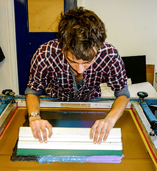
in the world of printing methodology, screen printing possibly offers the easiest access for even those with little by way of experience. 'tis but a simple matter, subject to having access to ink, screen and squeegee, to cut out some letter shapes and print onto a cotton t-shirt. that makes you not even close to a master of the craft, but at such early stages, wearing the resultant shirt is probably of more importance. with few exceptions, all other methods of transferring ink to substrate will undoubtedly involve some form of heavy machinery such as a letterpress, flatbed litho or chain delivery offset litho. these are not the sort of items that can be squeezed into a spare bedroom or stowed in the cupboard when you're finished.
however, my wholly inadequate description of the print method belies the sophistication possible. though stencils of increasing complexity can indeed be created even from simple sheets of paper, printing of fine detail or photographic material is easily possible by resorting to a light sensitive coating on the screen and subjecting it to strong, bright light over imposed artwork. and by affixing a series of screens to bolted brackets, it's possible to achieve pretty much perfect registration of several colours, often more than possible by even six colour lithography.
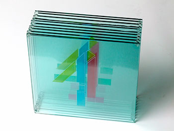
a bit like the proper names dropped upon the hapless pups at crufts, the technically correct name for this printing process is silkscreen, even if silk has been pretty much replaced with a very fine nylon mesh.
of course, as many of us might already have discovered, it's not the method that makes the art. in this case its the chap or chapess with a snippet of vision and a squeegee to hand. such a visionary, if he will allow me to describe him as such, is dan mather, a man i first came in contact with when he sent me a beautifully screenprinted musette that had formed a part of a rapha exhibition. like many successful artists/craftsmen, dan has progressed notably since that musette, recently having realised three years of silkscreen editioning. to celebrate the occasion, dan has now opened an online shop for all his printed matter.
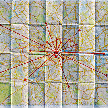
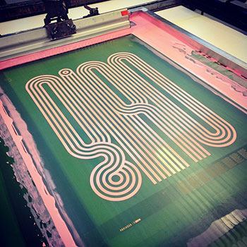
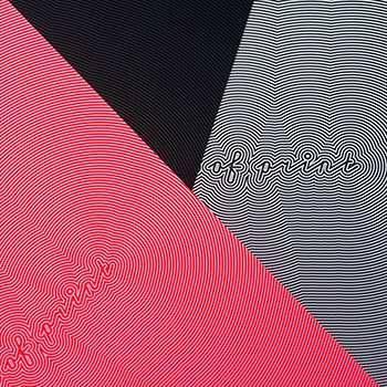
the first item to occupy its virtual shelves is an exclusive print in three colourways, representing mather's company mantra 'for the love of print' (see final image below). this is a large format print reminiscent of bridget riley's optical illusions, printed individually in one of three colours. i asked him how he started in the medium?
"Since first discovering screenprint at the Arts Institute Bournemouth, I've loved it. You could print on everything I'd dreamt of; acrylic, cardboard, bubblewrap, glass, even carpet underlay. I tried it all, resulting in a weird book entitled 'Retro', treated with more finishing techniques than you can shake a stick at, but lacking any decent content. Fast forward to university at the esteemed LCP, I practically lived in the print room, screening every outcome for all three years, mastering a vocation I wasn't even studying. I played with halftones, multiplying colours, blends, overprinting, registration, even printing PVA and throwing gold dust down. It was incredible to realise the quality of print achievable at a relatively low cost.
"After I graduated I was hooked, but scared. So I took the path many did, and embarked on a career in graphic design with my honours. I lasted a couple of years but it wasn't for me, so I returned to the squeegee (part-time) just printing my own work again. Then two good friends of mine (birch) recommended me to an established graphic designer I respect greatly (Mash Creative). After printing three editions of Mark's work, I hit the ground running. Three years later, 100+ editions, 70+ clients and enquiries every day.
"Crazy really."
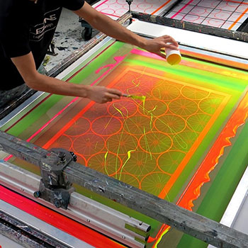
edinburgh's chris sleath has achieved the notable status, in my eyes at least, of producing an endless series of must-have letterpress outings, while others have flaunted impeccable, cycle-related litho prints, some of which grace the corner wall of debbie's in bruichladdich. dan, however, opted for screenprinting. what is it that attracts him to this particular medium?
"Aside from the richness of colour, ink consistency, quality and tactility you get with screenprint, It's a beautiful medium.
"From a business point of view it's about investment. Choosing screenprint is installing faith and confidence in your design, not just printing one out every time someone likes it. Sure, the process is premium; it's more expensive than digital and more cost-effective than litho for low-volume, but it's also a process with risks; mis-registering layers, getting the colour wrong, not meeting the edition etc. I see these as obstacles which only present themselves with silkscreen and for designers to have the trust and judgement that their work is worthy of the squeegee, and the confidence it will sell, is a great investment I love to be involved with.
"With print-on-demand ever increasing in popularity, there's a certain appreciation I find when a client has invested their income in having a limited edition printed with me. I like that.
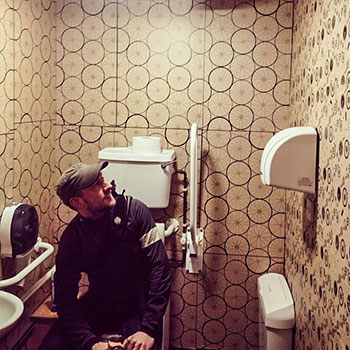
as i mentioned above, there are several other methods of transferring imagery to a variety of materials, though it's undeniable that the most common is often paper. when at college, i had the luck of experiencing everything from stone lithography, letterpress, etching, engraving as well as screenprinting, but i now wish i had paid a lot more attention than was actually the case. in my case, letterpress still holds great interest, but i wondered if dan had dabbled away from the squeegee?
"Through my university days, I picked up the nickname 'Materials Man Dan'. I scavenged for the reflective, the holographic, the ultraviolet and the fluoro. I loved experimenting with all sorts of materials; if it could go under a screen, I printed on it. Through this I developed a fascination with process. Whilst peers were swapping books on Emil Ruder and Crouwel, I had both volumes of Experimental Formats permanently out-on-loan from the library.
"I may have not graduated with a first in Graphic Design, but I did leave with a great understanding of the print-process, which in this day and age seems to be lacking. I've digressed I know, so to remount; yes. All manner of print and production excite me, and I'm keen to experiment further as I grow older, always getting wiser."
in the words of zen buddhism, we should be careful not to confuse the pointing finger for the moon itself. likewise, we ought not to confuse the ability to undertake a printing process with that of creativity. there are many printshops around the country which will happily output creative work to a high technical standard, but without any creative input of their own. what inspires dan's prodigious output?
"Ha. Good word Brian. I never intended to be quite so busy. It just happened and seemingly never slowed down. I think of way too many ideas all the time every ride I go on. I suppose harking back to my uni days, I always thought of how to produce something first before designing it. Much against my tutors' advice, I always thought of the production first, so I probably can't help but produce work once I've had an idea.
 "I must say that I now give more time to planning and designing, I've become extremely meticulous and critical of my own work. It has to be worthy, so I rationalise my ideas, and believe it or not a there's a great deal of strategy that comes into a release now. This in turn promotes the editioning side of the company, so the more I do, the more clients see and the more work that enters the inbox.
"It really is for the love of print."
all this is not just to deny that the uk is now only emerging from several years of economic turmoil, years that encompassed dan mather's three solo years. making a living from artistic endeavour has always been something of an uphill struggle, without the country's economy slapping you in the face while you get on with it. is making a living as an editioning screenprinter getting any easier?
"I still consider what I do to be design, not art. Design in my opinion has always been a more profitable path to pursue than art; itÕs more commercial. So as designer or printer, or both(!), earning a income is sporadic. Some jobs are good, others not so.
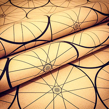
I enjoy my collaborations with lookmumnohands! those began with screenprinting my Ôspoke patternsÕ wrapping paper and more recently applying it to some musettes. Those were fun to make and profitable, though I didn't print them (I only print on paper).
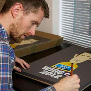
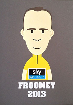
"Rouleur are a lovely client to have too. Wiggo & Froome were both great editions to screen, designed by the infamous Rich Mitch. Paniagua.cc are a fantastic client too. I love looking after relationships with clients; it's more than just a print-job for me, it's a friendship. I remember catching the train to Somerset with x50 A1 Giro d'Italia screenprints under my arm, just so I could meet Jamie. From there weÕve created seven editions together.
 "In London, things are always expensive and although doing 'well' for my chosen career, there's never a consistent salary like I've had in the past. I honestly wouldn't be where I am without the support of my love, Ellen. I'll forever be in debt to her for such support and compassion for the path IÕve chosen. Just donÕt tell her about the Royce hub in the post. :-)
though i've paid testament to the proliferation of quality photography applied to our beautiful sport, it's also an activity that seemingly delights in graphic representation of the print kind. dan has skirted the fringes of cycling via the screenprinting process on several previous occasions. is this a theme he intends or would like to return to in future work?
"Always.
"Every ride I take on my Moser, I'm inspired to produce more cycling work. Even the other day I was intermittently overtaken by time-trialists on a new route near the M25. I spent a good 15 miles after my return home thinking about the central alignment of the dossards on their skinsuits riding into the sunset, and how it would make a nice print.
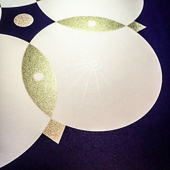 "But referring back to my point about rationalising ideas, nowadays the idea has to be worthy. I have a habit of having to better myself and my work. There's plenty more cycling pieces of work that just need refining before committing to print. I set the benchmark quite high for myself with my Hors Categorie, and Echelon. I've always had a thing for educational or posters that mean something, inspired by the great Tom Eckersley. I want my work to educate or prompt someone into thinking, not just be pretty.
"Echelon and Hors Categorie both share simple typographic footers bringing a definition to the graphic. Most recently was my design and print for Colours May Vary in Leeds to celebrate the worlds greatest bike race coming to Yorkshire. Note the subtle gloss varnish spokes in the petals of the white rose. That was a great piece to make.
 "One idea I will share is my fascination with the the association newspapers have with pro-cycling (beyond the obvious). IÕm keen to produce a piece on this, but haven't enough confidence in the idea yet. WeÕll see how it develops."
all through my own art college years, there was never any codified direction. i pretty much fell from one project to the next, with no cohesive structure to any particular body of work. subsequently the material sitting quietly in my portfolio showed little developmental progress. if i knew then, what i know now... dan, however, is already well past that point, but is there a cunning plan (as baldrick would have said), or does the rarefied atmosphere of artistic endeavour demand that he takes pretty much whatever comes his way?
"There's always a plan. I'm too organised to not have one. Keep your eyes peeled for #PrintedMatherÕ, that's the next release after #fortheloveofprint."
dan mather's online shop can be viewed at here
thursday 31 july 2014
 ..........................................................................................................................................................................................................