
..........................................................................................................................................................................................................
all those hills
logos are the bane of my life. with the number of funding bodies in the modern world, each seems to have its own poorly designed logo (witness the appalling creative scotland logo; formerly the scottish arts council) which must, at all costs, be incorporated into any advert that may appear in public. that latter demand rarely takes into account any notion of advertising space, which means that the funders' pennies are often spent on advertising that's double the size actually necessary. whether any of these funders bother to check if those necessary logos have been placed where they need to be is open to debate.
to give an indication of the size (literally) of this problem, a now defunct local access group found it necessary to insist on the incorporation of fourteen separate logos within any published ad, almost rendering any text surplus to requirement. had any of these logos been of a stylish nature, the visual appreciation may have been immeasurably enhanced, but as it was (and is) this was rarely the case.
in the days when graphic art was part of my official learning process (some would say that it still is), and before the advent of photoshop, with its ability to create bitmap images, those of us working on logo design were advised to fax a copy to ourselves. if the logo still maintained its integrity when subjected to being rendered purely in black and white, with no midtones, then the design was on the right track. with technology having shoved the fax machine to a dusty corner of the office, it is less likely that any graphic representation will suffer such iniquity, but for me, the principle still holds true.

still my favourite and to my mind, most successful logo, aside from the unmistakeable apple icon, is that of british airports authority. the success of a logo image is greatly enamoured if it becomes recognisable without accompanying acronyms or text, and i figure this one incorporates those salient points. i can accept that i may be the only one holding this particular opinion, apart, perhaps, from the ceo of britiah airports authority, but everyone is entitled to their opinion.
though not even approaching that level of identity, the logo for thewashingmachinepost was a lucky hit, depicting as it does (or is supposed to) a washingmachine and using the letters twmp as the wash door handle. other logos, however, require a great deal more sweat of brow to achieve. several years ago, a good friend of mine you may know, (phil deeker) sent me several variations on a logo for his new enterprise: the cent cols challenge.
these consisted, if memory serves, of several triangles arranged to relate to mountains, as well as variations on the letters ccc. none were particularly outstanding, but i confess to having been short of ideas that might have seen any improvement. the website for cent cols challenge was designed by another friend of mine, simon clayson, who, with obviously greater graphic skill than my own, rearranged those triangles into what was a particularly apt and successful logo for this new method of ascending purgatory.
the success of the cent cols challenge was greatly boosted by the involvement of rapha, and along with that assistance came the graphic skills of the inimitable ultan coyle. from conversations with others who work at perren street, mr coyle seems almost to churn out graphical excellence as if it were really that simple to achieve (which, for him, it probably is). witness his graphic for last year's festive 500. or even his rapha colleague, jack saunders' logo for the turkey takeoff. at this point, everything eased comfortably into place.
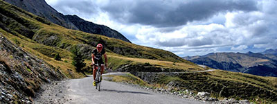
'comfortable' is not a word often used in the same sentence as the cent cols challenge, for that is surely an emotion or state of affairs that arrives at the crest of only the last summit. the preceding altitude gain of riding 100 cols in only ten days can rightly be justified as the ultimate cycling challenge in the mountains. 200 kilometres a day and 4,500 metres are not necessarily to be sneezed at. however, your host for the epic endeavour (surely one of the few times when the word epic can be used with impunity?) is the previously mentioned phil deeker who, at only a few months younger than yours truly, is still sprightly slogging his way up the sort of climbs that he probably shouldn't.
phil is the very chap that you want at either the front of your cent cols peloton or even at the back. having been one of the stalwarts who not only recce'd the gran corsa route earlier this year, but also subsequently rode the whole giro d'italia route. on the zoncolan, having reached the summit, phil went back down in order to shepherd some of the suffering stragglers to their own summit. that's the guy i want to be riding with.
for 2012, phil will happily and cheerfully drag you through the alps, the pyrenees and the dolomites; all three if you're of a mind. each trip is limited to a peloton of twenty-five. in a rather obvious situation of having to man up, is this the sort of expedition you could see yourself doing? more to the point, are you good enough? doubts? if i may quote from the cent cols website "Phil, thank you again for your patience with us in the back. We rode as hard as we could. Please know that our experience at the back was as rich and sweet as those up front. It was a tremendous experience, that would not have been possible without your vision (route planning) and more importantly your organization."
that perhaps may answer your question.
run in conjunction with la fuga, the cent cols challenge in the alps leaves annecy on the 19th of august and returns to the very same place on 29th august. that leaves you just enough time to recover before heading for perpignan in the pyrenees for a 17th september departure, perhaps unsurprisingly getting back to perpignan again on 27th september. the dolomites ccc provides the meat in the sandwich, which could be used as either a recovery ride (i'm joking) or preparation for the pyreneean raid. san pellegrino terme is the choice of departure location on 3rd september, arriving back on 13th september.
the rides are all fully supported, with mechanical support and luggage transferred on a daily basis to the evening's accommodation; all you have to do is sit and look at phil's back tyre for most of the day while trying hard not to become too sunburnt in the process. with numbers limited in order to provide the best cycling experience for all, if the horizontal rain and sub-zero temperatures outside have moved your thoughts to sunkissed mountain slopes and summer 2012, now's the time to ease the credit card out of its moth infested wallet and put your money where your training plan is.
you know you want to.
should you wish to avail yourself on some pragmatic thoughts on the winter training (or not) to come, you could do worse than read joe hall's salient words on the subject.
posted thursday 1 december 2011