
..........................................................................................................................................................................................................
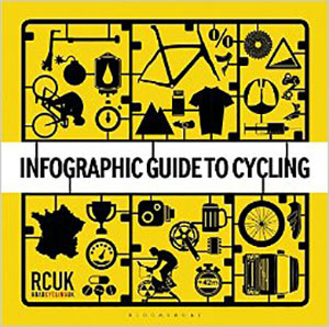
infographic guide to cycling. roadcyclinguk. bloomsbury hardback 127pp illus. £12.99
as you enter the front door of our local newspaper office, there's a sign, ignored by many, that points to the reception desk on the right. turn left (as many seem to do) and you would be confronted by the editor which is not the ideal state of affairs if, as is often the case, they're on the phone. in days gone by, before the interweb was born, submitting an advert or article was done either by hand to the reception desk on the right, by mail, subsequently opened by the receptionist, or by telephone, again to the very receptionist previously mentioned.
thus, there was but a single channel of contributions and advertisements to deal with between reception and dtp (desk top publishing) operator. things were nice and simple and everything seemed to be handled in a more controlled manner. the above system is still in place, but has been largely undermined by the advent of e-mail. now there are three channels with which to deal; reception, dtp e-mail and adverts sent erroneously to the editor's e-mail. it's a situation that has effectively trebled the likelihood of any mistakes being made, and alternative features have had to be added in order to minimise the chance of this happening.
i know for a fact that the same malady has affected pretty much every newspaper on the planet; many have more staff and greater financial backup to apply more sophisticated routines than can be seen on islay, but nonetheless, it's something that has to be dealt with in one manner or another. for this, as we are constantly being reminded, is the information age, one that was supposed to herald the paperless society, but seems only to have succeeded in increasing the amounts of paper being shuffled, archived and received across many different industries. far from easing the strain, this constant flow of information simply seems hellbent on creating even more.
however, to blame information per se is to risk shooting the piano player. information has never been more necessary, particularly the correct variety, and in a fast and furious world with an ever lessening attention span, providing information in a more graphic and less literary fashion is not only seen as a necessity, but often a more convenient means of dissemination. over the past year or so i have been sent and featured so-called infographics, usually lengthy pieces of graphic design that detail specifics pertinent to whoever commissioned them in the first place.
in an effort to compose the many strands of velocipedinal activity in a hopefully more entertaining manner, the folks at roadcyclinguk have published, in co-operation with bloomsbury, the infographic guide to cycling. all the usual suspects are present and correct, along with a number of pleasantly surprising infiltrators, offering such gems as a two page guide as to the carbon frame process, details of just how chris king's ring drive actually works, and a highly explanatory graphic of just how effective a well-drilled echelon can be.
there are features on the hour record, blood doping, the tour de france (naturally) and the classic one-day races. there is, in short, a wealth of information to be found. however, as is the case with many publications that detail facts and figures, the infographic guide to cycling, published on thursday 23 october, is already out of date. in a four page feature on the jerseys and teams of the uci's world tour, cannondale have already merged with garmin and belkin have, i believe, combined with lotto belisol, meaning the former no longer exists.
and i'm sure i read that giant shimano were not entering 2015 in the same format. there are doubtless other changes i have missed.
and for a book that places information first and foremost, it's a shame at least one item of that information was not proofread a tad more closely. on page 126 heading an infographic about big tex and il pirata, the heading reads pantini vs armstrong, compounded by the fact that the diminutive italian's surname is correctly spelt in the captions. i know all too well how easy it is to make proofreading errors but...
though i am partial to most varieties of good graphic design, the contents of this book are rather patchy and some of the included information seems a smidgeon on the spurious side, though that's an accusation that could be levelled at others of the genre. in short, it's a reasonably good idea that perhaps ought to have been confined to the occasional self-contained infographic, rather than an entire book.
saturday 25 october 2014