
..........................................................................................................................................................................................................
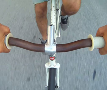
how many bits of blue and black can you fit in a jag?
those of you who pay more attention that the rest of your peers may well have come to the conclusion that i hold no great love for the motor car. i must concede that my actions, statements and general demeanour will have done little to contradict this state of affairs, but, as in most situations, there's slightly more to it than that. firstly, i have not owned a motor car for nigh on six years, and though the odd occasion has arisen where having one nearby would not have gone amiss, generally speaking, the bicycle and a robust pair of feet have coped admirably. however, were you to quiz mrs washingmachine post, i fear the answer would be somewhat different. but that is an altogether different box of grommets.
the truth is that it's not so much the motor car that i take exception to, but more often than not, those who own or drive them. with endless miles of screechingly expensive roads, i find it hard to fathom why it is necessary to park on the pavement. and even harder to comprehend why so doing is not, in fact, illegal. but that discussion is for a different article at a different time and perhaps a different frame of mind.
there is, somewhat iniquitously and quite contradictorily, no doubt that any form of professional cycling would find it hard, if not impossible, to exist in its current form without not only the motor car, but entire pelotons of the things. despite protestations by the pelotonese as to the green-ness and environmental soundness of our activity and sport, you need only peer keenly at the aerial shots of any classic or grand tour to realise that there are almost as many motor vehicles in the peloton as there are bicycles.
possibly more.
standing by the roadside in ballycastle getting wet this past month of may, the motorised troupe following the slowly pedalling giro d'italia cyclists took longer to pass by than the cyclists. but, despite my vehicular misgivings, i can see little alternative; the three helicopters bringing the tv pictures right to our living rooms quite conceivably use more fossil fuels than the entire race support.
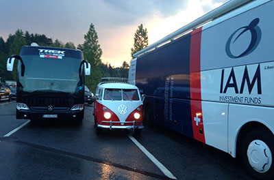
but if there are near to two-hundred cyclists beginning this year's tour de france in yorkshire, they'll need at least one spare bicycle each and more than likely access to a large supply of spare wheels. and those sticky bottles don't just hand themselves to the riders, nor indeed, are magic screwdrivers kept under the saddle. no doubt european employment laws would find themselves in the middle of an illegal infraction were the riders not fed at some point during their pelotonic exertions. and should the weather either turn foul or fair, it's necessary that an appropriate change of attire is easily to hand.
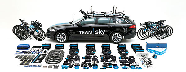
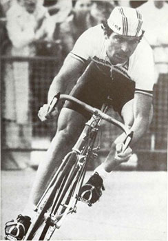
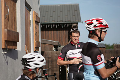
all this stuff has to be put somewhere, and as it says on the press release beneath the above photograph of an unpacked team sky jaguar xf sportbrake, " The team's race support car needs to be prepared for any eventuality, and simultaneously acts as wardrobe, mechanic's workshop, bike store, restaurant, hospital and race HQ." the subsequent list goes on to exhaustively name each and every bit of team sky paraphernalia that can be crammed into the aforementioned jaguar fitted, i might add, with a nine-bike custom roofrack. i shall, however, spare you its intricacies, but needless to relate, it's quite impressive. any team furnished with fiat 500s for their support cars would struggle manfully to compete.
this is not to say that team sky's rivals for the yellow jersey do not have similar logistical problems when packing their own tour vehicles, but should you find yourself with the necessary cash to fund your very own jaguar xf sportbrake, either for the weekly shop, or in case you have notions of running your own cycle team, its capacity for swallowing stuff is quite impressive.
i have enquired as to whether there might be a spare one lying around to assist the velo club, but nothing's arrived at the croft so far.
monday 30 june 2014
purple harry's old time medicine show and super sponge
mrs washingmachinepost's favoured movie is the wizard of oz, a film that begins in black and white before magically changing to colour when dorothy finds herself no longer in kansas. however, while she still inhabits not only kansas, but monochromicity, having run away from home with toto to prevent miss gulch and the sheriff from seizing her dog, she bumps into professor marvel, one of the old-time medicine men and fortune tellers who travelled the midwest earning a crust by selling elixirs of dubious provenance.
such medicine men were not unheard of in the wild-west, but surprisingly some of them lasted well into the 20th century. one, considered to be the last of these attractions, was run by a fellow by the name of tommy scott who, as a teenager, joined the doc chambers' medicine show in 1930. this was begun in the late 19th century by singer, guitarist, ventriloquist and performer m.f. chambers. during these shows, chambers' herb-o-lac herbal laxative was purveyed, a fact that makes me sure there's a joke in there somewhere, i just can't think of it for the moment.
when chambers retired, tommy took over along with his wife, sidekick gaines blevins and subsequently his daughter sandra. since the market for laxatives, herbal or otherwise, was presumably on the decline, the shows eventually became the framework for the promotion of a mentholated skin liniment known as snake oil. doc scott's last real old time medicine show finally closed its doors in the early 1990s after putting on as many as three hundred shows per year.
there's little evidence as to the efficacy of many of the substances sold as part of these medicine shows, an inordinate number of which contained a high percentage of alcohol. this was presumably to dull the senses as to the serious failings of the contents of the cork stoppered bottles. in short, these elixirs were sold on promises that rarely, if ever, materialised. despite the demise of the archetypal medicine show, there are still several products released each year upon an unsuspecting public that promise similar untold benefits, yet years later, these are either proved or admitted to have been less shiny than promised.
anyone remember biopace?
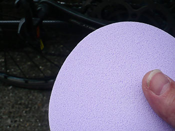
therefore, when an envelope arrives containing a circle of solid purple something or other, the label of which proclaims it to be a super sponge, one is almost honour bound to be circumspect in one's subsequent dealings with the product. like many, i have owned several sponges over the years, ranging from the bog standard product through to semi-organic examples crafted from some little-known caribbean fibrous material. in use, they more often than not, acquit themselves perfectly well, cleaning the parts that other sponges fail to reach, but only up to a point.
it cannot have escaped your attention that, on one side of your bicycle there are at least two spiky rings, behind which all manner of
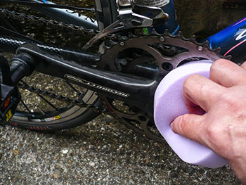 crappiness resides. short of removing the chainset each time you wish to clean the bicycle - a rather impractical undertaking - the spiky bits become the bete noir of each sponge, more often than not ripping the poor unfortunates to shreds or rendering them useless with an oily grime infestation. purple harry's super sponge claims to be different.
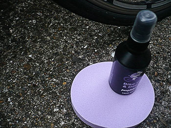
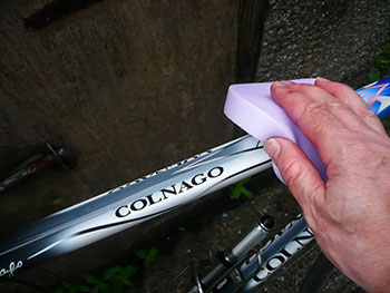
to use the super sponge, it needs to be soaked in water to soften it up a bit, after which it offers an impressively dense rubber consistency. having sprayed the colnago with purple harry bikewash five minutes previously, i did as bid on the instructions and expended many a calorie of elbow grease all across its carbon frame, including those spiky chainrings and the tricky-to-get-at bits in behind. true to its portended reputation, the chainring teeth seemed impressively not to have caused the super sponge any untold grief, though i cannot deny that its purple hue had been somewhat desecrated.
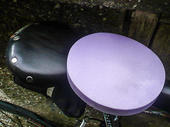
now, according to the purple harry medicine show, a good rinsing in soapy water would return the sponge to its original condition, something i was convinced couldn't possibly be the case, for in my considerable experience with oily bike bits, life simply isn't like that. yet, i have to admit their contentions to be correct. after having cleaned my mucky c40, washed the sponge and left it out to dry while i was out getting the colnago dirty once more, i returned to a super sponge that looked pretty much the same as it did when it arrived in the mail.
i'd be somewhat surprised if the sponge remained in pristine condition forever, but i confess it's looking pretty good after several scrubbings, including deliberate attempts to give it chainring problems.
maybe the last medicine show really is purple.
the purple harry super sponge is manufactured in the uk and retails for a measly £5.99. if you didn't like cleaning the bike before, this might prove the ideal turning point.
sunday 29 june 2014
getting in line

i've a feeling i've discussed this once before in these pixels, but that's of no nevermind, for so important is it to all and sundry (it is; would i lie to you?) that it's worth running through once more. bear with me for a few moments.
though much of the modern world is online, with reading and viewing in pixelated format, contrary to contemporary opinion, print is definitely alive and kicking. were this not true, we'd hardly be keyed with major anticipation at the aromatic arrival of rouleur magazine (and while i'm here, has anyone else noticed that ride cycling review also offers olfactory satisfaction?). and since you mentioned it, might this be an appropriate point to delve into a portion of the mechanics of printing? i knew you'd agree.
in the world of ink and paper, resolution is king, or at least it is if we'd like to recognise that which we see before us. the mantra recited by commercial printers was, at one time (and for all i know, still is) that any placed images had to equate to 300 dots per inch. i once sent a cd cover for printing including an image taken with an early version of a digital camera which, at the time, manged only 120dpi. i subsequently received a phone call from the printers eager to point out my pre-press faux pas and absolving themselves of all responsibility should i continue to insist on their printing it.
i did.
however, the complexity does not end there. if you own or have used an inkjet printer, you will likely already have experienced the blotting qualities of lower quality paper. the 80 grams per square metre stuff that you buy from the local stationer is very unlikely to offer quality reproduction. sadly, other than purchasing photo quality paper, there's little you can do about that. however, those of us who send output to a postscript enabled output device have the option to set something referred to as the line screen. where that original copy is eventually being used to create a master plate for offset printing, our immediate concern involves the properties of liquid printer's ink.
similarly to the inkjet on cheap paper, printer's ink on low cost newsprint and the like, experiences what is known as dot gain, where the dots output by the postscript interpreter tend to blot slightly on the paper. place those dots too close together and any greyscale tones will be lost when they bang into each other. in order to get round that problem, we lower the line screen which increases the space between the dots. if the line screen is ridiculously low, it becomes difficult to recognise the image, but hit it just right, after what seems like endless trial and error, and the result is not only an accurate image, but an aesthetically pleasing pattern of dots.
the latter is an inadvertant by-product. maybe not everyone adores a decent line screen, but i most certainly do, all the more so when it arrives as part of a series of cycling images offered by urban cottage industries. the a3 posters depicting eddy merckx, bernard hinault, jacques anquetil, louison bobet and italy's gino bartali have been lovingly created using the very halftone process described above and printed on an original heidelberg press. each has been individually numbered and embossed with the prelogram trademark. and were that insufficient provenance for these masterful portraits of cycing's finest, the type is set from hot metal on some of the last remaining linotype machines.
it is the printer's equivalent of a lugged steel colnago with pantographed and polished campagnolo record components.
i assume you're already reaching for that flexible plastic and clicking the link below? though i cannot deny a degree of prejudice in my appreciation of these pristine images (the words heidelberg and linotype had me hooked even before i'd set eyes upon them). appreciating cycling's illustrious past alongside a fast disappearing aspect of the glory of the printing industry in one satisfactory package can surely not be avoided, especially this close to the grand depart? at only £19.20 each this is, i believe, what the young people of today would refer to as a 'no-brainer'
these beautifully printed images can be ordered direct from urban cottage industries.
saturday 28 june 2014
and the winners are...
a common complaint amongst those of us who like to think of ourselves as the editorial team at the local newspaper is the one-sidedness of regular or infrequent contributors. to provide an example of where i'm coming from, i'll start with the annual easter football tournament. aside from the fact that a list of the matches to be played along with salient locationary and sponsorship details invariably arrives after our less than draconian deadline, it is rarely composed in the manner you'd expect of a written article. still, that's what an editorial team is for, so one of us will turn it into some sort of english.
so far, so good. but once the football matches have been played, crowds have screamed, players have been injured, and several cans of diet pepsi have been consumed in a local hostelry of an evening, we learn, in most cases, precisely nothing. it is not a singular occasion; many of the island's local voluntary and sporting organisations adhere to a similar pattern. all are keen to alert us to their forthcoming event, yet seemingly reticent or incapable of informing as to how it proceeded on the day. much of this has to do with funding and sponsorship. provided publicity duties have been satisfactorily dealt with, the principle of information is seemingly of a lesser importance.
i have no wish to fall into the same trap.
at the beginning of may this year, i brought to your attention the snapguide competition to invent some form of velocipedinal paraphernalia, with the opportunity of winning some marvellous and welcome prizes from both portland design works and studiolo. there was a verbal enticement from the organisers for yours truly to 'have a go', but being clever in any way shape or form is rarely seen as one of my few attributes, so i have simply watched from the sidelines.
now, at the end of june, the prizewinners have been announced, with the outright winner being dave moore who produced a delectable pair of desirable wooden handlebars for the commute du jour. the skill and ability demonstrated in making these, won him a total of $925 worth of custom bike accessories from pdw and studiolo. the other winners offered a home-made ski bike, a hand-assembled retro-direct bicycle, cue sheet readers and an emergency bike repair kit. naturally enough, as part of the entry conditions, the contestants had to accompany their entries with a snapguide how to, providing the necessary instructions for those of us with less sense of adventure or ingenuity to make one of our own.
i know i left that hacksaw around here somewhere.
friday 27 june 2014
cervo rosso at three
language is something of a master at enhancing or concealing, and on occasions, at perpetrating the very body-swerve you didn't see coming in the first place. though the english language itself is quite adept at so doing, foreign languages are every bit as adept. for instance, would the hoi polloi be every bit as keen on sartorial over-indulgence and pretension were aida to have been composed and staged by somebody with the name of joe green? and would you be ever more impressed on a culinary level were i to offer you a plate of poisson et pommes frite rather than fish and chips (or a fish supper, as we more coloquially refer north of the border)?
language is similarly used by motor manufacturers to add a frisson of excitement, solidity or quality to their mechanical offerings. iniquitously, this includes the numerical portion of the english language; the very reason why i have an intrinsic aversion to typesetting advertisements for the local car dealer. nomenclature such as a 208 xl 5d, hdi, 4wd etc., etc., fails, in my case, to provide anything like an accurate mental picture of just what is being described. conversely, referring to a family saloon as a solara, allegro, passat or mondeo, evinces little more than does the numbers game.
cervo rosso on the other hand, at least offers the audience something of a visual clue, often surrounding a graphic of a stag's head. for in italian, cervo rosso equates to red deer. it's a brand that i don't mind admitting, parallels the translation of joe green to guiseppe verde. however, as the old saying goes, the proof of the pudding is in the eating, and no matter what carlyle ware, cervo rosso's ceo had decided to name his swiss-based clothing company, the garments themselves speak volumes for his attention to detail and particular style of sports oriented bike wear.
aside from following a sport that has undoubtedly seen more than its fair share of accomplished photographers and illustrators, we are also particularly well served when it comes to dressing appropriately for the velocipedinal task ahead. such is the competition for our sterling, euros, dollars and perceptive mindset, that technical innovation is constantly being challenged in the quest for the aforementioned. with cervo rosso recently celebrating its third birthday, carlyle must surely have seen substantial technological change over that period?
"I'm not seeing enormous innovation or radical changes within the industry. That's one of the key drivers that enables Cervo Rosso to lead the way by doing things differently. Our inclusion of true performance fabrics, devotion to Italian craftsmanship and the inclusion of anatomical patterns in our finished garments, are key features that continue to define our performance focused collection."
the quest to remain at the forefront of whichever industry we may choose to inhabit is undoubtedly one of challenge. whether that challenge is seen as a good thing or not, depends very much on personal or corporate ambition. all considered, it's very likely that the cycling business that stands still will find itself cast aside very quickly, a consumer desire that has instigated the constant need for innovation whether truly needed or not. battling with such salient facts from the directorial chair must surely have provided carlyle with a mixture of benefits, conundrums, headaches or straightforward opportunities?
"Surprisingly no, as we have stuck to our game plan 100% from day one. The only difference is that we have become better at it and the broader cycling community is now aware of it. Hence our rapid growth and the rate we've experienced of customers switching from competitors' products."
the more organised amongst us often have at least the foreseeable portion of our futures completely or sketchily mapped out. there can be little doubt that the world's financial institutions look more favourably upon those providing a cogent business plan, one that at least appears to have taken into consideration any hiccups that might stray into the path of expediency. this corporate mindset is often at odds with the reasons folk get into business in the first place; the creative mind often shuns any kind of restrictive order, and numbers can be found less attractive than the bank manager said they would be. has cervo rosso been a three-year learning process, or was there a cunning plan waiting to be realised all along?
"Not a cunning plan at all, simply an honest commitment to develop the best product range possible, and to be true to our customers by offering them a product of exceptional performance, functionality and style without resorting to the usual commercial nonsense and ridiculous price points."
the cervo rosso moniker, though swiss-based, is well-earned, since the majority of the brand's product range is manufactured in neighbouring italy. other cycle clothing providers have found varying parts of the world to be the apple of their accountant's eye, often very much at odds with the location of their head office. though europe may still be considered as the rightful home of road-cycling, the reality is that north america, australia and the far east contribute every bit as much, if not more, to the company coffers. in the ight of this reality, is switzerland still the best location for cervo rosso, given the sport's encroaching internationalisation?
"Internationally, you would be hard-pressed to say that Switzerland does not represent a quality stamp. Coupled with this, we have an Italian manufacturing base which gives us a uniqueness with which most of our competitors cannot compete. We can and will, continue to produce remarkable products from our central European location. We're the only brand that back's up its product range with a sixty-day satisfaction guarantee."
the development of many technologies has been placed squarely at the feet of active sport. there will be few who do not regard the modern day motor car as considerably more economic, powerful and safe as a direct result of motor sport. bicycles too have developed technologically due to the input and perceived needs of those racing them for a living, a development cycle that ends not at the saddle and handlebars. aside from the fact that somebody has to make those close-fitting advertising hoardings, several go to extreme lengths to improve the consumer product by partnering with one or other of the world-tour teams. is this a route that fits in with cervo rosso's future plans?
"Absolutely not! We are more interested in investing directly in our customers. We also hold no desire to become an online shop for replica team kit. The Cervo Rosso Test Team provides an excellent platform for product development and testing, given the range of rider abilities of which this group consists (The Test team includes former professionals, elite amateurs and Gran Fondo / Sportive riders.)"
released within the past month or so has been the cervo rosso vetta range, yet another block consolidating their position as one of europe's foremost cycling clothiers. i asked carlyle what were the principal features of this new range.
"The VETTA line-up has been developed with three primary objectives in mind. 1) the need for lightweight functional fabrics wherever possible, 2) the inclusion of high compression / high recovery fabrics and 3) minimalist clean, design."
not all of us, however, are hell-bent on becoming the next bradley wiggins, chris froome or even robert millar, no matter the length of our greying and thinning ponytail. for some, the bicycle is nothing more nor less than a means of transport, one for which we have every bit as much enthusiasm as do the pelotonese. necessity being the mother of invention, the need to be not only pragmatically dressed for the trip, but equally so on reaching the comfy swivel chair in front of the computer screen, the checkout, production line or the reception desk is every bit as necessary as in the sprint for a finishing line. in a world where bicycle use is reputedly on the increase, the non-racing cyclist is undoubtedly in the majority. and that majority is just as keen to be catered for in the sartorial department as are the lycra brigade. however, cervo rosso's urban range has remained a tad thin on the ground. has carlyle any plans for expansion in this less sporting of arenas?
"Yes. For sure this is very light in terms of our current offering, the main reason being that we are just managing to keep up with our area of core expertise: premium performance roadwear. As we learn to balance the current demand with supply, we will start to have some creative fun in the CR Urban play ground. We are not short of product ideas, it's just a question of time and resources."
many of cervo rosso's competitors have been around a lot longer than three years, and in many cases are a good bit larger not only in terms of product range(s), but in both staff numbers and geographical locations. however, size brings with it arguably as many disadvantages as advantages, and it's no secret that smaller concerns can find it a lot simpler to alter direction in a shorter space of time. cervo rosso has grown in both stature and size over its first three years, but where does carlyle see the company in a further three years?
"Offering more of the same. We have built excellent foundations to setup CR for further success. We have only just begun this journey of delighting our customers."
the economic downturn is reputedly past or passing, with less of the economic blight that affected not only the cycle industry. as cycling continues to grow both as a sport, leisure activity and ever more practical means of transport, demand for apparel that equates with this growth is also likely to increase. in keeping with the sage advice that the best time to build a website is when you don't really need one, starting a cycle clothing company when few really saw the need, was possibly something of a masterstroke. the fact that cervo rosso has both developed and prospered over the past three years has undoubtedly set them up well for probably a lot more than the next thirty-six months.
thursday 26 june 2014
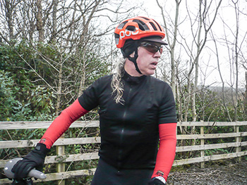
rapha king of pain s/s jersey
you will probably already be aware of the veritable treasure of phrases uttered by the mighty dave t on a weekly basis. there are those amongst you who think that it is i who creates those you see above, but i assure you that these are either verbatim or derived from conversations during the sunday morning rides. i truly wish i had started recording these on a regular basis, for were that the case, i'm sure we'd already have at least two well-thumbed volumes of the sayings of the mighty dave t on the bookshelf. sadly, i never had the presence of mind to do so, leaving them as so many wise and humorous words floating untethered in the aether.
of course, the mighty dave has been there, done that and bought the teeshirt; there is little that overly impresses him, and he does not suffer fools gladly. therefore, when we are on the receiving end of a limitless slew of reasons as to why members of the civilian population have need of excusing themselves from joining the sunday morning ride, he can be particularly dismissive. rather than simply drag their bicycles from the bikeshed and put in the required effort, far more time is spent explaining why they need to improve their fitness.
this situation led to the recent quote from the mighty dave "if you try to ride fast for as long as you can, at some point in the process, it's going to hurt". or words to that effect.
most of you will be familar with the sensation; there's always at least one guy in the peloton who climbs like a mountain goat, and in order not to be found wanting, we try our darnedest to minimise the gap between them and us. in most cases, that's bound to hurt. similarly, after grovelling into a headwind down uiskentuie strand, the notion of sprinting for the 30mph sign at bruichladdich is often a matter of pride rather than competition. and boy does that hurt. almost as much as coming last.
rapha have adopted the forcats de la route (convicts of the road) as an adjunct to their monochrome imagery, a mantra that is every bit as true for the pelotonese as it ever was for those early competitors in the tours de france or italy. who amongst us has not cast regular glances at the clock on the mantlepiece, eager to get the saturday morning shop over and done with in order to get out on the bike? similarly, the sooner the sunday programme on radio four moves onto the day's church service from wherever, the sooner we can clamber from bed and dress for the road. though we like to think of it as a voluntary effort on our part, we're every bit as captive to the need as our more competitive forebears.
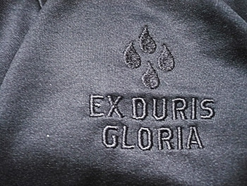
the former perren street inmates began their career with an exhibition entitled kings of pain, a surreptitious introduction to the next ten years of cycle clothing, events, publications and sportwool trinketry. it seems only right and proper, therefore, that those ten years are celebrated with a particularly impressive, limited edition sportwool jersey. you could, of course, argue that a jersey is a jersey, is a jersey. zip at the front, pockets at the back and an agreeable amount of fast inhabiting every merino wool fibre. it's a difficult contention to deny, but this, as was once the slogan for cyril lord carpets, is luxury you can afford.
the jersey forms part of a set, the components of which can be purchased separately, including an essentials case, a cap and a bottle opener, all incorporate the motto ex duris gloria (glory through suffering). that maybe as tendentious as referring to every bike ride as epic, but is intended to refer more to cycling's impressive heritage rather than another level of pretentiousness to be adopted by the wearer. the sportwool employed as the fabric of the jersey is a development of the original, offering slightly lighter weight and better wicking of perspiration.
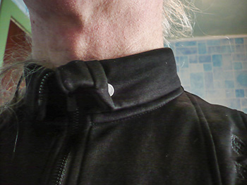
in a creative nod to the past, the king of pain jersey is topped with a poppered collar, effected by tailoring taller than usual before folding over in similar fashion to a polo-shirt and poppering each side of the full length zip. the usual zip-garage is incorporated in this affair, but at the risk of sounding overly critical, it's possibly the single feature of the jersey that it fails to carry off with aplomb.
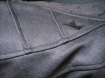
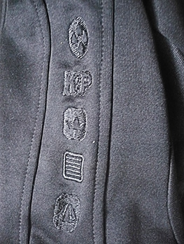
rapha have often favoured the use of black graphics on black fabric, something that is brought to a design peak on this particular jersey. descending from the left shoulder are a series of black embroidered graphics that take the form of hallmarks, denoting both quality and provenance. "the straight bars represent the 'forcats de la route' employed on rapha's pro-team line. the drops are for blood, sweat and tears; the essential fluids of pro-ness, as it were. the crown presumably needs no further explanation, being that of both victor and king.
"the arrows represent those once displayed on convicts in the british penal system. we're all marked as cyclists in one way or another."
fear not, however, that you will have to recall the above word for word in conversation during the weekly bike ride; the black on black format is not too obvious to the casual observer wiping sweat from his/her eyes. across the shoulders on the back of the jersey there are several diagonal panels, cunningly and cleverly mimicking the tyres that the early tour riders used to wear about their person, in the days before mavic neutral service. in a partial break with tradition, despite the existence of three rear pockets, the outer two have zipped closures, joined by the compulsory zipped security pocket. the hem is controlled by an elasticated draw-cord, though i've often found the existence of such adjustment to be surplus to requirements; rapha's jerseys have always fitted me impeccably.
it may be entirely predictable that rapha chose to celebrate their first ten years of existence by way of a jersey, especially one that lives well above the norm, but to place it in the vernacular, it's a doozy. it wears every bit as well as anything that emanated from the original imperial works and on past experience, it'll continue to do so all the way through the next ten years. i have no real idea of just how limited this edition will be, but if i were you, i'd form an orderly queue at the website front door after the weekend.
the rapha king of pain jersey retails at £150 and available in sizes xs to xxl. thanks to david evans for additional information.
wednesday 25 june 2014
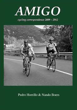
amigo. cycling correspondence 2009-2012. pedro horillo & nando boers. mousehold press softback 225pp illus. £14.95
gossiping is a way of life for many in the hebrides. granted, i might be doing the remainder of the country a disservice, for perhaps the habit is as much a part of daily life everywhere, but of course, i wouldn't know that. i, however, have not bought into this particular long-term trend, an option that brings me more grief than if i was content to spread the overheard, further afield. the looks of disdain that are pointed in my direction on discovering i had prior knowledge of a specific event would more than likely turn me to stone or a pillar of salt. perhaps i should cut my losses and join the party.
correspondence, however, is something i find far more amenable to my disposition, a practice that has been immensely assisted by the advent of the internet. despite the presence of a substantially sized ocean and one or two inconvenient time zones, it verges on simplicity itself to conduct a one to one conversation with folks i've never even met over the course of a few hours in the evening. when i consider how long the same process would have endured had we remained in the letter post age, those bits and bytes flying through the ether surely constitute the eighth wonder of the world.
e-mails were once the preserve of brevity, if only because the effort involved in typing, logging on (remember dial-up?) and sending any missive was far more of a gargantuan task than modernity has made it. the advent of such light-fingered keyboards, even in the hands of one untrained in the art of touch typing, has made the construction of sophisticated missives a veritable piece of cake, allowing for intelligent and intelligible to-ing and fro-ing across the continents in so-called real time. for those of us with an uncanny ability to be effortlessly long-winded, it's as if all our christmases had come at once.
in the mousehold press publication amigo, i was singularly unable to decide whether the enforced lengthy correspondence between sports journalist nando boers and former rabobank professional, pedro horillo, was being conducted by e-mail or good old paper, envelopes and stamps. a part of me prefers to think that the correspondents sat down at their own writing desks - the ones with the wooden roll tops - and carefully considered their missives and replies.
there is a sketch from the stable of monty python's flying circus from many years past involving a send-up of an on-air interview with a footballer. no matter the question asked or statement made, the answer is always the same "well jim, i just kicked the ball, and there it was in the back of the net" and not pronounced with a particularly educated accent. cyclists, on the other hand, often come across as closer to the intellectual ideal. tom boonen, for instance, reputedly speaks six languages, and several others have either studied for a degree or do so at the end of their cycling careers. i admit the football jibe is lowering myself to typecasting, but i assume you get my point.
the correspondence between boers and horillo is enlightening to say the least. not specifically due to the content of each other's writings, but more for the level of intellect it displays. such a contention, unfortunately, perhaps says more about me than it does about them. in similar manner to those joni mitchell albums of old, i found it hard to snap my way easily and superficially through the book's 200 plus pages; it's very likely that i will soon start once more at the beginning in order to better comprehend all that i have read. for quite naturally, none of us are either boers or horillo, and to assimilate ourselves with immediacy into this unfamiliar literary situation will likely take a tad more effort on our part than the average book.
in case you're wondering, i mean that as a most sincere compliment; a good thing. so many other books, and not necessarily about cycling, inhabit a more transient space. while others will undoubtedly show their age as time passes, amigo will endure pretty much forever.
the basic idea of the book had been to record a season long conversation between our two proponents, a situation dramatically altered by horillo's near death accident in the 2009 giro d'italia. after being airlifted to hospital, he spent some considerable time in an induced coma, before undergoing a long period of rehabilitation. not unnaturally, any desirous tendency towards written correspondence was not uppermost in his mind. boers did, throughout the intervening hiatus, continue to send words of encouragement to his pen pal, almost all of which was left unanswered until 2012.
the correspondence is not, however, without its faults. for starters, after horillo's accident, the timeline of letter writing becomes very hard to follow, to the extent that i began to ignore each chronological heading and simply attempted to follow the thread of discussion. there is also, specifically on the part of nando boers, writing that borders on artifice.
"In the storage room below your apartment in Abadino, next to the training bikes and the mountain of olf baguettes for the donkeys, this unopened suitcase had been waiting for months. 'I wasn't afraid to open it,' you tell me, 'but still I didn't want to.' Somehow you shied away from looking at the remains of a life before the crash. you put your bottle of beer back on the cafe table. "You had left the suitcase untouched for four months, but then one day you clicked open the lid, almost without being aware of it. 'The smell that came from it reminded me of the race,' you say."
does anyone really write that sort of thing? i can't help but think boers is writing this more for his intended and subsequent audience than its actual recipient. however, in the light of the circumstances, perhaps there was no other way to frame the story, involved as it is/was.
aside from its literary merits, amigo is illustrated with a selection of black and white images featuring both authors, amongst others. sadly, some of us will never know, for none are captioned.
amigo is, having said all that, a truly excellent book, one that will bear re-reading over many years and at times an almost unwitting view into the psyche of a particularly aware professional cyclist, untainted by the perceived constraints of media training. both men are of an intellectual nature as is notably evident from reading but the first few pages. there is an intriguing complexity to their correspondence that hints at the whole being considerably greater than the sum of its parts. it might well take an intellect considerably greater than mine to fathom each twist and turn in its true context, but to my mind that is the very attraction of the book in the first place.
set aside as much time and understanding as you can before sitting down and reading. the more effort you put into reading and appreciating amigo, the greater will be the rewards. a possible contender for sports book of the year i'd warrant, but one that would happily inhabit a wider field of appreciation and influence than simply that of the velocipede.
tuesday 24 june 2014