
..........................................................................................................................................................................................................
they come when you least expect it, but somehow find your soul in the right place to receive the message

if it were necessary to sit a qualification exam prior to owning and riding a race bike, it would likely not be too far-fetched to consider the following as one of the questions: are legends born or are they created? discuss. if the same query were applied to the world of pop music, it would be a simple answer, for few are the legends who appear from the swamp, so to speak. simon cowell is responsible for most.
the fortunate incumbent required to sit this metaphorical exam, however, need only avail themselves of the rare, yet magnificent volume 'henderickx's non-illustrated survey of cycling history' (vol73, no 17), a sizeable, faux leather bound tome that contains many a forgotten or hitherto unknown gem regarding the beautiful sport. where else would one learn of the incident concerning eddy merckx and that emperor penguin? and it is surely a curious conclusion to that tale that such a bird never once made a repeat appearance.

but it is around 1973 that the concept of the agonist surfaced in conjunction with the realm of road-racing. agonism was not only known prior to the early seventies, but in many cases, celebrated as an integral feature of the confirmed sportsman, linked clearly to the kapeletti family who, surprisingly enough were wont to distance themselves from the association. as the saying goes, there's nowt so queer as folk.
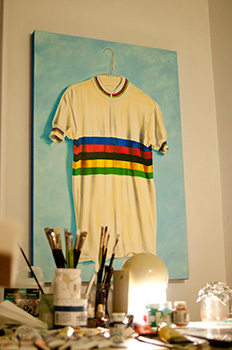
the kapeletti's denial of any participation in the almost clandestine succor affair led to its being dismissed as purely apocryphal, but were that truly the case, it is difficult then to explain the rise and subsequent obscurity of the agonists known to be competing in the beautiful sport. consider too, the mythical jersey design that formed a part of the short-lived history of the kapeletti cycling team competing in 1973. avoiding, deliberately or otherwise, the modern day fascination for designing by committee or focus group, this legendary team apparel has assumed a level of fame that has outstripped that of the legendary cycle team.
though many a rider (six, in fact) of the kapeletti period went on to success in the one-day classics and monuments of the sport, along with a further three who took victory in the grand tours, to a man, they despised the jersey foisted upon them on the morning of their first race. however, as alex dowsett has given voice in the comic this past week, when turning professional, a rider gives up almost all notion of equipment or clothing preferences. the kapeletti family loved it.
however, the fact that the jersey may as well not have existed, considering that no end of research by henderickx in the composition of volume 73 of his historical survey has unearthed a single photograph, and even had that been the case, as an non-illustrated survey, we'd have no way of viewing it in any case. this is, however, but a diversion. cycling, though often described in europe as the sport of the working man, has its existential side. were this not the case, we'd hardly have paid lip-service to the agonists. for it is all but impossible to recognise one of their number amongst the peloton. despite agonism having at one time infiltrated the pelotonese to a substantial extent, there were still many thundering across the country roads of central europe who thought of themselves simply as bike racers.
were that the case, and i would be the first to agree that there is much evidence to support such a simplistic theory, we surely would not have the classics and monuments of the sport? other than geographical location, each race would be essentially the same; none would differ greatly apart from the number of left turns as opposed to those veering to the right. agonism, and all that such an epithet entails, rasies mere competition from such a base level to something altogether more celebratory, bringing many to the status of legends. when put like that, does it not make so much more sense?
the jersey is now all that remains of the 1973 kapeletti team, or at least, the legend of its creation. though reviled and mocked by many, including the poor unfortunates who had no option but to compete in its colours, the intervening forty years have now conferred the status of genius upon it.
should you find yourselves with a few moments (or hours) at your disposal, perhaps we could also share a few words regarding artur kapeloshivsky's theories of frame atmospherics. with carbon frame design and construction surely reaching the pinnacle of its development, kapeloshivsky's search to quantify the compositional differences of the air occupying the frame tubes of famous and successful cyclists, is surely worth a moment or two of your time?
agonism has many yet unexplored facets.
i am indebted to the publishers of 'henderickx's non-illustrated survey of cycling history' (vol73, no 17) for permission to go off on a tangent of my own making while referencing this essential publication.
monday 25th february 2013
more of the folding stuff
in 2009, i visited the fair village of portland, during which i was introduced to a sizeable number of the town's frame-builders by my voluntary tour guide for the occasion, the inestimable mr chris distefano. the extent of his graciousness stretched as far as being driven to the airport on a saturday morning, briefly interrupted by a visit to courage cycles, the compact and bijou workshop of which occupied a garage at the rear of aaron hayes' home. his work is/was delectable, and the rather fine dark blue courage bicycle leaning against the workbench featured those shiny connectors that allow the breaking down of a conventional frame for ease of transport.
a folding bike jim, but not as we know it. and that, quite frankly has been the awkwardness that has dogged the folding bike market almost since its inception.
i have reviewed a couple of folding bikes on the post in past years; one from brompton and the other a bright yellow example from dahon. though i wish no disrespect to either manufacturer, both gave the distinct impression that the folding mechanism had been the prime consideration, with the bicycle part coming a distant second. the brompton folded in a different manner to that of the dahon, but it is perhaps something of an obvious necessity that some of the strength lost through having split the tubing in half and welded on a hunking great hinge, needed to be restored. and this restoration seemed to me at least, to have added one or two pounds to the entire edifice.

and while it would be a foolish person (unless you're michael hutchinson) that expected a folding bike to ride like a colnago, a modest degree of resilience wouldn't have gone amiss. but those little twenty or sixteen inch wheels are not truly built for speed, and drop bars rarely fold well. add to that the likelihood of shimano di2 or campag eps becoming available for the folding market anytime soon, and we must surely accept that a folding bike is a folding bike is a folding bike.
or is it? and does it have to be?
montague bikes of cambridge, massachusetts are demonstrably not bromptonesque in their thinking. backed by some mit thinking, they have a unique take on the methodology of taking a full-size, 700c wheeled bicycle and folding it in half. but they have now taken even that just a small step further and introduced a hitherto unseen level of customisation. not to the method of folding, you understand, but to the componentry the customer can now specify to hang from his/her folded racing bicycle. granted, their top of the range fit is unlikely to trouble the uci's minimum weight restriction arriving at a healthy 12kg, give or take a gram or two, but every folding bicycle has to encompass a compromise or two somewhere in its make-up.
as montague's marta choya stated "With the new framesets, riders can build a full size folding bike, with any off the shelf components they like, and still easily fold their custom bike for the car trunk, closet, or public transportation". the custom program includes three different frame styles: a single speed with horizontal dropouts, a road bike with carbon fork, and a hard-tail mountain bike. montague is now taking orders for frames which will ship next month. montague's product manager, jonathan vandenberg was keen to point out, "Montague frames are compatible with a wide variety of industry standard components, so they're easy to customise. For our 25th Anniversary, we decided it was time to offer fully custom builds for folding frames."
despite the company being based in massachusetts, montague folding bicycles are available in the uk and across europe via their appointed distributor, 2x2 worldwide who are based in tamworth, staffordshire. as more and more people start to look seriously at adding one or two bicycles to the household, necessities such as storage and transport are going to impinge far more than is likely the case for the pelotonese, and more than just one or two of those potential customers are going to be more impressed with a full-size bicycle than that of the more commonly sized folder. add the option of speccing it just the way sir bradley would have it, and it does look like an idea whose time has most definitely arrived.
in a foldable sort of way.
montague folding bikes usa | montague folding bikes uk
sunday 24th february 2013
it's a classic
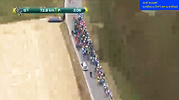
earlier this week, animator and illustrator richard mitchelson put out a call to arms on twitter for favoured sayings or mantras used in cycling situations. though i tendered just a couple, one was a variation on a more common saying, my derivative of which is "some days you get the mountain, and some days the mountain gets you". i think it relatively self-explanatory. an excellent example of the latter part of that saying took place today, as many of us rejoiced at the commencement of the one day road-race battles in central europe.
now referred to in its contemporary, yet linguistically challenging name as omloop het nieuwsblad (or het nosebleed as i find it easier and more humorous to refer), the race itself first ran in 1945 as omloop het volk, organised by the newspaper het volk in answer to the tour of flanders. the latter, far more well-known race, first run in 1913 had become the property of het volk's newsprint rival, the previously mentioned het nieuwsblad. i'm sure you can see where this is going and why it fulfils the "some days the mountain gets you" part of the equation, for in 2000, both newspapers merged for economic reasons and explaining why we now have a classics road race that is all but impossible to pronounce.
but if one so-called spring classic were not enough, on sunday (24th) there's a second bite at the cherry with kuurne-brussels-kuurne, a race which also commenced in 1945. the existence of both races as back to back events is a single factor in providing the pelotonese with the superb sense of cycling heritage that inhabits a whole gamut of grainy black and white photographs and years of anecdotal deeds of derring do. the latter have perhaps less to do with reality and more to do with the limited communications technology available to the journalists of those early days. a bit like watching highlights of tour stages on itv4, though we now have ned boulting to fill in the gaps from actual footage, in the forties and fifties, more often than not, necessity was the mother of invention, with the emphasis heavily weighted on the invention.
yet despite wall to wall internet, and relatively easily accessible footage of these historical yet modern one-day classics, and presumably a larger audience than was once the case, they seem not to have lost one iota of their attraction. and yet again, as seems endemic in modern culture, there is a screamingly obvious contradiction, one that i have mentioned on more than one previous occasion.
as the well-aged roads used for the classics degrade, with the possible exception of the pave in paris-roubaix, they are repaired with the benefit of modern techniques and materials, most of which do not include cobbles. thus, when faced with a cobble strewn ascent or even flat stretch of road, the majority of riders opt for the smoother and more contemporary gutters that border their way ahead. and who can blame them? well, it seems that we can, for did we not switch on to see towering strength in the face of cobbled adversity? you bet your sweet bippy we did. so how dare they ride at the roadside when we had all hoped to see some serious grovelling over uneven surfaces.
yet, topically enough, and a conversation in which i played no small part, the banter round the office on friday morning was of the parlous state of islay's roads. for there are many singletracks out towards the west on which there is little or no evidence of the original road surface whatsoever. most of them resemble the pair of jeans i owned at art college; patchwork all over, apart from the pockets. why is it that the council have not seen fit to apportion the millions required to have them billiard table smooth? do they not realise how uncomfortable they are when riding a bicycle?
i think it's called double standards, for though the chaps being admonished on the telly are being paid for the luxury of being both shaken and stirred, if you were amongst their ranks, are you telling me you wouldn't look for the smooth stuff too?
by now we'll all be aware of the winner of het nosebleed and can look forward to kbk after the sunday morning ride, during which i will endeavour to avoid every smooth part of road in my path. which, to be perfectly honest, won't be a particularly onerous task.
as we say on twitter #springclassicsyeah (and the man in the red tights won)
saturday 23rd february 2013
hearts and champions
several of children that mrs washingmachinepost looks after on a daily basis are at the stage of their life careers where sheets of paper, felt-tip pens, crayons and pencils are front and centre for many of the days' enjoyable activities. there have been pictures of boats and helicopters, dinosaurs are a confirmed favourite because it's fun to make the associated roars, cars and planes and many another item that is seen as fair game for the purposes of rudimentary illustration. in all the time ascribed to such graphic activity, never once to my knowledge, has any child attempted to draw a bicycle.
as one with a modest degree of artistic ability, a personal attribute that is known to one or two of the children, i am regularly besieged by cries of 'draw me something brian'. you won't be in the least surprised to learn that most of my initial attempts on paper or megasketcher are geared firmly towards that of the velocipede. yet, i need only commence drawing two circles and one of them already has their tiny paw on the lever that clears the drawing from the grey screen.

if kids are generally so enthralled with bicycles, why are they so averse to drawing them?
my current theory, based purely on partial observation, is that they're simply too hard to render with any coherent degree of skill. let's face it, lacing 32 spokes three-cross into a rim is a hard enough technical exercise for the uninitiated adult; you can imagine how much more difficult it might be for the under fives to draw one. and can anyone of that age be expected to know on which side of the frame the chainset appears? plus, racing cars, helicopters and dinosaurs are so much more exciting at that age.
however, there is no doubt that, for the practised artist, drawing a verisimilitude of a bicycle is something of a towering achievement. despite my proffered artistic skill (such as it is), i very much doubt i could apply it to the sight of a speeding racer or, in fact, a stationary bicycle. like many an intriguing object, it all looks a lot simpler than reality will demonstrate, and i have the greatest of admiration for those who maintain the bicycle as the principal object of their artistic endeavours.
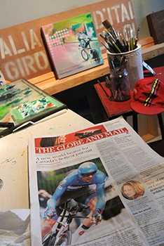
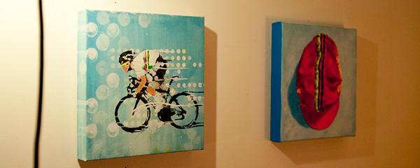
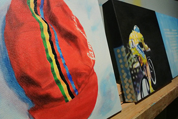
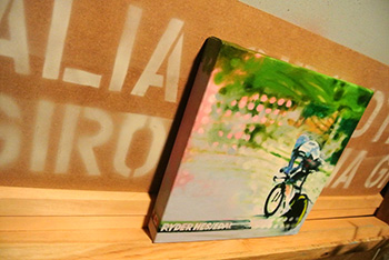
such as david atkinson, for example.
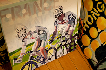
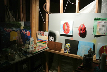
currently a resident of kitchener in ontario's waterloo region, about 100km west of toronto in canada, david's palmares consists of some quite excellent paintings of riders, jerseys, caps and cycling related ephemera that would suitably enhance any wall within viewing distance of the archetypal cycling obsessive. like me for instance. such is the integrity of his illustrations, that he must surely have had an artistic training that contributed to such technical prowess? so is he college trained, or just simply darned good at it?
"I've designed and drawn throughout my life. I didn't study art in college but I did have a very inspiring art teacher in high school. I've learned and continue to learn the necessary skills along the way."
but if i might return briefly to my original point, that, since bicycles augmented with speeding riders, are hardly the simplest of objects to accurately or even impressionistically depict, why eschew the joys of landscape, portrait or still life in favour of the bicycle? even artists have to think carefully about the commercial aspect of their careers, compromising between artistic speciality and the ready, willing and able market to which the results might be sold. so why, for david atkinson, is it all about the bicycle?
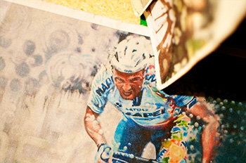
"Hmmm... I imagine the magical childhood experience of learning to ride a bike and the adventure which consequently unfolds of seeing life from a bicycle must have something to do with my current artistic fascination. As I grew up, the simple thrill of bicycle riding was enhanced by my discovery of bicycle racing. My older brother had saved up his dollars and purchased a custom built Bertrand racing bike. He also conjured up a small portable television and negotiated permission (we grew up in a household with no television) for us to watch the Race Across America and ABC's coverage of the Tour De France. In this newfound world of television images and high tech racing machinery the thing that really caught my artist's eye was my brother's replica La Vie Claire jersey. I was a big fan of the bold designs of Piet Mondrian. So began my continuing fascination with the designs and visual appeal of bicycle riding and racing.
"I remained a spectator more or less until much later on (1999) when I started riding for fitness, pleasure, adventure and escape. My interest grew to a sort of fanaticism over a decade of "training" and eventually I found myself racing for one season (2009) in the Ontario Cup series. I now have many thousands of kilometres of road riding experience which feeds into the feel of my bicycle paintings and has created a habit of looking regularly at the world of bicycles."
apple computer was, at one time, infamous for its not invented here stance. if the chaps at 1 infinite loop had not brought the item to the table, they weren't interested in adding it as a string to their bow. it is a dalliance that affects many walks of personal and commercial life, and one that easily assumes a disproportionate affectation for the practising artist. does one wish to be at the behest of others, compromising one's artistic stance in the service of the filthy lucre, so to speak? however, economic reality down the centuries has meant that even the great masters were often beholden to their patrons, stylising their subject matter to suit the vanity of their patrons. does david prefer to live by the fruits of his own engendered labour, or do commissions feature large in the portfolio of hearts and champions?
"I love to work on commissions. I have lots of experience in graphic design and enjoy the challenge of using my hand/eye skills to incorporate someone else's concepts and visions into a strong visual reality."
cynics that we undoubtedly were when learning our trade at art college, that it wasn't too long before one or two of us sussed that appending the words 'mixed media to the little card accompanying any work for exhibition, garnered it a faux artistic importance that it doubtless was undeserving of. though it remains a truism that many works are indeed conducted in mixed media, does atkinson have any preferences as to that which constitutes his work?
"I am interested in working in any media. I was recently commissioned to create a sculpture incorporating five used ZIPP 404 carbon tubular wheels . My original set of 'Hearts and Champions' paintings are made with acrylic underpaintings and finished with oil paint and spray enamels."
in my second year at college, there was a guy very much out of step with what passed for the accepted college mode of painterly output. he was in his final year of study and had opted to make photo-realism the object of his research, using airbrushes, acrylics and all manner of devices to render paintings that were almost indistinguishable from the photographs from which he worked. fabulous though they were, several of us could not quite comprehend why anyone would put so much effort into reproducing an image that already sat before him, and had taken but a fraction of a second to create.
however, it has to be said that there is a sizeable audience for those with the prowess to demonstrate an unparalleled technique of almost photographic reproduction. almost as many, in fact, as the number of artists who would be seriously offended if asked had they worked from photographic imagery. would david be offended if one such as i, enquired whether he worked from photographs?
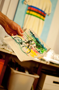
"I do use photography in my process. In my teenage years I became interested in photography and was fascinated with taking photographs of the TV screen. I continue to experiment with the unique characteristics of photographs taken of live action on a computer monitor. For my paintings of pro races I'll watch the live internet feed and shoot as the action happens. The final painted images include not just my impressions of watching racing but also the experience of watching it from afar through the artistic eyes of the TV camera operators and the moto drivers. Locally I sometimes take my GoPro camera on rides and shoot hand held video footage of riders and scenery. I then review the footage as it plays and shoot still photos in the same manner I do with the race coverage. In both cases the resulting images are used as a starting point for my paintings."
painters such as leon kossoff and frank auerbach produce works of thick impasto that can often take years to realise, continuously scraping off each layer of paint before reworking the image until it satisfies their sensibilities. are david's works the result of painstaking hours at the canvas, or do the images resolve themselves a little more prudently?
"My level of interest in painstaking details seems to vary with each individual piece. In general I am most pleased when my art has a strong "feeling" to it. (of course this is subjective) Often the details that I spend more time with are of a graphic and compositional nature. I'm not sure if the results would be described more as expression or impression but in the end the experience is all happening in the viewer."
the disclaimer at the top of thewashingmachinepost rather firmly states that this is a website concerning itself pretty much solely with the world of the bicycle, a stance that i am more than comfortable with, even if i do have a tendency to digress every once in a while. the imagery prevalent on hearts and champions is also predominantly concerned with the bicycle. does he prefer to inhabit the world of cycle racing, or is there latitude to encompass other schools of thought? and does he, at the same time, see an evolution to his work, or are there self-imposed restraints?
"I suppose my artistic influences would come from just about any art that I have seen. As a child I spent a lot of time looking at picture books of many different artists. I notice that interesting artistic styles and visuals from life around me seem to make appearances in my work so I guess my experience of influence is that it's continuous and ongoing. Evolution seems unavoidable. Choices are made along the way to try working in one way or another but restraint doesn't come to mind. I like to dive into a project and find out what it demands and enjoy what appears in front of me. Practical tips from other people and newly discovered art materials are always influential too. Life is the influence. All of it."
ultimately, every successful artist has to come to terms with the need to exhibit. whether that is viewed as a necessary evil or, indeed, the very raison d'etre of those long hours in the studio depends a great deal on each individual's personality. in this age of the interweb, it is perfectly possible to simply show one's wares in pixelated format, relying on paypal for the monthly stipend. david atkinson is currently showing at the mercury espresso in toronto; is this something he views as part of his metier, or would he prefer to remain comfortable in the confines of his studio?
"I really enjoy exhibitions. They are exciting to prepare for. I hope to keep that going continuously. Exhibitions give me a chance to meet people, which provides some variety and contrast to the quiet studio hours. I will be taking the bike paintings around the Ontario race circuit this year and also introducing some handmade posters, prints and a line of t-shirts based on my paintings."
and finally, almost as a follow on from the naming conventions of rock bands such as led zeppelin, pink floyd and toad the wet sprocket, a website can adopt any moniker its protagonist sees fit, whether the resulting name has any audible or visual semblance to the site's content. i might offer up thewashingmachinepost as a pertinent example. in atkinson's case, why hearts and champions?
"Hearts and Champions' came to me in a very simple way one day as I was working on the original set of paintings. A heart shaped stencil I'd made was sitting next to a board on which I had painted the famous world champion stripes. The story started to fill in. The "Hearts" refers to the common element and the metaphorical centre of every human. The "Champions" refers to the sporting side of bike riding and the mythical stories of competition and racers. The slogan "We Ride The Same Roads" ties it all together. Because both champions, pleasure riders, and commuters literally ride the same roads and share the same heart we have a unique opportunity to mingle on and off bikes and share our experiences of the ride and life."
the paintings of david atkinson can be viewed online at heartsandchampions.cc. photos of all the images are by aaron schwab whose own work can be seen at aaronschwab.ca
friday 22nd february 2013
contradiction

i was asked to design a poster the other day. actually, that's not strictly true, for in truth it was an advertisement for inclusion in the programme for a forthcoming event. text and pictures were duly e-mailed through, along with the information that the programme was heading to the printer's the following day, so i would really need to complete the advert pretty much immediately. nothing quite like being given a dod of liebensraum.
were it not enough of an imposition that work had to be undertaken with deadlines looming, there were added instructions asking me to send a copy prior to the final instance being sent to the printer.
naturally enough, there were dimensions to be adhered to, dimensions that were not supplied by the client (no change there then), but fortunately the amount of text left a reasonable amount of room for manoeuvre. so, under duress, i completed the artwork and duly sent a copy to the client for any alterations and sign-off. and it's at this point that the contradiction crept in.
one of the iniquities of the ubiquitous powerpoint is the conditioning that any sort of a list ought to be preceded with bullet points. this may be perfectly acceptable when beamed onto an off-white wall in some anonymous conference room, but it sure as heck isn't the ideal graphical solution for printed matter, advertisement or no advertisement.
i had, therefore, removed every last bullet point from the client's original copy, and increased the line spacing between each feature in the list to accentuate their differences. though hardly cutting edge, the end result looked not unpleasant. however, the message on return asked to have the bullet points reinstated (aaargh) and the spacing between each item decreased on the basis that 'there's nothing wrong with a bit of white space'
now perhaps it's just me, but does that not strike you as a contradiction in terms? for surely, if i remove space from between each line, the apparent white space will be decreased, rather than increased? however, i should be careful who and what i criticise, for in truth, i am about to be totally contradictory myself.
a couple of days ago, my digital version of peloton magazine arrived in my inbox (well, actually the link arrived rather than the digital publication itself. sorry to be pedantic). though we've yet to make it as far as march, the cover bar code includes the legend april 2013, a feature of many a publication i have yet to comprehend. however, chronological bizarreness aside, it is in fact, a rather fine issue, including as it does an interview with tom boonen and jeremy powers and taylor phinney, accompanied by a distinctly classics theme.
did i ever mention how much i like the spring classics?
anyway, my contradiction concerns itself not with the editorial contents of the magazine, but that of one of the advertisements; for the latest assos ladies jersey, an item referred to in a rather attractive script by the name s5.ladyellisse, strangely missing a word space between lady and ellisse. someone else with a powerpoint fascination; intercaps.
quite why the young lady in the photo is wearing spray-on black latex trousers and high-heeled shoes along with the s5.ladyellisse jersey is quite beyond my ken. though i find the jersey design somewhat less than attractive, that is surely an entirely subjective statement not necessarily transferable to any adjacent observer. i have no idea whether the female pelotonese will find this paricular selection of colours appropriate for their velocipedinal activities or not, nor do i know whether its presentation will be found pertinent to the female sporting aspiration.
happy to lay myself open to accusations of ignorance, i find it a rather sexist means of advertising, but i'm willing to take advice from counsel.
however, the contradiction is surely to be found in my described dismissiveness. for though i think the presentation to be entirely wrong in so many different ways, other than the two page advertisement for sram red in the same publication, this is the only one that truly caught my attention. perhaps for all the wrong reasons, but it caught my eye nonetheless. and correct me if i'm wrong, but isn't that exactly what an advert is supposed to do?
and were it not sufficient to proffer individuality in advertising, i might quote from the assos website regarding this particular design series. "The featured graphics are unusual compared to what we are accustomed. Let it grow on you. It will all make sense. The colors and names selected have been inspired by great operas, except the Moussa. Its featured color is what the fashion world and textile industry have established as the color of the year. This color of the year decision process is taken by a select group of influential individuals who meet once a year in a secret place in France to discuss trends and technologies. When the day is over, the color decision is formulated and the color of the (coming) year is announced. When you wear the Moussa, you show that you are on the cutting edge."
pretentious? moi?
i dare say the chaps and chapesses in san pietro di stabio would tell me to go sponsor myself.
thursday 21st february 2013
shiny
i have been remiss. in fact, my remissiveness has reached almost criminal proportions, for i have barely wiped a bicycle tube clean since the new year dawned over islay. i can recall the day when each bike ride would have ended with my grabbing a sponge and soapy water to drench the velocipede and restore it to its former shiny glory. however, i figure my location is extreme and remote enough, that if we promise to keep this to ourselves, perhaps no-one need suffer indictment.
there has, however, been such an unbroken chain of crap weather almost all of this year, that the last thing on my, or anyone else's mind has been to divest myself of weather-beaten garments and once more enter the fray to apply the same care and attention to the bicycle as i would wish upon myself. for were miss kirstein of sugar wheelworks fame to happen by of a sunday afternoon (unlikely, i know, but i like to think of it as dramatic licence), she would have been aghast at the highly inappropriate state of each and every spoke on that tied and soldered chris king rear wheel.
rather than the brilliant shine that a set of stainless steels really ought to offer the innocent bystander, these appeared as if coated with a coarse matt black substance which, in truth, they were. however, one can bear only so much embarrassment; it is beyond the pale to spout forth the pelotonic dialect at each and every opportunity, all the while concealing the skeleton in the closet. eventually, something had to give, and that moment happened on one day earlier this week.
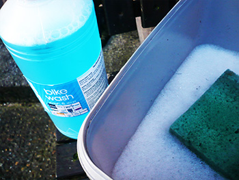
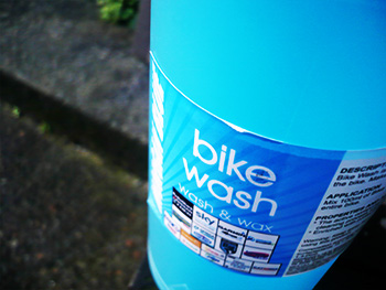
there's no doubt that, as is reputedly the case for the professional mechanic, lashings of soap and water would have had the desired effect, but in this particular case, i enlisted the aid of that morgan blue chap who so kindly supplied chamois cream only moments ago. this assistance was two-fold, stage one living up to the descriptive colour in the shape of a one litre bottle of clear blue liquid bike wash.
according to the instructions imprinted on the label, one ought to splash 100ml into ten litres of water. however, rather than an entire fleet of bicycles, i had only one chris king cielo clamped within the workstand, and such a quantity seemed a tad excessive for my requirements. so i resorted to guesswork. filling a bucket half full of warm water, i added a couple of capfuls of bike wash to move onto the next part of the equation. unfortunately, it seems my guesswork is not metric in intent, and i ended up with rather more bubbles than i'd bargained for.
however, an excess of foam is never a truly iniquitous problem, for i think it likely the bike can only be cleaned skin deep. mrs twmp's childminding kids would have enjoyed the overabundance of bubbles. since the agricultural nature of the island is unlikely to keep the frame and now shiny rear spokes in the manner to which they hope to become accustomed, i would surely bear no criticism were i to have stopped at that point. and as a product of belgium, a country i have unilaterally twinned with the hebrides, it would surely be used to the consistency of grit disguising the cycle formerly known as cielo. it may not have resembled sir bradley's tour winning velocipede at each stage start, but it was a darned sight cleaner than had been previously the case.
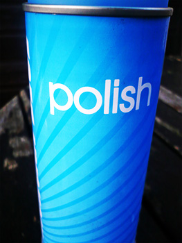
but morgan blue was not content to leave things as they now were, for cuddling up to the one litre bottle of bike wash, was an aerosol can of bike polish. surely the ideal companion and an inseparable pair? having allowed the frame and odd bits to dry, after removing the remaining soap bubbles, it was a simple matter to spray everything in sight, careful not to get any on the wheel-rims and brake shoes. it is then a simple matter of grabbing a nearby cloth and shining every bit of my beloved bicycle. the results were impressive to say the least.
i have now promised self and morgan blue that i will not allow this situation to repeat. as often as possible, i will use shine as my mantra. and when i get one of those roundtoits, i have every intention of moving onto the next stage, by taking advantage of some morgan blue chain cleaner and lube.
much as i hate the cliche, might i impress upon you to watch this space.
belgium's morgan blue offer their one litre bottle of bike wash for only £9.95 and a 400ml aerosol tin of polish at an rrp of £9.99.
wednesday 20th february 2013
rotor spray
i'd love to say that 'm not nostalgic, for i think it's probably quite trendy to be of such a mind, but in truth i'm as prone to discussions and thoughts about the good old days as anyone else. in my role as percussionist of the county, i played at a double birthday the other evening, two celebrations that gave cause for concern. one birthday was that of an eighteen year-old and the other a fifty year-old; an incongruous and seemingly unresolvable clash one would have thought.
thus, in the process of hedging their bets, the organising family had booked those of us willing to encourage flailing limbs all across the dance floor in some resemblance of traditional scottish dance, along with a disco comprised of more speakers, amplifiers and lights than possessed by the grateful dead in their heyday. rather surprisingly, it worked remarkably well, a statement that could not, in truth, be applied to the on-stage sound mix.
however, all those speakers and computer controlled flashing lights made me yearn for a nostalgic personality, because that level of thudding bass when the disco took over, all but obliterated the record that was apparently being unidentifiably played. oh for the good old days of motown, stax and parlophone vinyl, where it was technically impossible to cut the grooves wide enough to sustain that painful level of bass response. digital has, in my considered opinion, a great deal to answer for.
and nostalgically speaking there are features of cycling that, if not the subject of subtle degradation, are perhaps no longer to be seen at all. as i'm sure i have mentioned on more than one previous occasion, i have a stunningly hefty, yet rudimentary tool for effortlessly removing the inevitably well stuck fixed cup, once a beloved accompaniment to the square taper bottom bracket. and oh how we revelled in the introduction of the splined isis development, one that inevitably brought with it the requirement for at least one more workshop tool.
few will raise an eyebrow at my recent discovery that the very tool kept for the purpose of removing the crank bolt from a standard square-taper, had not, in fact, been seen for at least a couple of years. and during those 24 months, it has not been missed. crank affixation such as this has entered the annals of history and thus subject to nostalgia.
disc brakes do not, as yet, feature even on the periphery of such thoughts of yesteryear.
as more or less compulsory contemporary affixation on mountain bikes, disc brakes are accepted as the norm. and if the american influence has its way, there may be more of the euro pros on the cyclocross scene swapping cantilevers for at least cable-operated discs come october this year. but meanwhile, the union cycliste internationale have yet to cave in to the inevitable pressure calling for the allowance of discs in road racing circles. i still have my (serious) misgivings over this development, but there's no chance whatsoever that pat mcquaid is going to call asking for my opinion on the subject, so, like everyone else, i'll have to put up with whatever they eventually decide.
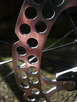
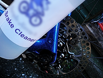
however, perhaps in a foretaste of what is to come, those in a better and independent position to prepare have already begun to countenance that which is already a permafix in offroad, a strong likelihood in 'cross and possible hell on earth in the world of professional road racing. a well known hippo, with a highly favourable reputation in all matters pertaining to the cleaning and fettling of comtemporary and vintage bicycles, no matter their individual constitution, has had his eye very firmly on the rotor.
purely in the interests of research i have in my possession a disc brake cleaner, a pre-production sample if you will, which has made its way to thewashingmachinepost workshop for extensive testing.
although on the surface this may appear as a rather irreconcilable quandary, fortuitous circumstances have smiled upon my faux professorship. for though not a single velocipede in my possession has anything other than cantilevers or dual pivot calipers, luck has dictated that i am currently the temporary owner of an hydraulic disc equipped colnago. there will be, in the fullness of time, a rather lengthier dissertation on the efficaly of such rotating perforated steel, but for the time being, the present onus is on keeping them shiny, efficient and protected from the elements.
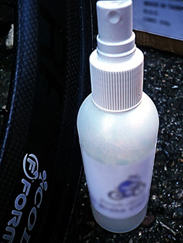
it would not be unseemly to consider the portended benefits of such a spray-on liquid, for, one would think, even at the speeds managed by yours truly, surely their rotating mass and need of passing a couple of friction pads on a regular basis would keep them free from unwarranted detritus? perhaps so, but one need only power through grit laden puddledom to hear less than subtle scraping for one or two metres after the event; that cannot be good.
and though i'm sure you will read not a word of it in the marketing blurb preparing us for the great disc transition, those rotors squeal like banshees when cold, wet or both. i am insuffciently appraised of disc brake technology to pinpoint the exact reason for this state of affairs. it may indeed be simply the cold and the wet, but for whatever reason, it is publicly embarrassing, especially when riding near ten thousand pounds worth of bicycle. it really ought not to happen in my opinion.
this particular disc spray is as kind to friction brake pads as fairly liquid is to housewifely (or househusbandly) hands. its evaporative qualities mean that it causes no discernible reduction in braking power if even for a matter of mere seconds. secondly, it shines those rotors to the level of a shaving mirror, while removing any stray particles of grit that may have inadvertantly adhered to the surfaces, both back and front (or verse and obverse to be technically correct).
squeal reduction did initially seem to be quite favourable, and perhaps repeated use would make serious inroads to such audible embarrassent. however, i cannot deny that it took only a few cold kilometres and a smattering of puddles to restore volume to full flight. that might just be a cross the professionally hydraulic racer has to bear.
as mentioned above, my review sample exists currently in prototype format only; the label is devoid of instructions for use, though i have my sources. on the surface of it (see what i did there?) this particular disc cleaner is pretty darned toot'n and, if we all shout loudly enough, ought to be coming to a set of rotors near you in the foreseeable future.
perhaps by that time, we'll all be nostalgic for calipers.
tuesday 19th february 2013