
..........................................................................................................................................................................................................
ride 2: more short fiction about bicycles
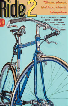
it has been said, more often than once, the there is a novel inside each and every one of us. i am not in any position to deny that such is the case, though thinking of one or two of the folks in my acquaintance, i'm not sure i'd like to read the results. it is, may i venture, even an outside possibility that i myself might be capable of writing an entire novel, but i can assure you it is an eventuality that will not come to pass.
several years ago, having had the cycling on islay section in place on thewashingmachinepost, i had every intention of re-shuffling the words into something more akin to a book, even though it may be more likely to remain as a pdf than ever see the inside of a printing press. however, though i can think of one or two who might beg to differ, cycling a bicycle on islay is not a fictional state of mind. were it to achive print status, it would not be filed under fiction in any of the sections in waterstone's or amazon.
i hold the same concerns regarding the commencement of a work of cycling fiction as i would apply to writing a song or drawing a cartoon strip; the stream of consciousness would dry up before the end of even one chapter. how embarrassing would that be? imagine announcing to friends and colleagues that 'twould be only a matter of months before they would hold in their grubby little paws, a work of cycling fiction that would alter the genre entirely. then by the end of week one to be sat facing a blank page on the macbook air.
however, perhaps my metier remains firmly in the world of the non-sensible, able and willing to impose daily dissertations upon an unsuspecting readership but of a non-fictional nature. which, in a nice, cosy, comfortable sort of way, keeps me on the straight and narrow. thankfully, however, there are those in that great big world out there who are afforded writing abilities beyond my ken, folks who can turn their pens to the art of storytelling in a manner that will benefit the cycling race.
keith snyder is editor of the perhaps less than imaginatively titled ride (if only because there are so many other cycling publications with a similar title), a compendium of cycling fiction that has now reached issue two, and available for kindle, ibooks, nook and kobo. i was almost afraid to commence reading this issue (having been culpably unaware of issue one), purely on the basis of having come across so-called cycling fiction on previous occasions that made me physically cringe. it seems often that the writers of short stories about cycling know plenty about their chosen activity, but pretty much sod all about writing or the civilian world in general. when considering the 147 pages of ride i need not have feared.
this stuff is brilliant. how can you not empathise with contents that open with the following phrase "For anyone set free by two wheels and their own power, especially if you brought along a Thermos?
in order to cater for those with an interest in quirky fiction, but who may not be possessed of a cyclopaedic mind, prior to delineating the chapters contained within, there is a glossary of bicycle terminology. one or two of these display a delightful humour; "tailwind: Fictitious explanation for times when you can go much faster and stronger than usual. Used by people jealous of your sudden natural ability". by this particular point in proceedings, i was already well and truly sold.
but truly the very best part about this collection of ten stories is their innate and astounding ability to have us cycling obsessives become aware of the world that might surround our self-built cul-de-sacs. for i truthfully relate that had one or two of these been not a part of a volume subtitled short fiction about bicycles, the inclusion of a bicycle somewhere amongst their paragraphs would have seemed all but incidental.
subtly clever.
polo by eric neuenfeldt is, indeed, about bicycle polo, but then again, it's not really. bicycle polo is the setting in which the story is placed, and it is a regularly referenced subject, but truthfully, the narrative subsumes its topic beautifully. this is followed by a short story entitled ulterior motives by barb goffman, and without re-reading, i believe a bicycle only makes its presence known once, or perhaps two times. so can it truly be referred to as bicycle fiction? of course it can. the bicycle is not the be-all and end-all of daily life.
i will confess that the only name inscribed upon the cover instilling any recognition was that of taliah lempert, she of the infamous bicycle paintings. she has not only provided the cover for issue one, but also for the present issue along with the chapter headings and tailpieces. the authors are completely unknown to me, but in terms of the quality of writing, this is a mere bagatelle.
keith snyder, who edits each issue, contributes a poem entitled the rambler. i am not, as i may have informed previously, particularly enamoured of the poetic realm, but as one of three poems included in this issue, i rather enjoyed it. and i enjoyed one of its two companions; passing thoughts, by nigel greene.
Don't feel bad.
I've been training."
each story is short enough to devour at a single sitting, and if you're a non-sequential sort of person, there's not even the need to read them in the order in which they are presented. if you, like me, have been previously bitten by worthless bicycle fictions, allow me to present the antidote, one that will have you e-mailing mr snyder impatiently enquiring after the publication of number three.
a triumph.
ride 2 is currently available for kobo, ibooks, kindle and nook readers. there will be a print version arriving in january 2013.
Gnats top out at 5.5 mph.
This may be useful to you
at some moment
on hills
in the summer.
tuesday 18th december 2012
 ..........................................................................................................................................................................................................
painting by numbers
when my brother and i were (a lot) younger, we used to pester the living daylights out of our parents on a regular basis for those grey plastic airfix kits, leading to hours of sticking bits of that grey plastic not only to other bits of grey plastic, but also to unfortunate areas of the bedroom carpet. over the ensuing days, odd parts of fighter aircraft could be discovered in the strangest of household locations. i think on one or two occasions we may have been in receipt of royal navy destroyers and the occasional frigate, but for the greater part, the dramatically decorated boxes contained aeroplanes; fighters, bombers, biplanes. you get the picture.
though each box contained appropriate instructions on how to correctly assemble each model, including just where and how to apply the decals, as i recall, there were underlined remonstrations that each part ought to be painted prior to assembly. but that would have entailed owning the necessary tins of humbrol enamel in the first place, something that would have extended the purchasing budget over the amount allowed by conscientious parents. and over and above that, which child of a certain age is going to carefull apply one or two coats of enamel paint and wait at least 24 hours until dry, before letting loose with that small tube of polystyrene cement?
(did anyone else put a pin in the nozzle to prevent unnecessary egress of adhesive at inopportune moments?)
it doesn't take too much of a stretch of the imagination to realise that once the clear plastic cockpit was glued in place, the pilot would then remain forever grey in the face of all-over camouflage. the impetuousness of youth. though not wishing ever to admit to such a faux pas in the paint application department, i remember my brother, in the absence of the recommended enamel colours for camouflaging a lancaster bomber, opted to paint the wings and fuselage with the oil paints that form a part of a painting by numbers set. because he could.
i think we're all adult enough to know that this was not the most prudent of decorative choices, for oil paints designed to emulate the great masters are comprised of linseed oil base, one that is absorbed by the canvas board on which they are designed to be applied. strangely, grey plastic has no absorption properties whatsoever, meaning that this particular lancaster bomber had a propensity to cover eager little fingers with green and brown coloured paint over the succeeding weeks, until a well-meaning parent pointed out the error of our ways. for though i cannot be held responsible for applying the paint, i was complicit in letting my (younger) brother do so.
a handy lesson to learn at such an early age, that not all paints were equal, and that, depending on the purpose, several technical choices were available to be made, preferably by more experienced recommendation. which rather neatly leads me to explaining why you shouldn't attempt to refurbish an elderly bicycle frame by means of felt tip pens and coloured wax crayons.
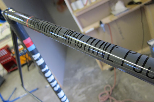
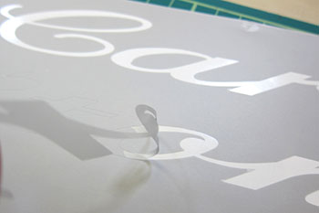
steven and russell at shand cycles maintain a particularly well-stocked series of flickr pages, something that seems inherent in the make-up of many a framebuilder. they're pages that i have occasion to wander aimlessly through from time to time, if only to kid myself that i am conducting professional research. mystified to find photos of the lettering process for an italian brand of bicycle, i thought perhaps steven and russell were contracted to build these for the manufacturer, something that would have been most worthy of a few pixels. as it turned out, russell was in the process of restoring the original frame with delicately masked lettering to reproduce the original decals.
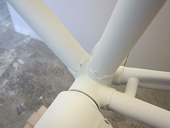
the fact that a scottish framebuilder was not only equipped to paint its own frames and offer quality resprays seemed even more deserving of pixel space, so i made further enquiries. the result of all this too-ing and fro-ing was the following e-mail: "Just a thought. Do you have a frame than needs a bit of tlc? Rather than just sending you a bunch of words and pics, if you send us a frame that needs some work, we can refinish it for you, take loads of pics and document the process.". which, of course, is exactly what transpired.
the frame in question was a 1960s steel carlton road bike, originally belonging to the mighty dave t, but which had sat in thewashingmachinepost bike shed for many a long year, ignored and unloved. the perfect example for the subject, one which was duly packed up and sent out to livingston.
high hopes were slightly undermined by the following communique from russell stout, shand cycles partner and expert painter. "After your chat with Steven we thought it would be a good to show how paint can highlight a quality frame. However, looking closely at the frame, we're not sure the build quality will lend itself too well to that approach." but it did get slightly better. "Instead, I'm wondering how you might feel about using the exercise to instead demonstrate an approach to a paint design? We'd still aim for a high quality finish, but the emphasis would more be on the paint design rather than the frame."
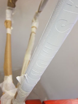
since the purpose of the exercise was to allow shand cycles to demonstrate just what they could do with paint and steel, i had no objection whatsoever to this slight change of trajectory, following which i was sent four variations on a theme from which to choose. always a sucker for a good script, i was rather taken by russell's variation on the original carlton script, so we opted for that version on a mid-grey base colour along with some delightful if quirky details. i should point out at this juncture that all the lettering on the finished frame is applied with paint through some sophisticated masking. there are no decals on any of the tubes.
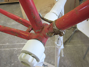
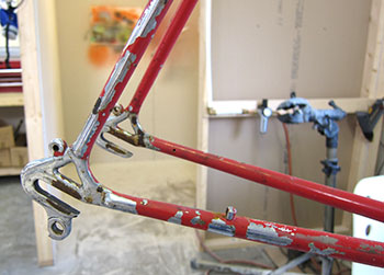
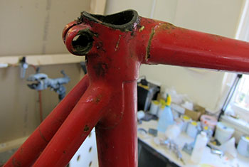
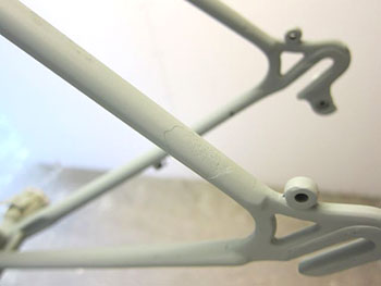
russell described the basic overall procedure of their two-pack paint system thus: Acid etch primer; Filer/primer; Base colour and applying masks for graphics/other colours; Clear lacquer. the actual process breaks down in the following sequence. the frame was first bead-blasted with aluminium oxide to remove any surface oxidisation and provide a key for the primer, before application of a degreaser (any grease from fingers is bad). the tubes were then wiped with a tack cloth to ensure no fluff from the degrease cloth remained. this is followed by an application of etch primer, used as a base layer and to prevent oxidisation.
the next stage involved the application of filler/primer directly after the etch primer. this provides a base for the colour and covers any minor imperfections that might exist in the build. (You can see from the images above that corrosion on the frame had left quite large pitted areas that the primer subsequently smoothed out.) the primer was then rubbed down with 600 wet and dry, scotchbright, and again degreased and rubbed with tack cloth, before application of another coat of primer. this second coat of primer was again degreased, wiped with tack cloth and the base colour applied as well as the masks for the graphics. the base coat tends to dry quite quickly allowing almost immediate lacquering.
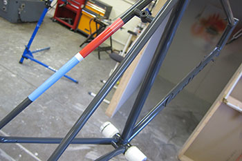
the first coat of lacquer was then rubbed down with more 600 wet and dry and scotchbright befroe a second coat of lacquer was applied. any dust specks were removed with 2000 wet and dry, then polished out with a mini polisher. at this point, mechanical considerations needed to be taken into account by preparing the bottom bracket and head tube faces. finally the whole frame received an application of wax and frame saver.
according to russell "The most important thing is prep, cleanliness and attention to detail. Good hand control is needed for the spray gun, but most of the work is actually involved in the prep and rubbing down between coats to get a good even surface and key for the next layer to adhere to.
That's the aspect that takes most of the time in achieving the desired finish. I also try hard to reduce the appearance of ridges around the edges of the graphics, so there's a bit of planning about the best order in which to put down the colour, minimising full masking between colours and the paint thickness. I actually find the masking of graphics and painting quite easy, but applying the lacquer is quite tricky and you need to be 'in the zone' to get a perfect finish. It's a bit of a challenge to paint a tubular structure and not get runs or overspray as you work around the frame and the laquer starts to go off.
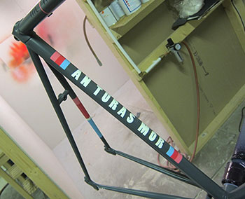
written and described as such, the process sounds like a simple following of instructions similar to the painting by numbers set mentioned at the top of the page. however, if you've ever attempted to create a meticulous finish on one of those airfix kits, a far less onerous task in my opinion, you'll know that simplicity is not one of its finer points.
i currently have the frame and forks in my possession, still safely in the box in which they were delivered. over the course of many, many years, i have received a goodly number of bicycles for review, most all of which are wrapped in pipe insulation and copious amounts of bubble-wrap, but never ever have i received anything so meticulously wrapped as the carlton. each length of polystyrene pipe wrapping was held in place with a couple of lengths of masking tape, the end of each of which was folded back on itself, making it simplicity itself to pull each piece to reveal the frame. that's what i call attention to detail.
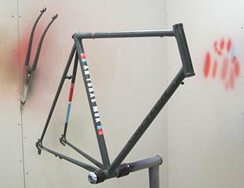
the frame is beautiful. there is no way on this earth that the mighty dave would ever recognise it; in fact, even its own mother would pass by in the street without so much as a nod of recognition. the top tube bears the finely detailed lettering defining the name of this website, while the downtube displays that beautiful carlton script. the seat tube features the words an tubhas mor, a gaelic phrase culled from the bruichladdich distillery website meaning the big (or long) journey. the name carlton is emblazoned vertically in block-style lettering on the head tube.
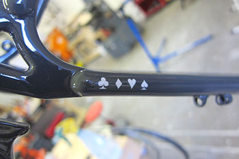
the left seatstay bears hoops of blue, red and pink as occasionally used by a well-known cycling apparel provider, and rather eccentrically, the right-hand chainstay features a tiny sequence of card suits: club, diamond, heart and spade.
as mentioned at the outset, the original carlton frame hails from the 1960s and was thus equipped with downtube braze-ons. however, this is now the 21st century and it would, i fear, be somewhat incongruous to maintain any degree of retro-ness in the face of brake lever shifting. therefore, prior to all the above taking place, shand cycles removed the lever braze-ons and replaced them with cable guides. the existence of threads on the fork steerer will necessitate a modicum of yesteryear in the shape of a quill stem, but i think it likely that there's something ideal from nitto sitting in london's tokyo fixed. additionally the slotted cable guides across the top of the top tube were replaced with more contemporary cable stops.
there was never any intention on my part to simply leave the carlton as a beautifully painted frame, taking it from the box to show eager admirers every now and again. this needs to once again to take to the roads in all its modern-day splendour, and i will undoubtedly return to the build from time to time over the next few months.
craftsmanship of the highest order is undoubtedly alive and well, living in an industrial estate near edinburgh.
more photos can be seen from this project on the shand cycles flickr site | shand cycles
work such as that detailed above would cost between £220 and £250, but current demand for shand's own output means any prospective customers might have a bit of a wait. however, there's no denying the skillset available, one which also features on a skinnymalinky, stoater or stooshie.
monday 17th december 2012
 ..........................................................................................................................................................................................................
inside out by tom southam and camille mcmillan. sharp uk softback 170pp illus. £10
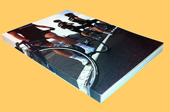
"...after my first two months of racing, I felt I was trying so hard, I was 'literally turning myself inside out'
preofessional cycling nowadays has become an alchemy of art and science, such is the constant need for incremental improvement, sometimes only to stand still let alone garner a lead on the competition. at this level, it is often easy enough to see the art in the science, but i confess to being left in obscurity as to any perception of science in the art. however, dave brailsford's renowned 'marginal gains' must surely have been adopted in some manner or other by team sky's competition in the heady world of top level cycle racing; it would almost be rude not to. this could even be seen in the placid attempts to invoke the sky promulgated warm down; clambering aboard turbo trainers post stage in a similar manner to track riders who ride road bikes slowly round the infield.
whether there are any serious gains to be had from so doing, nobody apart from tim kerrison can truthfully answer. the riders, including brad, likely do just exactly as they're told. it's a faith thing, i should imagine.
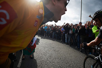
for all the books that exist to tell the inside line on the whys, wherefores and grubby little secrets of a professional cycle team, there are few which have the appropriate ring of authenticity. most of us are acquainted with the lack of personality, restriction of expression and downright ineptitude of the modern footballer when put on the spot, even at a regulated press conference, while professional cyclists come across as far more erudite, often in more than one language. yet when it comes to writing their autobiographies few have the temerity or penmanship to do so alone. all those self-effacing chapters seem to lose something in the translation.
tom southam, however, has an intriguing advantage, of which few of his peers seem to be in possession. in this profession, intelligence is not a singularity, but judicious use of it seems a tad more sparing. using this intelligence to put pen to paper (a bit of artistic licence in this day of the word processor) yet still tip the fol de rol to one side are undoubtedly skills to be applauded. tom's approach to writing errs on the eccentric in an absorbingly endearing manner; his pages are almost worth reading purely for the pleasure of his written word; the fact that they regularly concern cycling is simply a bonus.
in the book under consideration, the fact that mr southam was a previous member of the rapha condor sharp racing team, has him ideally placed to understand the world of his young subjects.
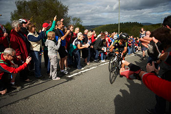
for inside out is a truly exceptional peek into the world of the rapha condor sharp team (as was) during the first year of its altered strategy, catering for new up and coming british talent. the team benefited greatly from the directorship of john herety, the man in charge when its more senior riders were winning many of the prizes on offer during the first two years of sharp's sponsorship. the man at the top was aided and abetted by dean downing, kristian house and james mccallum, three riders who had played a winning part in those early years. southam's narrative relates, interviews, describes and disseminates in equal measure, the trials and tribulations of those who had been dropped from a great height into a brave new world.
man, however, cannot live by means of words alone, and i think southam's off-beat style is superbly matched by the erratic and thus glorious photography of the inestimable camille mcmillan. in comparison with the many other photographers of whom i have had the great good fortune to meet, camille's almost laissez-faire approach to image capture is disarmingly impressive, resulting in photography that seems almost accidental; but brilliantly so. i have no wish to come across as a sycophant, but the pairing of southam and mcmillan, at least with regard to inside out probably could not have been bettered.
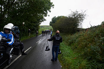
the life of a professional cyclist is one that many will have mulled over at some point in their cycling lives, even if the chances of its happening are akin to being elected prime minister. viewed from the selectivity of the television cameras, it often seems undeniably glamorous, even when grimacing on the upper slopes of the ventoux, or being battered by the elements in the four days of dunkirk. the reality, and you know we all know it, is substantially different, something that the new recruits to rapha condor sharp were in the process of discovering in 2012. though southam could indisputably sympathise, on reflection, it's the lack of this that emphasises the rawness of inside out.
"That year I went to Italy and I experienced the usual shock; going from Britain, being dead good, to going to Italian amateur races...Because I weighed 60 kilos, I just had the image in my head that I was just going to fly up climbs. I ended up doing 22 races all year; I didn't even finish my first four races. I just thought, what is all this shit about?" tim kennaugh.
yes, southam offers a brief insight to his own early years as a pro, but the interviews display no sign of a "don't worry, you'll be fine" palliative. even the interview questions themselves are often a little left of centre: 'do you think being a bike rider makes you antisocial?' what greeting do you give other riders when you see tham on the road?' and 'do you take pictures of cups of coffee?'
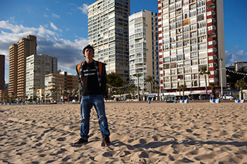
there are chapters devoid of words. ireland's the ras is encapsulated by camille mcmillan in six images that i guarantee none of us would have even considered taking in the first place. the section on the tour of britain is as eclectic a selection of words and imagery you will ever come across in a book about cycling, simultaneously paying a lasting tribute to the final days of rapha condor sharp (sharp have now transferred their allegiance to the garmin team for 2013, replaced in the black and pink by jardine lloyd thompson). the mix is impeccable.
"The Tour de France is kind of like the Beatles. Occasionally, when circumstance, history, economics and the fickle but formidable power of the media combine, things don't just get bigger than the sum of their parts, they get so big that the parts are barely recognisable."
so commences the chapter concerning garmin sharp's dan martin. though ostensibly about rapha condor sharp, the sponsor's dictates undoubtedly pointed in the direction of their future while recording the past. the comparison, in the context of inside out is remarkably well made, for here surely is the pinnacle of any rider's career; to compete in the tour de france. as southam continues "The Tour is the dividing line that separates all professional cyclists. At first it divides those who have and those who haven't. And then it divides those who can perform on the biggest stage of all, and those who can't."
contrast and compare that with a caption accompanying mcmillan's image of a despondent looking ollie rossi who abandoned the 2012 national championships after covering less than half the distance. "The National Championships in late June was the last race he would take part in as a member of the (Rapha Condor Sharp) team in 2012. Time will tell if the 19 year-old can return to continue toward his aim of reaching the top of the sport." same sport, same ambitions mediated by a huge gulf. southam has a strong sense of perspective.
all the while i have been praising the efforts and results of the southam/mcmillan pairing, it would be particularly remiss to exclude the endeavours of sharp electronics. for not only were they willing to support rapha condor's avowed aim of developing young british talent in the face of almost certainly reduced victories through 2012, but apparently had the perspicacity to commission this book as testament to that which has been achieved and will hopefully continue to do so under the succeeding sponsor. there are surely far more formal and corporate ways of underlining company sponsorship, that would skew the contribution more towards the efficacies of largesse rather than this unexpectedly apposite and insightful document.
how many international companies do you know of that would allow a chapter to be entitled 'Sometimes things are just fucking shit' in a book that bears their corporate logo? additionally, they've let designer andrew diprose (the ride journal, wired uk) put the title on the back cover. brilliance.
"The National Championships is the race that can make a career, or make for a career of frustrations, but it is as unavoidable as it is desirable and as difficult as it is different."
sunday 16th december 2012
 ..........................................................................................................................................................................................................
the little people
i'm sure i have broached this subject before, but since it's one that continues to niggle even after several decades, i feel it does one good to vent forth every now and again simply to let off steam, even if you are the unfortunate recipients of said evaporated water.
as graphics students, we were encouraged to scribble anything and everything in one or several notebooks; ideas that may occur in those singular moments, influences that may have made themselves known and possibly the odd copy of an artwork seen in the local art gallery. some of my peers were not overly impressed with this directive and avoided any form of sketchbook at all, though the majority, including yours truly were quite happy to while away those idyllic moments by penning our creative thoughts on blank sheets of paper.
since my schooldays i had been enthralled by cartoons, animations such as bugs bunny, road runner, top cat and even yogi bear. however, my more constant sights alighted upon the peanuts cartoons as drawn by charles schultz. i still own a substantial row of volumes that occupy a bookshelf on the upstairs landing. aside from the humour, i was most impressed by the manner in which schultz was able to encapsulate a wide range of human emotion by a few strokes of his pen. many of our life classes seemed to occupy themselves with a myriad of graphic marks simply to recreate that which was set before us, yet schultz could seemingly achieve the same with an absolute minimum of marks.

i found that impressive.
therefore, a substantial percentage of the pages in my own personal sketchbook were given over to copies of charlie brown, snoopy, linus and peppermint patty where a particular expression had caught my eye. when time came for the annual assessments of our work, we were asked to include this personal sketchbook along with the required work, for adjudication by our betters.
it was a somewhat despondent graphics student that entered the assessment room the following day to find pages torn from this personal notebook, pinned to the wall and accompanied by a handwritten note; 'a bit less of this please'. surely even one's lecturers were not in any position to dictate that which was incorporated in a personal sketchbook? apparently so, it would seem.
though i have dabbled in cartoons of a purportedly humorous nature periodically in the intervening time, rarely for financial gain (though i did try regularly to have work accepted by punch magazine without success), i cannot truly attest to having made that dabbling serious in any way. yet, there are those who spend their professional careers making real animation, either by stop frame, computer or so-called onion-skinning, and every now and then, i envy them, because the idyll would have me sitting at a large wooden table overlooking an immaculate rural scene, all the while drawing impressive cartoon characters. wouldn't that be endless fun?
well, in much the same way as being in a rock'n'roll band, negotiating endless tours of america's holiday inns seems glamorous from the outside, continually producing an endless stream of impressive caricatures is not the easy run it purports to be. i confess to having avoided embarking upon any form of cartoon strip in case the ideas dried up after only a few days. who would have looked a right prat had that come to pass?
there are, however, a modest number of talented professionals in this world who continue to produce cartoons that are every bit as good as those offered by the late charles schultz, and it is much to our benefit that at least one of them has a penchant for the world of cycling. richard mitchelson is well known to many, initially through his race footage cartoons that inhabited pages in rouleur magazine. the success and popularity of these led on to a series of posters, t-shirts and mugs, many of which, most notably that of tour winner bradley wiggins, have disappeared off the rouleur storeroom shelves faster than a mark cavendish sprint.
richard's metier, however, at least until now has solely occupied the two dimensional space provided by the said posters, pages, mugs and t-shirts, an art space for which it must be said, they are beautifully apposite. however, part of the mystery of effectively flat artwork is that of the planes that remain hidden. we cannot see the back of bradley's head, nor do we see his profile. in fact, mostly we are treated to only head and shoulders plus a smidgeon of jersey. the hidden parts are, quite delightfully and imaginatively left to our own invention, and in that, each of us will hold a unique vision, probably not even close to that of mr mitchelson himself.
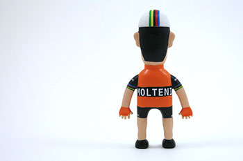
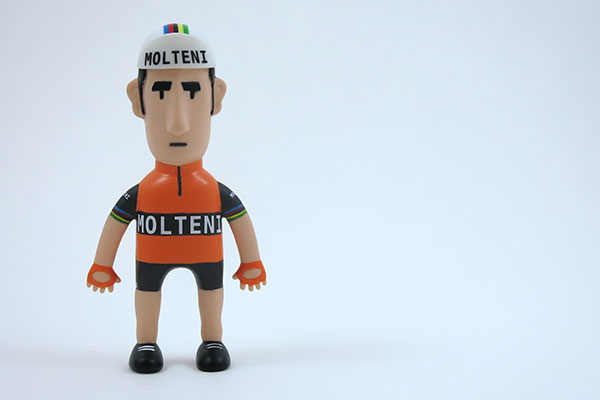
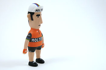
richard has, somewhat unexpectedly, now broken free from the two-dimensional restriction and provided those hidden views in vinyl 3d, brought to life in his latest eddy character now available from rouleur. having described at least a few of my own pathetic attempts in the illustrative sphere, relating those to three dimensions was always going to be fraught with despair. did richard find that a problem, given that much of his work seen to date has been in 2d?
"As most of my work is pretty flat, even for 2D work with few or no shadows etc., it was really exciting to see the first sculpt from the toy makers. Imagining the characters in 3D just seemed like a natural progression. I've been drawing in this way for some time and I know how things would look in my head before they go down on paper or onto the computer screen. But that first photo we got back really blew me away. It was the realisation that this was really happening."
assembling for the print process, whether destined for paper, porcelain or cotton, varies not a great deal when it comes to preparing artwork, often simply a case of rendering into cyan, magenta, yellow and black to allow colour separation at the print stage (whether litho or screen) and e-mailing a pdf to the printer. three dimensions, however, would seem to exaggerate the possibilities of disaster. i mean, how on earth does an illustrator present artwork to the manufacturer for a six inch vinyl caricature?
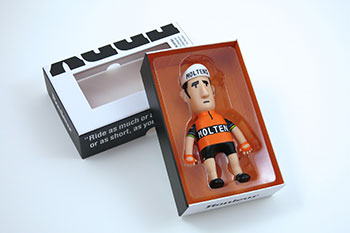
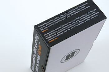
"The process has been made pretty painless for me by the guys at Rouleur Magazine and the brilliant people at the toy manufacturers we worked with. They were highly skilled and clearly dealt with artwork of characters all the time. I sent them a turn-around drawing of how I wanted things and they took it from there and created the first sculpt. Finding the right people to work with and then the correct material for them to work in was key. When you have confidence in the whole process it makes things run more smoothly."
my original introduction to the work of richard mitchelson was via a flash animation of eddy posted on his website, in requisite orange molteni jersey, pedalling his bicycle. i believe the object of the exercise had been to explore the drawing required to render a smooth and realistic pedalling style in two dimensional animation. in this, i think it succeeded. three of richard's portrait caricatures occupy pride of place in debbie's cafe, bruichladdich, including that of eddy, but from there, richard has expanded his peloton to include, anquetil, hinault, pantani, coppi, millar and several others, including the previously mentioned team sky riders. as the first three dimensional figure is again personified by eddy, will there be an ever expanding number of his peers and descendents?
I'm not sure, to be honest. This is the first one and I guess it's testing the water somewhat. I'd love to do more; as I said it's great to see the work in 3D and hold it in my hand. So far the response has been really strong and people seem to like it a lot. I'll keep my fingers crossed."
it is something of a truism that those involved in any form of personal project rarely see it from any other perspective. this can mean several years deeply involved in the minutiae of one thing or another and becoming blissfully unaware of how it has informed that to which it is related, and quite often just how far it has developed as time rolled by. from those early beginnings in rouleur through to mugs depicting team sky members and olympians then onto an vinyl eddy figure, has this all taken on a life of its own?
"I guess it has, and hopefully it will continue as long as people enjoy the work I create. When you look at things written down about what I've done it's kinda mind blowing. I started working with the mag in 2009 and I still recall my first meeting with Guy in a cafe in north London.
I work full time for Mind Candy as their Senior Animator on the kids website 'Moshi Monsters', meaning life is very busy. I create all the illustration work for cycling at evenings and weekends, but I wouldn't have it any other way; I love my job and the fact that the illustration work is going so well, is a huge bonus because I'm just a massive cycling fan."
some folks are just unstoppable, though as most of us know, it takes many a long year to become an overnight success. what's in the next chapter of richard mitchelson's plan for world domination?
"As long as I can keep a smile on people's faces with the work I create, I'll be happy. I'm planning on creating some new work for Rouleur next year and it might be a bit of a departure from the vector art style you've seen so much of. I use a lot of thick marker pens for my sketching; I love the instant bold marks they make. So I might go down that route; more like a traditional comic strip. But we'll see. I'm really hoping to keep creating work for Team Sky and British Cycling. As I said earlier, I'm just a cycling fan."
saturday 15th december 2012
 ..........................................................................................................................................................................................................
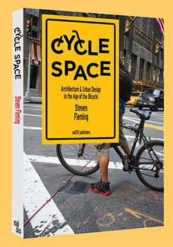
cycle space - architectural and urban design in the age of the bicycle by steven fleming. softback nai010 publishing (rotterdam) 176pp illus 19.50 euros
"Places have more life, not less, when cyclists are encouraged to ride to them and through them; and they threaten nothing."
many years ago, i had a gentleman visit the office on behalf of some well-meaning and well-funded access group to enquire after my thoughts on cycling facilities on islay. considering, at the time, there was pretty much only me riding the highways and byways around the principality, not only did i think it an unnecessary question but was more than intrigued that they were asking it at all. though there has been an increase in the numbers visiting whisky heaven in the intervening period, a busy day on islay would look like an empty street on the mainland; aside from the odd idiot in a motor car, it's a perfectly safe venture to go bicycle riding on islay.
not unnaturally, i informed the young gentleman that i could think of nothing that i thought necessary to ease the pain and suffering of the indigenous or visiting cyclist, an answer that was apparently not in the plan. this i assume because he then offered a number of suggestions as to what might be just what i was looking for: cycle paths, specific signage and one or two other alternatives. not wishing to be held responsible for having money spent on unnecessary bits and bobs, i assured him that it would be better placed at the disposal of those who truly had need of specific facilities.
i have no idea whether this advice was heeded, but thankfully, no additional cycle facilities ever appeared (though the council did, for no good reason, erect a couple of cyclists dismount signs at the tiny bridge in port charlotte).
the good that came from this meeting, though not of a tangible nature, was that it was really nice to know somebody had my best interests at heart, even if only because there was a budget that had to be spent in order to justify its existence in the first place. in a world in thrall to the motor car, the fact that anyone with even a modest degree of clout would consider placing the bicycle first was, at the time, something of a revelation. yet here we are, perhaps less than a decade later, and architect steven fleming has put together a particularly thought-provoking book about the relationship between buildings and bicycles.
'Pedestrians too look at cyclists with envy. How could they not, especially when they see us in these revamped former industrial parts of our cities that are so inviting of cycling!
i confess at this point to having prior prejudice regarding the architectural profession, and not of a particularly positive nature. in my art college days, the latter shared campus space with scott sutherland's school of architecture, a building which could almost be seen from the art school. other than that, we of superior artistic powers had little to do with the envisioners of our concrete future, apart from the few occasions on which we shared lectures in the larger theatre across the grass and behind the trees. the display cabinets that lined the outside of the lecture theatre were filled with imaginative technical illustrations of futuristic buildings, yet the figures, cars, bicycles and trees were all applied letraset.
basically speaking, architects cannot draw, leaving us, so we thought, occupying the artistic high ground.
fleming's book cycle space is subtitled architecture & urban design in the age of the bicycle and narrates an enlightening and intelligent treatise on how modern cities pay scant heed to the needs and desires of the commuting cyclist. however, in the process of providing his experienced thoughts on the subject (fleming is a senior lecturer at the school of architecture and design at the university of tasmania where, amongst other architecturally related subjects, he lectures on architectural theory) he seems less well disposed towards the similar needs of the average pedestrian, perhaps encapsulated in chapter one's title why stroll when you can roll?
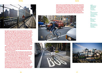
each lengthy chapter is interspersed with what could conceivably be referred to as case studies depicting how well or poorly cycling has fared in some of the world's major cities such as amsterdam, new york, paris, portland and singapore amongst others. these are not only finely observed, they are also appropriately illustrated.
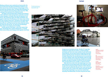
"I appreciate that in poor, lawless cities criminals have been known to push cyclists onto the ground, with the bald aim of stealing their bikes. However, this book is not addressed to such contexts."
honourable and well-intentioned though fleming's treatise might be, and it is a particularly cleverly thought out and supported encapsulation of his ideas, i can't help feeling that steven fleming lives in a world of make-believe. by his own admission, the world of architecture is still heavily influenced by the needs of the motorist and the space required by the motor car, yet each proposition as to how the humble architect may start to disarm this perhaps necessary obsession seems fraught with obstacles. for a start, it would need a high level of international co-operation between highly individual firms of architects. though it is not unusual for an entire street or housing development in even mid-sized towns to be designed by a single practitioner, even fleming must surely be aware that rarely are adjacent tower blocks in a city brought to singular fruition.
i think it more likely that the needs of the motorist, cyclist and pedestrian are shaped by those in the planning offices responsible for each metropolis, while the adjacent buildings have to slot in where required. though the architect can undoubtedly lay claim to influence in the right places (witness the 2010 danish pavilion in shanghai, designed to allow cycling from top to bottom), that is no guarantee of any joined up thinking across the city. for fleming envisages egress and access to modern buildings via cycleways that integrate with a citywide network; surely pie-in-the-sky for even the most vociferous bicycle advocate?
We know this ascension will happen, because cycling addresses so many challenges facing humanity. It reduces greenhouse gas emissions, traffic congestion, traffic accidents and the cost of medical treatment associated with today's sedentary lifestyles. Compelled by these obvious benefits, cities across the industrialized world are developing plans that will make cycling a key plank of their transport strategies."
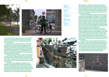
though i'd love to believe that last statement, i have my doubts.
those with whom i share an office would be up in arms if aspects of their motoring centred life were cast aside or modulated to allow for the easier perambulation of the cyclist. i am in the minority as a cyclist, and i have no illusions that this is a situation that will change in my lifetime, and though it may not truly be the case, fleming comes across as one who thinks most of society shares his enthusiasm for bicycle transport. to that extent, there is more than just a touch of the fairytale about cycle space, case studies such as portland, oregon notwithstanding.
however, at the end of all his theorising and postulating, in the final chapter he offers some particularly adept observations as to how we currently design cities to a whole different set of criteria
'The cyclist's point of view speeds up as it goes downhill, decelerates as it rises, leans as it turns and when at speed sees fine-grain detail as merely a blur. Pedestrians plod along at roughly the same speed all the time, regardless of gradient. When designing for people who will be view- ing the world from a bike we can start with the assumption that riders will move on a ground plane designed to optimize the cycling experience. Road design guidelines and even guidelines for the design of bicycle infrastructure are not as concerned with optimizing the cycling experience as with merely making bicycling possible in a world that has been overrun completely by cars. Spaces that are purpose-built for the pure joy of cycling, like velodromes and BMX tracks, provide a more joyful lead to thinking about cyclescapes.'
however, i think it less than likely that architects currently design transport routes to even favour the perspective of the motorist. it would be more realistic surely to accept that things are as they are; cars drive through it, cyclists cycle through it and pedstrians walk through it 'A piazza in cycle space would be shaped like a basin. Freestanding buildings would be located on mounds (doubly useful, as the waterways and flatlands I am proposing we develop for cyclists are often flood-prone). Streets would be U-shaped in section, naturally slowing cyclists as they veer towards the edge and bringing them back to speed as they rejoin bicycling traffic.
We would be looking at a ground plane with no parallel in the history of architecture.
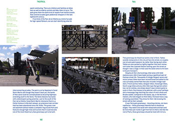
it cannot be denied that all across the world the bicycle is beginning to engender greater influence than has been hitherto the case, therefore if changes are to be made, they have to start somewhere, and someone is going to have to be the first to put their hand up. in which case, i am rather glad it is steven fleming. and it is to his great credit that these ideas for change seemingly pay scant heed to current practicalities and embedded ideologies. rotterdam's nai010 publishing are to be congratulated for giving them houseroom, but i would be even more fulsome in my praise had they paid a touch more attention at the proofing stage.
fleming seems hell bent on proving that not only can architects not draw, but they can't spell either. when describing a steel bicycle of lugged construction, he seems convinced that the joining process is akin to that of cooking beef. richard sachs, to my mind, would never braise a frame. nor are they insalubrious while feeling the lour of former industrial zones. there are others, repeatedly employed, dashing all hopes that they may be singular examples and simple errors. proofing errors such as the above are compounded in the urls listed in the margins. http://www. youtube.com/ watch?v=i99MzGa3Vec contains spaces that ought not to be there; copying this from the e-book version and pasting into the address bar of your web browser will result in an error 404. file not found. not everyone is going to take a second look and amend accordingly.
if you want to believe in hope for the cyclist of the species, particularly offered by one in a position to influence those who may well be able to achieve it, this is a thought-provoking and delightful book. spelling errors aside, it is well written, if a trifle obscure and self-absorbed at times, but nonetheless well constructed and argued. much of the content is theoretical and is likely to remain so, but every now and again, we need someone in our midst to reach for the stars.
'Cyclists could be directed with signs, while drivers would be the ones who are made to fumble with maps a reversal of the situation at present. If I lived someplace cold, I would be witnessing snow being ploughed from the bike tracks and onto the roads. Then I start imagining bike routes that are weather protected, with solar powered fans ensuring we never know headwinds.'
friday 14th december 2012
 ..........................................................................................................................................................................................................
the emperor's new clothes

i am happy and confident enough in my scribblings to be thought of as parochial. i might just qualify that by pointing out that i have been a vociferous negator of such a practice on an hebridean island that seems mired in the folly; in fact, i have all but made it my life's mission to put a stop to any business or organisation with the word islay in its name, from using a map of the isle in the almost inevitable logo.
aside from demonstrating the arrogance of an incomer (which i still am even after twenty-five years of hebridean domicile), there is good reason for my damning of the practice. after having resided here for only a year or so, i was cordially invited to join the committee of the local islay festival, or feis ile as it is more romantically known. this is a festival that has all but been subsumed by the island's annual whisky festival, one which has more or less adopted the gaelic epithet as advised above.
at that time, each member of the committee was required to take on a particular role, for which they would be solely responsible, and given my background in design along with the pretence of being able to write in proper sentences, i elected to be the provider of publicity and copy for the local and national press. as many a press release, even to this day, is less than memorable amongst a whole slew of forgettable press releases, i opted for a slightly different approach that contained my words and information within the confines of a printed card, the outer cover bearing the festival logo.
this latter graphic consisted of (and pretty much still does) a triangle comprised of celtic knotwork surrounding a (i know you saw this coming) map of islay. the so-called press release was sent out to many of the national newspapers in the hope that they might include our events in any festival roundup they may deem appropriate to feature in their esteemed publications. now this was so long ago that the memory is a tad foggy on the specific details, but i think it either the guardian or daily telegraph that responded in the affirmative with regard to inclusion in a future feature, but at the same time, enquired as to just what the green splodge midst the celtic triangle might be?
it was at that point that my reaction to inherent parochiality took one step forward. those of us who live on islay are well aware of its topographical and coastline delineation, but for reasons that are hopefully glaringly obvious, no-one else held the same recognition. hence the splodge. therefore, should an island business or organisation be proffering its services or wares to the indigenous, what purpose was served by incorporating a map of the isle? and should the same purpose be cast further afield, again, why bother; no-one has a clue as to why that particular graphic has been included.
however, in the face of globalisation, something regularly practised by the major sponsors of professional cycling and actively encouraged by the tainted governing body of the sport, a discrete level of parochiality cannot possibly be seen to go amiss.

in the world of rapha condor, sharp electronics are no more. having been well-satisfied by their three years in black and pink, they have moved their sights to more international horizons and pitched their colours on the jerseys of jonathan vaughters' garmin team. as sharp uk's jasper credland wrote me on a postcard 'end of an era, brian'. however, little stands still in the world of high speed cycling, no matter the perceived level of competition, and that includes the financial aspect of putting a team on the road for at least a season or two. thus moving smoothly in to replace the departing electronics giant is the london based jardine lloyd thompson group, an international group of risk specialists and employee benefits consultants which, if i have correctly unravelled the formalities, means insurance and pensions.
and here is where the protected parochiality is allowed, nay encouraged to surface. rapha condor club president, charlie pearch did a modest degree of digging into jlt's past to discover "JLT is actually owned in major part by the conglomerate Jardine Matheson, whose founding partners were two Scotsmen in the 1890s". we are now on sure-footed ground, for two of the rapha condor stalwarts from the 2012 team have re-signed for 2013; kristian house and the inimitable jimmy mccallum. the latter, as i have been at pains to point out perhaps just a bit too often, is the undisputed king of scotland. in other words, jimmy is the current scottish road race champion, and it seems no less than he deserves that this title be observed in the peloton.
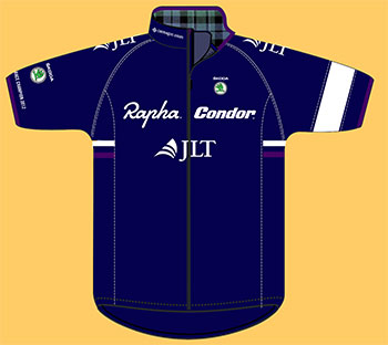
thus it is that the latest rapha condor jlt jerseys, which follow the age-old team formula by adhering to black, pink and white with minimal advertising, have now encompassed a variation on a theme. the jersey that will be worn throughout at least the early part of the king of scotland's season has replaced black with the dark blue of the scottish flag. subtlety has been the rapha condor watchword from the get go, and jimmy's jersey is no exception. allied to the tartan lining on the inside of the collar, there is a white thistle graphic on the rightmost rear pocket, while the pink edging on the sleeves and on the side panel flashes have been replaced with heather purple.
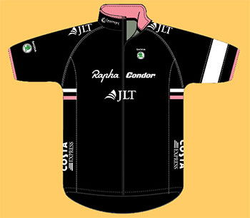
though i have reproduced here the design drawings for jimmy's jersey, the man himself is "actually in possession of the very jersey you may have seen the graphic of." personally, i have never come across any other professional team that has provided a scottish road race race champion with a specifically designed jersey. dressed thus, does he intend to ride at the front of the peloton all season? "Over the past few year I've never actually seen a properly issued or well thought-out Scottish champs jersey, but one cool aspect is that i also get to wear the same design on the road and in the crits I'll be doing in 2013. Pretty sweet I'd say."
for those of you who pass periods of your spare time watching jeremy powers' 'behind the barriers' series, racing for another rapha sponsored team, it has perhaps come to your attention that jpow seems to possess a whole wardrobe of giro helmets decorated with american national graphics attesting to his position as america's national cyclocross champion. now endowed with a tartan and thistle emblazoned jersey, will jimmy augment his own headgear with an appropriately embellished helmet?
"Not sure about the helmet situation as I'm led to believe we are due to change helmet suppliers. However, I like your JPow comparison, but I feel I must declare my inferior talent in that area. It would be cool but I'm not sure. However I can always do my own bit of modification if I can do it well."
though i think mr mccallum may protest too much when comparing himself to jeremy powers, he is a rider who has been known to indulge in some cyclocrossing all of his own. in fact, he was due to have participated in the recently cancelled scottish cyclocross championships in irvine (cancelled due to bad weather?) with this in mind, i asked whether an appearance at dig in at the dock in bo'ness on january 6th, might conceivably be the first public outing for his new jersey?
"Dig in at the Dock unfortunately is a cross race and a TLI event at that, so I'm not sure my jersey would be relevant."
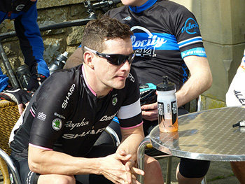
other members of the rapha condor team in the past have been wearers of championship jerseys: dean downing in the national criterium jersey and subsequently kristian house in the british national road race champion's jersey. if i recall correctly, replicas of both jerseys were available in rapha's online shop not too long afterwards, that fans of both riders could avail themselves of a similar look, though obviously without the speed benefits. therefore, it seems only fair that, in order to continue our hard-won parochiality, that we be offered a similar north of the border opportunity. is it likely that there will be jimmy mac rapha jerseys for sale in edinburgh's ronde next year?
"The idea of it being on sale is a cool and pretty humbling thought, however I'm not sure there would be enough demand."
this man is way too modest.
many have paid tribute to the notion that cycle racing is as much attributed to the rider's state of mind as it is to his level of fitness. clad in a jersey that acknowledges jimmy mac's scottish superiority on the road means one of those boxes has been clearly ticked before the season begins.
there has been no change in the rapha condor philosophy since the beginning of the 2012 season; the team will continue to be a development vehicle for up and coming young professionals, creating a platform from which they might conceivably move to a continental career. and as an adjunct to jimmy's mention that the team may be changing helmet supplier for 2013, they have also chosen to decorate those italian built condors with campagnolo groupsets and wheels.
with the recollection of my recently published article about 'made in scotland' and vague comparisons with italian style, my heightened sense of parochiality is now complete. don't you just love it when a plan comes together?
thursday 13th december 2012
 ..........................................................................................................................................................................................................
lmnh espresso cup and saucer
i cannot deny a particular affection for the occasional cup of coffee. i do not count myself amongst the characters oft populating american sitcoms or movies who come nowhere near their best until that first cup of coffee has hit the spot. it is a dependency which also affects those closer to home and with greater affinity to our own needs. as i recall, graeme obree feels himself unable to ease himself into the day without coffee at breakfast.
this, more often than not, would be cafetiere or filter coffee, the sort that sits in a large glass jug being continually reheated throughout the working day. this was a feature of that offered in the aerogrill when as a student working at prestwick airport. such was the infrequency of those jugs being topped up with water, that by day's end, the resulting extremely dark brown liquid could not only stand a teaspoon vertically, we think it may have been used to repair cracks in the runway.
coffee such as this interests me not in the least; the often watery liquid that fills a large white mug or cup and which, in american restaurants at least, is continually topped up the minute the cup is replaced on the saucer. you need to have lightning reactions to keep such eager waiters/waitresses at bay. my breakfast of porage is accompanied, more often than not, by a small glass of smoothie. coffee is nowhere to be found. and even on reaching the office each morning, i cannot pretend to be of hardened disposition, settling most often for a hot cup of green tea (though this morning had to be fed by ginger and lemon flavour, having inadvertantly run out of the green stuff.)

however, a long day can exert unforeseen pressures on an uncaring body, revival of which can be more effectively remedied by a swift, short, sharp cup of espresso. we are not so refined that the office is possessed of a burr grinder, apparently the only true way to achieve the appropriate grind for a strong roast espresso, therefore we are confined to that offered by the local supermarket in pre-ground fashion. to the most part, this is more than acceptable. i have notions that i have the palate of the coffee cognoscenti, though there is every possibility that i fool myself. however, i daresay there is none so blind as he who will not sup froth.
the coffee machine ensconced in the office kitchen does have one of those milk frothing wands but it is very much to our collective discredit that we have singularly failed to operate it in an efficient and flavoursome manner. thus espresso has become the order of the day. this is, of course, a more than amenable situation, given that only a matter of kilometres away is debbie's cafe in bruichladdich, where the cappuccinos and lattes are second to none. we are amongst the privileged in this sense, having access to a particularly fine cup of espresso each weekday afternoon (far better than the cost of the machine would profess) and chocolate dusted froth at the weekends.

there is, however, a singular factor which has not so far been mentioned, yet is inseparable from that excellent cup of espresso; the vessel in which it is poured. i wish i could not count on the fingers of both hands and the toes of both feet, the number of times i have been served an espresso in a rather large cappuccino cup. aside from the philosophical considerations of so doing, physics plays its eager part, offering too great a surface area to the great indoors and overly cooling the espresso before consumption has been even considered. there truly is no alternative to utilising a compact and perfectly formed cup designed purely for the purpose.
stunningly obvious, don't you think?
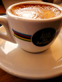
which is why, given our collective inhabitation of the cycling milieu, and barely disguised sense of one upmanship, it is necessary to have at our disposal not only the cup of our dreams, but one that features appropriate decor. and this is where the excellent fellows at look mum no hands! take one step forward. retailing at a mere £15 their espresso cup and saucer is decorated with not only the lmnh logo, but waisted by the world championship bands now belonging to philippe gilbert. i need not mention that christmas is only a matter of days away, and a device such as this would undoubtedly be held in gratifying hands clad in short finger, crochet-backed mitts.
it does cosset a remarkably good cup of espresso.
look mum no hands espresso cup and saucer
wednesday 12th december 2012
 ..........................................................................................................................................................................................................
the bicycle as theory
it is more than likely that even those with little or no interest in eastern religion will have come across the zen koan that enquires 'what is the sound of one hand clapping?', and perhaps even the allied query 'where does my lap go when I stand up?'. these, particularly the former, have been repeated so often in an uncomprehending western society, that they have lost all the intractable qualities they were designed to incorporate, by the zen masters who formulated their existence. i am insufficiently practised in the art to even attempt an explanation that would not occupy the remainder of this article, yet remain largely as incomprehensible as at this particular moment.
an introduction in this manner does, however, open the way to my looking at the bicycle in a somewhat more philosophical manner. not that i perceive it as a necessary vision; more than likely the bicycle can take care of itself without any requirement to invade its existentialist space, but bear with me if you will. this is perhaps more about the journey than the arrival.
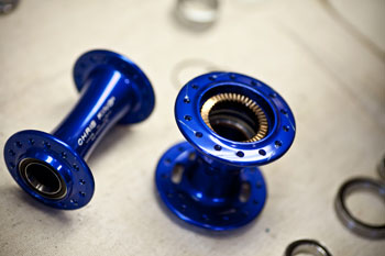
rather than dive in with both feet to a subject i think it unlikely i am qualified to assess ( something that has rarely stopped me before), i'll begin on the periphery at a point that derek at wheelsmith and jude at sugar will feel comfortable in concurrence. It seems almost juvenile to point out that the bicycle wheel starts its useful life as a set of apparently unconnected components: hubs, spokes and the all-important rim. the only one of the three that is capable of displaying any (e)motion is the hub, for assuming the bearings are of appropriate quality, the axle can be twiddled endlessly, though perhaps just as obviously, to no virtuous end.
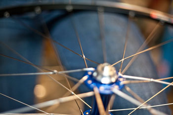
in the hands of the skilled wheelbuilder however (and occasionally even in the hands of the considerably less skilled but no less intrepid), those three components can provide not only a safe, speedy and comfortable ride to the bicyclist perched above, but may well continue to do so for several years with even rudimentary maintenance. perceived graphically, therefore, we lay bare the inadequacies of the english language, for on one hand, a collection of spokes, rims and hubs cannot technically be described as a wheel, yet when conjoined in the appropriate manner, there is little option in that same language to describe them in any other way. throughout the build process, none of the individual components has been chemically or physically altered, allowing for easy, if tedious dismantling into the same sets of individual components with which we started this conversation.
i realise that the foregoing is of little practical use other than to those involved in the business of wheelbuilding, since i am sure we're all agreed that meditation upon such is rarely of great servitude when applied to the daily commute or weekend sportive. however, the same guiding principles invade that of bicycle frame construction, a skill that must also start with either a collection of various metal tubes and lugs or, in these modern times, black woven matting comprised of burnt plastic. this is not a treatise on how to build your own from yogurt cartons, sticky back plastic and sellotape, so I will spare you my rudimentary and likely erroneous narrative of how to make the archetypal 'double-diamond' from such materials.
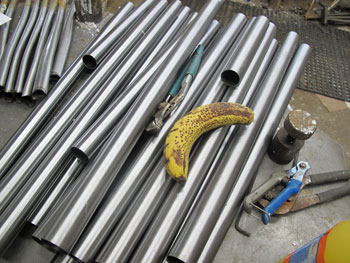
if i might ask you to consider the two distinct methods with which to construct a bicycle as briefly outlined above, you may perhaps begin to see the kernel of my why and wherefore. ignoring the uci for just a moment (though ideally for a lot longer, if we could be so lucky), the difference between the two materials is so marked and so vast, that one has seriously to consider why anyone in their right mind would expect essentially the same result when searching for a bicycle at the end of the rainbow. sure, the burnt plastic material can be moulded into smooth swoops and flourishes that are perhaps the envy of metal tubes, but ultimately, we expect there to be a recognisable similarity between the two definably different end products.
it is at this point that one feels compelled to ask 'why?'
at the risk of being seen to answer my own question, it is surely because that is the theory of the bicycle and its acceptance as a philosophical object? The bicycle has, arguably, become greater than the sum of its parts, and I mean that in both senses of the phrase. when we discuss 'the bicycle' or 'bicycling' we rarely hold a mental picture of such at point of proposition; certainly in the western world, everyone knows to what we refer, irrespective of their own feelings, knowledge or experience of the object. additionally, though it is possible to literally bore onlookers to death with the technical and manifest intricacies of the bicycle as a subject in its own right, the implied connotation is that the device with which many of us are obsessed, is all but inseparable from the act of cycling itself.
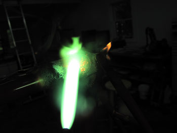
it would be simplicity itself to put this down to social conditioning and simply leave it at that, but that, in my opinion, would be to be guilty of what the soccer fraternity would refer to as a 'body swerve'. in the past few weeks i have read thousands upon thousands of coherent words written about the bicycle, few of which have touched upon the merits of individual models or marques, and many of which have given scant punctuation towards those who race the blighters. all, almost without exception have paid at least lip service to the bicycle as a philosophical point of discussion. some, in fact, have concerned themselves solely with that aspect.
for those who have followed little of the preceding paragraphs, i apologise; in this particular case, it was not my intention to be wilfully obscure, but on occasion, when the paraphernalia surrounding the bicycle, whether it be doubtful sporting prowess, the less than impressive manners of those identified as 'cyclists', or even the knowledge that there are those who wish simply to be regarded as using the bicycle for its original transportational purposes without any further connotations, it is worth reminding ourselves periodically that in modern times, they all start out as collections of metal tubes or sheets of burnt plastic.
the rest is human invention.
steel tubing and brazing images from the workshop of richard sachs. spokes and hubs courtesy chris king and sugar wheelworks.
tuesday 11th december 2012
 ..........................................................................................................................................................................................................