
..........................................................................................................................................................................................................
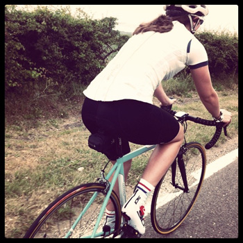
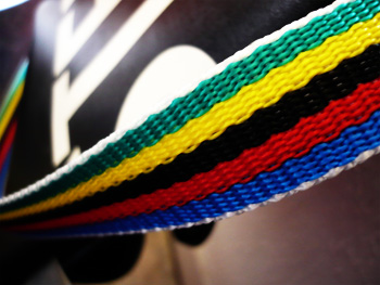
dhb aeron bibshorts and coolmax socks
only just the other day, i regaled you with some thoughts on global warming, though i hasten to add that in the manner of accepting no blame for anything (a bit like a consultant), the thoughts expressed were those of the individual contributors and not necessarily those of thewashingmachinepost editorial staff (me). i would, however, be extremely glad if someone could explain to me why it is that the phenomenon is referred to as global warming when i can see little evidence of the temperatures that such would profess to indicate.
at the tail end of every second week, my days are involved with newspaper production; ensuring that proofed pages are available in timely fashion for the publication's printer. not always the smooth operation you would think it ought to be. thus, irrespective of the weather beyond the editorial office window, i am indoors for the enduring duration. thursday and friday on islay were particularly uncharacteristic, though just bizarrely enough of a variation on the preceding days to be the sort of thing it is famed for. afternoon temperatures were in the low twenties centigrade, not a cloud appeared in the sky, and the wind was all but completely absent.
that latter fact alone is surely worthy of celebration.
sadly, i only experienced this for a few minutes, having nipped down the street to collect my newspaper and a granola bar for lunch. none of my bicycles came even close to being sunned upon in the calm stillness. still, optimism convinced me that such would likely continue through my personal days (more commonly known as the weekend). the thought of being able to improve on my non-existent tanline, legs encased in a brand new pair of bibshorts, seemed all but guaranteed. weather such as experienced on thursday and friday could surely not vanish without trace?
the more observant amongst you cannot have failed to notice the flaw in my argument; the west coast of scotland hardly comes under the jurisdiction of predictable and like snow off a drystane wall, localised global warming evaporated overnight.
saturday was mercifully free from precipitation, but the wind had returned, and the temperature was now in single figures. sunday continued the trend, with the mercury dipping to around six degrees, and the wind gaining a smidgeon of strength. i'm not one for checking weather forecasts; working on the basis that we're going to get what we're going to get, i rarely bother. however, i had conjured a sneak peek a few days earlier and sunday showed overcast in the morning with one or two drips of rain, before the sun came out to play shortly after lunchtime. weather is fickle. sunday morning was cold and eventually quite wet, and, as raymond briggs was wont to say, that north wind doth blow.
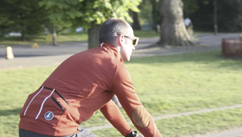
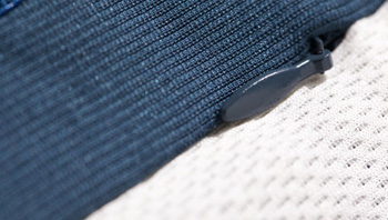
perhaps the notion of wearing and testing two items from the dhb spring/summer collection was a false hope. surely if we are immersed in the vagaries of global warming, road testing ought to be getting warmer? it is of worthy debate as to whether the lower limbs are mildly tanned, weatherbeaten, or rusty. in any event, always willing to suffer for my art, i donned bibshorts and socks, both trimmed in a rather unflattering shade of blue and prepared to pedal for valour.
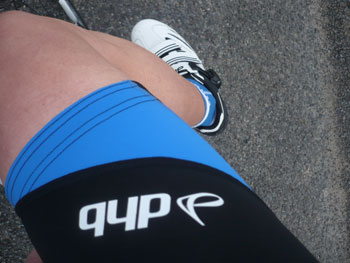
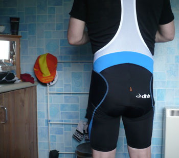
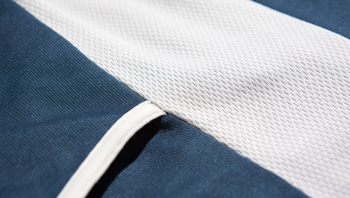
the grippers at the bottom of each leg seem just a tad too thick for their own good. though they gave no cause for concern in use, the double thickness, stitching and gloop prevents them lying flat across my chris hoy thighs (would you like the phone number of my optician?). the fit is pretty good overall, and the red cytech pad is sylph-like enough to prevent the feeling that one is walking to the bike shed wearing a pampers super-fit nappy (diaper). the mesh back is, in my opinion, not quite wide enough for the purpose; it pulls the bib straps slightly too close to the neck on each side. this, of course, has a beneficial corollary as i have at least two pairs of bibshorts or tights on which the straps have a tendency to drop off the shoulder while in use. maybe i'm just a moaning git.
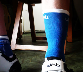
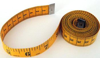
the socks are obviously licensed from larry, as they pull at least half way up my shin, surely a very strange feature for summer socks? in order to maintain a certain decorum, i rolled the tops downwards, ensuring that the dhb logo was still visible and legible.
back to the weather. fortunately, legs seem incapable of experiencing much in the way of lowered temperatures, at least not after a few kilometres of frantic pedalling. a headwind will do that. i still maintain that the best compliment i can pay to a pair of socks is that i never noticed them, ensconced as they were in a pair of dhb carbon soled shoes. the shorts almost managed the same; in use i barely noticed they were there, though a lack of aghast expressions from passers-by was enough to convince that they were indeed, still in place, covering my modesty and impressively muscled thighs. the primary blue flashes on each leg thread their way around the back, expanding into a larger slab of blue just below the mesh bib.
unlike shorts from the how much? end of the world, the dhb aerons are not quite like a second skin, but to an extent, that's one of those features for which you perhaps expect to pay a substantial premium. professionals and excitable amateurs are probably besotted by the latter, but those of us with a less competitive disposition (and with an average speed to match) are unlikely to find a slightly heavier grade of lycra to be too much of an imposition. in their favour, this is likely to enhance their longevity i would tender.
it may be entirely co-incidental, but the word aeron is more readily associated with herman miller's infintely adjustable chair, beloved of recording studios and editing suites the world over. in any case, the implied comfort factor is not entirely without merit.
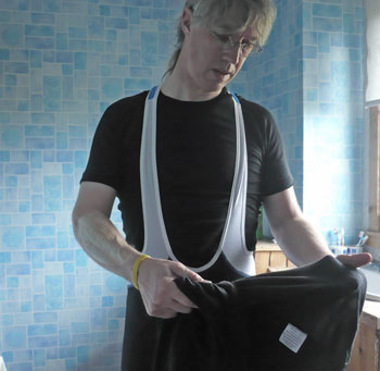
these are modern times; adobe have thoughtfully provided a control panel for kuler in both photoshop and indesign. so why dhb found it desirable to enhance both socks and shorts with a rather unimaginative, cycling weekly shade of blue, i do not know. there is some consolation that much of it is all but obscured while riding. on the contrary, however, the dhb logos on right leg and butt cheek add a frisson of professionalism. as wiggle's house brand, dhb has long inhabited the lower spectrum of pricing. the current economic climate notwithstanding, this continues to be the case, but with the benefit of hindsight, the quality of the product has improved substantially, making these particular dhb items competitive with similar further up the credit card scale.
time will, of course tell whether they wear comparably and retain their shape as the months roll by, but on present evidence i can see little that would place those hurdles in their way. colour aside, and bearing the length of the socks in mind, both these dhb summer products are well worth your hard-earned.
even in the face of persistent global freezing.
dhb aeron shorts are available with white, grey, blue and red colour contrasting colour panels, in sizes from xs to xxl. cost if £59.99. the coolmax summer socks can be had in black, white, blue and red, in sizes ranging from 3 - 12 at a cost of £6.99 a pair.
posted sunday 6 june 2011
footdee
i can see how the english language places so many obstacles in the way of implicit comprehension and spelling. there are way too many words with the same pronunciation, yet variations in spelling that convey entirely different meanings. quite a number spring to mind, but there, their, and they're is perhaps enough illustration of my intent. i am pedantic enough to be aghast at the misuse of the wrong spelling, and physically embarrassed when i realise i have just implemented one in my 140 characters on twitter. at that point, the first four letters of the name are particularly apt.
there is little doubt, though i cannot claim to have statistical evidence to prove so, that the almost wholesale use of computers and/or mobile phones have forced this upon us. add to that the fact that english is rarely taught in schools the way it used to be, and, for pedants like me, the world has become a darker place. as someone whose daily travail often of necessity incorporates text from the local schools, i have queried why the teaching staff do not indulge in a modicum of proofreading prior to it leaving the halls of education. the answer, invariably, questions my question and comes to rest on expression of thought which could apparently be hindered by the rigidity of correct spelling. it is fortunate that i am not given to swearing.
the sop to all this computer generated versatility is the inevitable spellchecker. how simple it might be to type the requisite number of words, select all and hit spellcheck. there are two major pitfalls in such a method: firstly, i would refer you back to my opening gambit; all three instances of there are correctly spelled, but only one would be correct depending on context. secondly, the bulk of day to day software such as adobe indesign, pages, and microsoft office are of american origin, and thus the spellcheckers included will regularly default to the north american spelling.
the latter is a pet hate of mine; the encroaching influence of so-called americanisms on the spelling of indigenous brits is annoying (yes, i know it's sad, but there you go). where the english language as originally taught would prefer -ise, north america more regularly uses -ize. there's nothing intrinsically wrong with such a variation, as long as they remain as individuals. you will hopefully be impressed by my pseudo-intellectualism when last on a visit to scotland. i bought a copy of the times literary supplement. one would hope that the major bastion and defender of the english language would be the times newspaper and its many offspring, particularly the tls. yet every single review from front to back incorporated the american variation -ize.
incensed and confused, i e-mailed the editorial department of the publication to query their, to my mind, incorrect spelling of so many words. all credit to catharine morris, deputy production editor, who actually replied rather than clicking junk on receipt of my e-mail. here's what she said:
Many thanks for your email. We use the New Oxford Dictionary for Writers and Editors and therefore follow Oxford spelling, which favours -ize over -ise.
Here is the OED's explanation: "[I]n mod.F. the suffix has become -iser, alike in words from Greek, as baptiser, évangéliser, organiser, and those formed after them from L., as civiliser, cicatriser, humaniser. Hence, some have used the spelling -ise in Eng., as in French, for all these words, and some prefer -ise in words formed in French or Eng. from L. elements, retaining -ize for those of Gr. composition. But the suffix itself, whatever the element to which it is added, is in its origin the Gr. , L. -iz re; and, as the pronunciation is also with z, there is no reason why in English the special French spelling should be followed, in opposition to that which is at once etymological and phonetic. In this Dictionary the termination is uniformly written -ize. (In the Gr. -, the i was short, so originally in L., but the double consonant z (= dz, ts) made the syllable long; when the z became a simple consonant, (-idz) became z, whence Eng. (-a?z).)
so that's all clear now.
but it still doesn't really explain why they felt it necessary to go to such lengths. the times is quintessentially english, and should, by my reasoning, have adhered to the english spelling in the first place. more to the point here, why has the oxford dictionary created such obfuscation? it's a worry. i replied stating that i felt this decision along with the morphing of the word facebook into a verb, (as in i'll facebook you later) signalled the end of civilisation as we know it (probably around 6pm if i'm not mistaken.)
this leads me onto, in rather convoluted fashion, to the word fit which, though easy enough to spell, has more than one meaning. in context - ie cycling - both definitions are somewhat interlinked.
this past week has seen a large influx of cyclists onto the isle, something that inevitably leads to breakdowns, many of which could have been prevented, had the riders only had a quick check around the bicycle and its componentry; much in the way that pilots do prior to starting up the engines. but that is of lesser concern at present, for one errant mountain bike owner topped out at six foot eighteen inches (or at least it seemed like that), and rode a mountain bike with several feet of seatpost showing above the quick-release. basically, the bike didn't fit; the frame was too small for someone so tall. and in the course of my travels, i have passed several on bicycles too big, and several with the seatpost too low.
though there are many, many bits and bobs that can be purchased to slap onto a bicycle, several of which cost more than strictly necessary, after my visit to cyclefit last year, i figure some of that money would be better pointed in their or mosquito cycles' direction. fitting the bicycle properly has an unbelievable effect on ride comfort and ultimately the level of fitness that it can foster. i still have no idea why there are people who insist on touring on mountain bikes shod with big knobbly tyres, yet bearing enough panniers for more than a packet of cheese and onion crisps. why make life so hard? but not having the seat or bars at the right height, let alone saddle positioning and distance to the bars seems likely to cause more problems than you'd want to have in the process of cycling for days on end.
perhaps some of those referred to above could learn from my pedantry and start paying more attention to those millimetres. however, even that pales into insignificance after seeing one cycle-tourist pass wearing a full-face bmx helmet.
now that's a worry.
(for those confused by the title, footdee in aberdeen is colloquially referred to as 'fitty')
posted saturday 5 june 2011
global warming

it's rarely out of the news these days, how mankind is destroying the planet through the emission of noxious and ozone destroying gases. i am not a scientist, at least not in any recognisable form, but i do have a theory that the industrial past, around the middle of last century was particularly adept at flinging substantial amounts of crud, better forgotten, into the atmosphere, creating so called acid rain. this had the joyous secondary effect of eating away at structures and the like on planet earth, while the gassy stuff played merry hell wtih the ozone layer. if that is indeed the case, we're stuffed anyway, because all that happened some fifty or more years ago, and doing away with cans of aerosol deodorant in the present may just be too little too late.
but there are also the contra theorists, those who maintain that global warming is a load of tosh and nonsense. according to nasa's goddard institute for space studies, december 2007 to november 2008 was the coolest on record since the turn of the century. their data also shows that the hottest decade of the 20th century was the 1930s. in 2008, reports indicated that the arctic ice volume was 500,000 square metres greater than at the same time the previous year. additionally, antarctic sea-ice reached its highest level since satellite records began in 1979. polar bear numbers are reckoned to be at record levels. this latter point seems ironic, since the bear is often portrayed as one of the victims of global warming, and i've seen tv adverts asking for money to adopt a polar bear.

and apparently the world was hotter around 1,000 years ago.
so much contradictory information from opposing sides is confusing to say the least. particularly when the information comes from academics with whom most of us are ill-equipped to argue on the same level. the words with, science and blinding spring to mind. the contrary argument is something that feels just a bit too much like tempting fate. my english lit. tutor advised me strongly against arguing the opposite point to that which i believed, even if it did provide the basis for a more convincing and substantial argument. i'm not sure if this was said on moral grounds, but the point was well-made that any attempt to do so would be spotted from miles away and lead to a big, fat, red 'f' at the bottom of the paper.
i'm afraid to admit that i paid no heed to his advice, and john donne bore the brunt of my literary salvo, demeaning his status as britain's leading metaphysical poet. so i now find myself in the same contradictory position; well almost. whenever the subject of global warming rears its ugly head either at lunch round the office table, conversing with confirmed car drivers, or if i'm feeling just a tad too adventurous over coffee, i find myself trotting out a well-rehearsed dictate about how much better off we'd all be if the motor car were unceremoniously dumped and wholesale adoption of the bicycle were to replace it. it is, however, a bit like trying to convince a fanatical football supporter that his/her saturday afternoons would be better spent watching a mountain stage in the giro. whether by sustained intellectual arguing or by persistent example, i have failed miserably to convert large numbers of islay's population to cycle as if their life depended on it. it seems to bother no-one that such might just be the case one day.

so if i believe that global warming is somebody's idea of a joke, am i at fault if i continue to pursue my argument of mass cycle use based on the fact that it's good for the planet? at present i console myself that, irrespective of portentous doom and gloom for planet earth, more people on bicycles can't be other than a good thing. despite the fact that i can remember the naysayers predicting the world's oil would disappear from garage forecourts by the mid-eighties, it will at some point cease to exist; probably not in my lifetime, but like most things, the scarcer it becomes, the higher the price. add to that, commercial extraction is likely to increase in cost as more obscure places are drilled, making those confirmed motorists skate on thin ice, if you'll pardon the pun.
i think i might find my conscience salved if i constrain my pro-cycling argument to one of health and cost. many a motorist driving the latest all-wheel drive suv with a chilled glove compartment to keep the chocolate from melting when global warming becomes a reality, finds the cost of a decent bicycle, verging on the ridiculous. i find myself of similar mind when discussing how much they paid for the chocolate cooler.
cycling is for everyone; it just takes a bit more persuasion to get some folks to realise it.
posted friday 4 june 2011
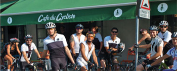
cafe du cycliste
while usually determined to avoid any formulaic approach to newspaper design, my editor and i are pretty much agreed that putting a photo of local kids involved in enjoyable activities is something we're unlikely to receive complaints about. a bit like the adage from many years back 'nobody ever got fired for buying ibm', a photograph of such ilk seems to please pretty much everyone, and doesn't harm the paper's sales potential.
for reasons which are well beyond my ken, it's possible that a similar ambition may be achieved by mentioning either cafe or coffee in an article about cycling. i am not an adherent of the offroad persuasion, and i'm not too sure whether i'm being truly impartial in my observations, but i think these two related components have more affiliation with tarmac than dirt. one of these days we could perhaps investigate this further, but for now please try to accept my contention.
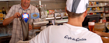
thus, in the case under consideration, the name cafe du cycliste could be seen as an affectation on the part of its progenitor; a valiant attempt to associate with all things french and cycling in one coffee emporium. the fly in the ointment with that supposition is that cafe du cycliste is of bricks and mortar in the cote d'azure. last time i looked, that was definitely in france.
were i to wax lyrical about debbie's in bruichladdich, there would be only a modest number who have tangible experience of same, and only a few more who might conceivably have future opportunity to sit on the couch in the corner, supping their own preference for froth. when it comes to the cote d'azur, many more would feel excluded, self included.
however, i bring mention of the cafe not to underline a level of temptation that might well go unsatisfied by the majority of the great unwashed, but to introduce a range of clothing bearing the same name, and a selection of which can be purchased online and without the need to check thetrainline.com for a cheap day return to the french riviera. impose just a snippet of a pub cycling quiz, hands would be up all round if asked to name cycle clothing providers from the uk, from switzerland, italy and possibly even new zealand. but try as i might, i could not name one french cycle clothing manufacturer. (please don't e-mail to tell me how wrong i am; ignorance is bliss).
the brains behind the clothing line emanating from a cote d'azur cafe belong to andre and remi, respectively an ironman triathlete and a former canoeing world champion. the initial offerings are split into two categories: sur le bitume and sur le zinc. the former, as even rudimentary french might suggest, are geared towards the road rider, while the latter inhabits the the area we might more readily recognise as urban. however, much like my own locale, i find it hard to identify the concept of urban with the cote d'azur, but in this case, a modest degree of pigeon-holing does no real harm.
but this leads me back to my oft repeated contention: surely the cycle market is somewhat saturated with a more than appropriate quantity of choice. what on earth would you have to be thinking to enter the fray without getting burnt? remi clermont; "You are right, this market has a fair number of players, but the large majority of them have, in my opinion, very little to differentiate from each other. They all claim to offer the most technically advanced products and often try to make their products look even more technical than they actually are. As a result, they produce look-alike garments and the customer has very little variety to choose from. For us it all started with not finding products that we liked: we did not want to wear club jerseys with prints all over them and were bored of the of the existing cyclewear on offer in France."
of this, i'm not entirely convinced, since i seem to receive the same answer everytime i ask the same question. surely there are few who are so hard to please, that they cannot find suitable cycling apparel from the huge amounts currently available? remi and andre must surely have had a certain type of customer in mind when designing the new ranges? "Yes we have designed our products for the elegant and modern French cyclist who wants to keep being himself on the bike without trying to imitate the pro-cyclist style. Something which does not stop him from being a fan of our sport, heroes and magic events such as le tour de france or paris-roubaix."
it does have to be admitted, however, that the garments on offer through their website do have a certain je ne sais quoi. to my mind and my weather, the eye rested easily upon the long-sleeved maillot yolande manche, nicely identified by its red colouring and what look like elbow pads. i cannot explain why it is that a cyclist would feel the need for elbow pads, but the fascination would be enough to have me consider parting with £125. and should i have any confidence in today's weather lasting longer than an ice cube in a microwave, the rather eccentrically different maillot henriette short sleeve jersey, inspired by tennis polo shirts of the eighties would surely cut an appropriate dash in the saddle.
returning, not literally, to the cafe, do the two lads have an identifiable philosophy pervading their ideology, and is the coffee as important as the ride? "Those have to me the same answer. Yes the coffee is as important as the ride as it is all about pleasure. Enjoying the effort, the scenic roads, riding with friends and stopping at the cafe or sharing a glass of wine. This is what makes our sport so beautiful." in which case, does remi feel that it's important for them to have the cafe as a tangible base for their project? "Yes. This is where the idea started in our heads, while cycling around the cafe and drinking hot chocolate last autumn. The cafe also gives our clothing brand the right spirit ,even if it isn't directly connected to the clothing business."
in the process of wearing and reviewing a great deal of the world's cycle clothing, i will confess to the odd if only... moment, but the luxury from my point of view is that those moments form a part of my feedback to the clothing providers, and usually inclusion in the subsequent review. i have no real notion of just what is available in france, but there has to be a certain degree of national pride pedalling around the french countryside, wearing a brand of cycling apparel that originated in the french riviera.
before you leap to the misapprehension that cafe du cyclisme clothing worships at the foot of the dye sublimation temple, let me disavow this notion. though the products inhabit the technical genre, as others have successfully shown with great aplomb, fabrics such as sportwool and merino compete well in the same race. but is the sportwool philosophy of cafe du cycliste a deliberate attempt to differentiate themselves from the mainstream? "It is a differentiator, but definitely more than this. I spent too many years of my life practicing kayak and outdoor sports not to like the idea of wearing natural fibers as opposed to 100% petrol made products. Sportwool also gives a more elegant look and feel that we liked when comparing with polyester."
the cafe is the "ideal place to enjoy a cappuccino after a ride and discuss endlessly with friends the weight/stiffness ratio of your latest pair of wheels...", and from first explorations, the clothing seems the ideal selection of garments to wear while lounging about in the sun, coffee in hand. but there's always more. what, i might ask, is the long-term plan?
"To make ourselves a place in this market, before a French cyclist wins the Tour de France again."
posted thursday 2 june 2011
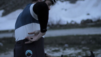
rapha ladies jersey and gilet
despite a myriad of different ways to communicate and work online while effectively offline, this has not led to the multitudes abandoning their office spaces en masse and closeting themselves behind closed doors. this was the prophecy of the recent past, when business would no longer need to spend squillions on property and furnishings in order to keep the workforce happy and warm; broadband and its ilk would make leaving for the office in the morning a custom confined to history, as we married domestic bliss with travailement to keep those pennies rolling into the bank account.
of course, only in one or two instances has that truly become the case. human beings are of a sociable disposition, and all hours spent surrounded by those office walls were just as much about interaction with one's fellow inmates as they were about satisfying the bottom line as decreed by the accounts department. much as i would love to present this as an observation of my very own, i doubt i am possessed of such perspicacity, and i must own up to having read just such an article only last night.
the sociability of the workplace, however, depends very much on it being a friendly, relaxed environment in the first place. let's not kid ourselves; that paypacket each month is not bequeathed that we might enjoy each other' company all the more. it is the end that accompanies the means, and someone, somewhere in a lofty office would far rather that you worked for your beans, as opposed to discussing the coffee variety round the espresso machine. and it is here that i find myself in sympathy with this mysterious paymaster, for i too have had to crack the whip (metaphorically at least).
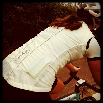
i think we're pretty much agreed that, despite the length of my hair, and the fact that it was secured by a pink bauble during the giro d'italia, i am ill-equipped to review cycling apparel destined for the fairer sex. i have been most fortunate to have secured the excellent services of bianchista gem atkinson, who could likely not only leave me standing on the start line, but who is also rather adept at reviewing said clothing. or at least, she is when she's here.
in the course of earning an honest crust as a photo editor, miss atkinson has great propensity for jetting off to glamorous locations in order to sit in front of a computer screen in a darkened basement. last year it was the world cup in south africa, this year the cannes film festival. but while engaging in such international sociability, her homework was not appearing on my desk, and a timely ultimatum simply had to be issued.
here's the result.
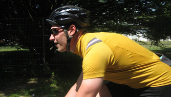
Ah is it that time already again? Time to put Rapha's latest ladies-wear offerings through their paces. Albeit a rather tardy review (apologies to the editor!) for the last six weeks i've been putting the latest incarnation of the humble club jersey and the ladies gilet through their paces. The club jersey is offered in three bold colours, shying away from their classic monotone palette, with a maglia rosa-inspired pink, deep teal and all cream jersey available. I would like to start a petition to instate the pink jersey as the official jersey of the Giro Donne, such is its impeccable styling. I should imagine the riders would be more than happy to sport this technical top instead of the techni-sporty-fabric sponsor emblazoned polyester monstrosity that currently fills the post! In fact I may just send Mr Giuseppe Rivolta a quick email after this review.
Sadly, the club of which I am a member has yet to supply kit in the dainty xs for those of us smaller in stature (im usually a size 8), much to my disappointment. There is something very comforting in participating in a ride wearing a common uniform, whether it be the team-issue club kit or even a co-ordinated effort with colours. Such is human nature that many of us like to feel we 'belong', a strength-in-numbers type approach if you will, harking back to our more tribal days. I rather enjoy the pack mentality, and nothing looks more impressive on the road than a moving beast comprising many riders in tight formation, proudly sporting their club colours.
So step forward the aptly-titled Club jersey to merrily take pride of place as my clothing of choice when gracing club runs, chain-gangs and social rides with friends. On a recent ladies ride in Regents Park (every Thursday 6:30pm. Sorry brian, one has to make mention) there were no fewer than five people wearing various colours of the jersey, and my did we cut a dashingly stylish peloton.
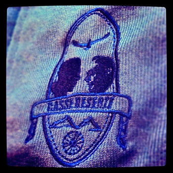
I tested the blue representation and couldn't help but notice a certain Coppi-esque styling; a simple main torso panel of blue in Rapha's infamous sportwool, and contrasting cream sleeves in a lighter-weight mesh material. Those Coppi suspicions were confirmed on inspecting the rather natty rear pocket embroidery, depicting the famous memorial to Coppi and Bobet at Casse Déserte on the Izoard. Both riders famously attacked here and were thus immortalised in Le Tour history. Rapha's gesture is an appropriate nod to the sport's heroes of yesteryear.
Unfortunately, donning said jersey did not transform me into a nimble, agile, attacking legend. Where was the panache and flair I so richly deserved? I still laboured over every false flat, panted and heaved my derriere up Surrey's notorious Whitedown, and all the while made numerous 'faces of hell'.
However, benefitting from Rapha's ingenious twin-material design, implemented on the Club Jersey, made the suffering more bearable. With side panels and arms made from breathable lightweight mesh, my body temperature definitely felt more regulated compared to that of a more heavily constructed top. A small yet important mercy that has blessed many a recent 'sufferfest'.
As with most, three rear pockets provide the usual cargo capacity, and a secret stash pocket will keep your most valuable of valuables secure and hidden. A small reflective tab sits underneath neatly, providing a small sliver of reflectivity in those menacing car headlights. Enough to catch an unwary driver's eye one would hope.
The jersey's arms are perfectly complemented by the ladies gilet, its light cream colour looking decidedly fresh for the summer months. The trusty gilet has long been a favourite of many cyclists, even among high ranking members of the peloton when racing, providing a versatile shield for any unexpected changes in the weather. Given the constant state of flux in which the UK weather seems to find itself, this has proven a very useful item.
Even when not being worn, the gilet provides peace of mind packed away in a pocket. Should you be caught out, you'll have some protection against the elements. (Having been caught out on many an occasion, I am a confirmed believer in Sod's law; if it can happen, it will.)
The gilet is constructed from a windproof fabric, and did a more than agreeable job in keeping my chest protected. I cannot vouch for its water resistance as sadly (actually what am I talking about, this is a good thing!) it has not rained on a ride during the period of review. (you need to start your reviewing up here. ed) An offset zip enhances the front panel, generously adorned with reflective piping, not that visibility should be too much of an issue in such a light, eye-catching colour. Two pockets and a reflective logo finish off the rear, while a handy droptail cut offers one's rear a morsel of protection from any dreaded deluge hell-bent on giving your butt a soaking. A welcome flash of colour is provided by neat red waistcord adjustment.
Again a secret easy access pocket sits on the front panel, providing a cute solution to storing earrings, or at least that's what I have used it for thus far (I'm assured it has many more uses than this; fill the pocket to suit).
Be aware, however, that the gilet is very tight fitting. This could be for one of three reasons; I'm rather used to the looser men's cut of my old gilet; I have indulged a little too much recently and, ahem, put on a few pounds; or, in fact, the gilet is cut very tight. I would suggest pinging Rapha an email with your vitals to seek advice as to which size to plump for.
gem atkinson 2011
..........................................................................................................................................................................................................often the highest point in the tour de france, the galibier tops out at 2645 metres, one of the highest road passes in the alps. via the col du telegraphe and the col du lauteret, it connects the towns of saint michel de maurienne and briancon. in 1911, it became part of the tour de france route, emile georget being the first rider across the summit and along with paul duboc and gustave garrigou, the only ones not to walk. its instigator, henri desgrange, is
 commemorated by a monument at the southern end of a single lane tunnel breaching its mass.
since 1947, the galibier has featured in the tour route a total of 31 times, and even those as dim with numbers as i am will notice that its first inclusion in 1911 will make this its centenary year. what better way, therefore to celebrate this probably little known (until now) fact, by availing yourself of rapha's galibier jersey?
as has become almost a trademark with regard to such celebratory apparel, the attention to detail is exquisite, perhaps most obviously with the excellent example of embroidered typography across its front. this is bolstered by an embroidered badge on one of the rear pockets and a colour scheme that seems entirely in sympathy with those surrounding jeremy dunn in the promo photo.
we have just ended the islay whisky festival as of this past weekend, when thousands of blokes (predominantly) descend upon each distillery often to purchase at great expense, a special, limited edition bottling exclusive to the distillery in question and the festival itself.
 frequently these find their way onto e-bay quicker than you can say bunnahabhain, but there are just as many who lock their bottles away in a display cabinet to either keep for posterity or to enjoy in front of a coal fire come winter time.
rapha have been particularly adept at releasing limited edition, collectible jerseys, starting with the tour en londres and including last years tourmalet edition. whether you wear these on the bike in the worst of weathers, or whether they live out their existence behind glass is entirely up to you.
but don't hink about it too long.
the rapha ladies club jersey is available in sizes xxs to xl in three colours at a cost of £95 ($160). the rapha ladies gilet is available in black and white, sizing the same as the jersey. cost is £115 ($165). the galibier jersey costs £135 ($200) in sizes xs to xxl
posted wednesday 1 june 2011
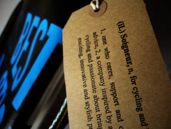
it's the soigneur what did it
it's not really a secret that the only reason i missed out on a successful career as a professional cyclist is down to one thing. personally i didn't find it to be a major failing, but in these days of concerted television coverage it obviously is something that worked against me.
i can't ride no-hands.
you may wonder why that should affect anyone with the cycling skill and prowess i have displayed over the years, but think of how each non-sprint stage of the major tours and races culiminates. a look over the shoulder, just to check that no-one has escaped from the bunch, intent on snatching that victory away in the last few metres. then either wave to the smiling ds in the following team car, or move close enough for a quick high-five, before sitting up straight, checking that the shades are in place and zipping the jersey all the way to the neck in order to display every sponsorship logo in front of those adoring cameras. these actions can be nicely rounded off by pointing to the main sponsor's name across the front and raising both arms skywards. assuming steering can be accomplished by modest knee movement, there's even time to avoid the phalanx of photographers crowded in entirely the wrong place just past the finish line.
think how disappointing that would be if replaced by simply punching the air with one hand. heck, it even sounds disappointing in print. trivia and superficiality; i dare say had i been allowed to deliver on the promise of an endless string of victories, sponsor and directeur sportif may have been inclined to grant a degree of leeway, but my second failing rather mitigated against my ever reaching the finish line even in last place.
the feed station.
really, there are far too many opportunities for disaster at this point. for heaven's sake, at those kind of speeds, how would i ever find the guy from my team standing at the roadside holding that musette high? and what if i grabbed the wrong one, from the wrong team? i mean, suppose he wasn't even vegetarian? but in purely practical terms, assuming i have managed to grab the right feed bag in the first place, how would i ever get the food out and into my three rear pockets? remember, i can't ride no hands; starvation and malnutrition before the first week of the tour is even over.
so i have had to be content with my lot, sat here every night in the comfy chair, typing in black and yellow thinking all the time of what might have been. mind you, it hasn't prevented me from acquiring an impressive selection of musettes, for unlike the pelotonese, i am loathe to throw them to the side of the road once the rice pudding and peanut butter sandwiches have been safely stowed about my person.
even for the amateur, a musette handily scrunched in a back pocket can come in decidedly handy if it becomes necessary to take a white pan loaf home from debbie's on saturday (only because i forgot to get one during the saturday morning supermarket excursion). yes, the musette has more than just decorative value, possibly none more so than the il soigneur edition currently on offer from urban hunter. for not only is practicality to the fore, particularly with regard to weatherproofing, but also a novel form of recycling. these are all one of a kind, made from banners formerly displayed at manchester velodrome.
the lettering on the review version appears in sky blue on one side, and white on the other, both continuing inside and closed by way of three poppers across the top. an integral part of any musette has to be a strap with which to sling around shoulder and neck; in this case, the ego was massaged by world championship stripes. that hovis loaf fitted inside quite comfortably, along with a stowaway jacket, digital camera, and a copy of saturday's guardian.
granted, gale force winds were hardly the ideal scene in which to try out this particular (or any) musette, if only because its rigidity took to acting like a sail. it is of constant curiosity just how the average gale works. while cycling south to north, i, the bike and musette were being pummeled from the left, yet when the direction altered north to south, pummeling continued to be from the left.
go figure.
this particular musette treads the space between the trade versions handed out at the side of the road, and something slung across the shoulders of a city messenger. it's less flexible than a bag of cotton, but the decor and rigidity provide a different perspective on an item of cycling tradition. if you're looking for a neat way to transport stuff, this might just be it.
but i am not the only one to find joy in the humble musette; it has found salvation and rebirth as an objet d'art, one that has more pragmatic appeal than duchamp's urinal or damien hirst's shark. packaging specialists progress had the thoroughly admirable idea of inviting fifteen designers to provide artwork/design that could be screen printed onto custom dyed canvas musettes. were that not clever enough, the subsequent exhibition curated by look mum no hands from 19 - 26 may was entitled feed my ride. does anyone else wish they'd thought of that first?
the eccentricity and brilliance of such an undertaking was brought to my attention by dan mather, a young designer approached by rapha to provide the artwork for one of the exhibits. his design, entitled 'record recipe june '65', celebrated dick poole's superlative end to end journey; the first man to cycle land's end to john o'groats inside two days. "using dick's nourishment as a central theme of the design, the musette acts as a recipe to success, listing his food intake whilst pedalling his mercian." accentuating the musette is a strong diagonal split front and back, visualising the epic 1,407km journey along the spine of great britain.
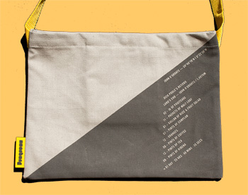
many of the accompanying fourteen designs are particularly worth taking note of. if, like me, you missed seeing the exhibition in the flesh at look mum no hands, you can still view each and every musette here, and if the mood so takes you, purchase one for a mere £15 plus postage. each has been produced in a limited edition of 100.
the il soigneur musettes are available from urbanhunter at a cost of £32 each. there are a variety of designs available.
posted tuesday 31 may 2011